Our Washington Square Park Project Featured on AD.com!
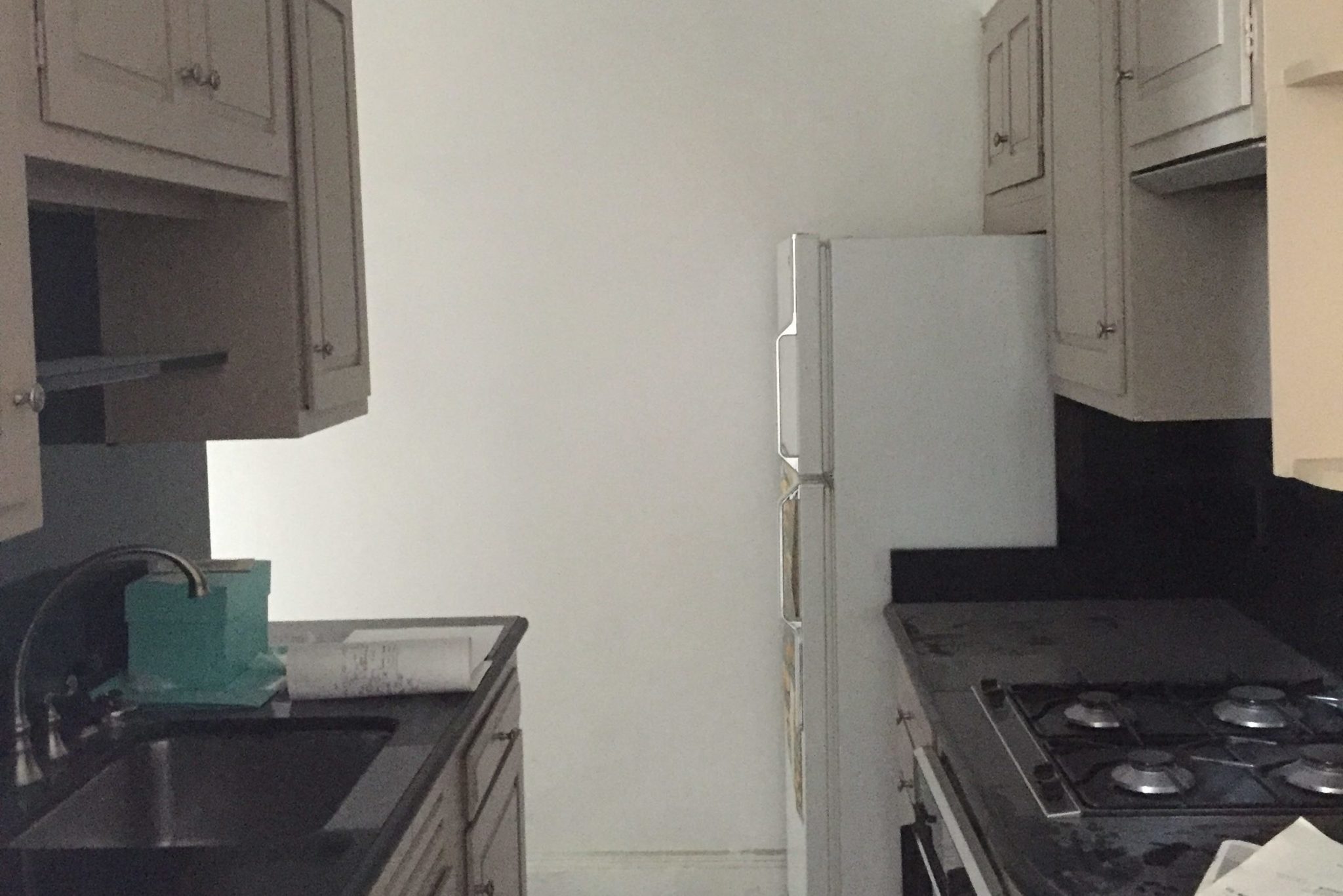
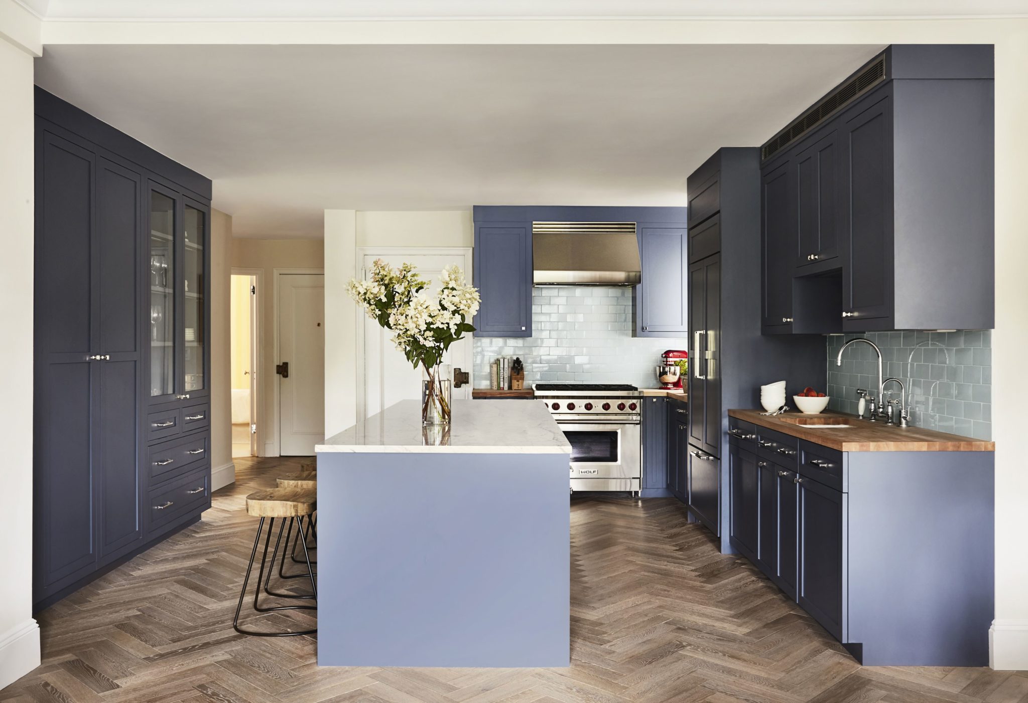
September is here, and we’re feeling inspired and ready for the challenges that the new season will bring. This summer was a busy one for us at McGrath II with numerous installations making for a summer season that just flew by. We’re looking forward to regrouping over the next two weeks, evaluating what we think worked well with the summer’s installations and what we could have done differently. We’re always trying to improve and modify our business practices so that our clients get the best results. A favorite project that we completed last summer was recently published on ArchitecturalDigest.com and we’re really excited to share it with you (Click Here). It was challenging for many reasons, but primarily because our clients wanted to make dramatic changes to the interior architecture of the apartment. When they purchased the pre-war apartment, it hadn’t been renovated in some time, and needed not only updating but also (in their minds and in ours) an updated plan to complement the way we live today. The biggest change was to opening up a hallway wall and living room wall creating one large chef’s kitchen.
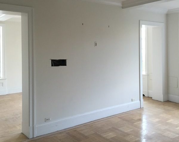
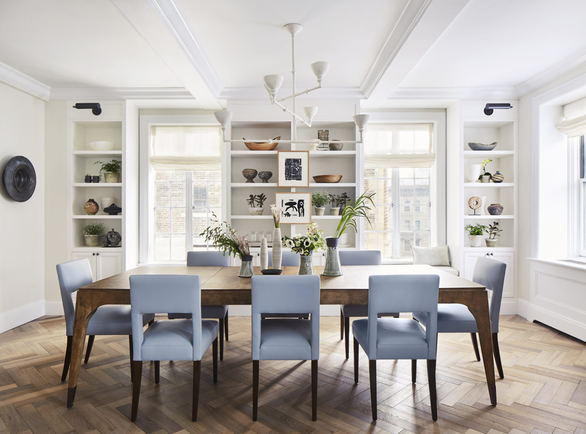
In another dramatic move, the wall that originally separated the living from from the dining room was opened up. The apartment gets such great light, and to really take advantage of it, we convinced our clients to remove this wall and build a pair of bookcases where the dual openings once were. Our goal here was to create an open flow that was conducive to entertaining and hanging out, while still respecting the architecture of the apartment, and perhaps even adding to it.
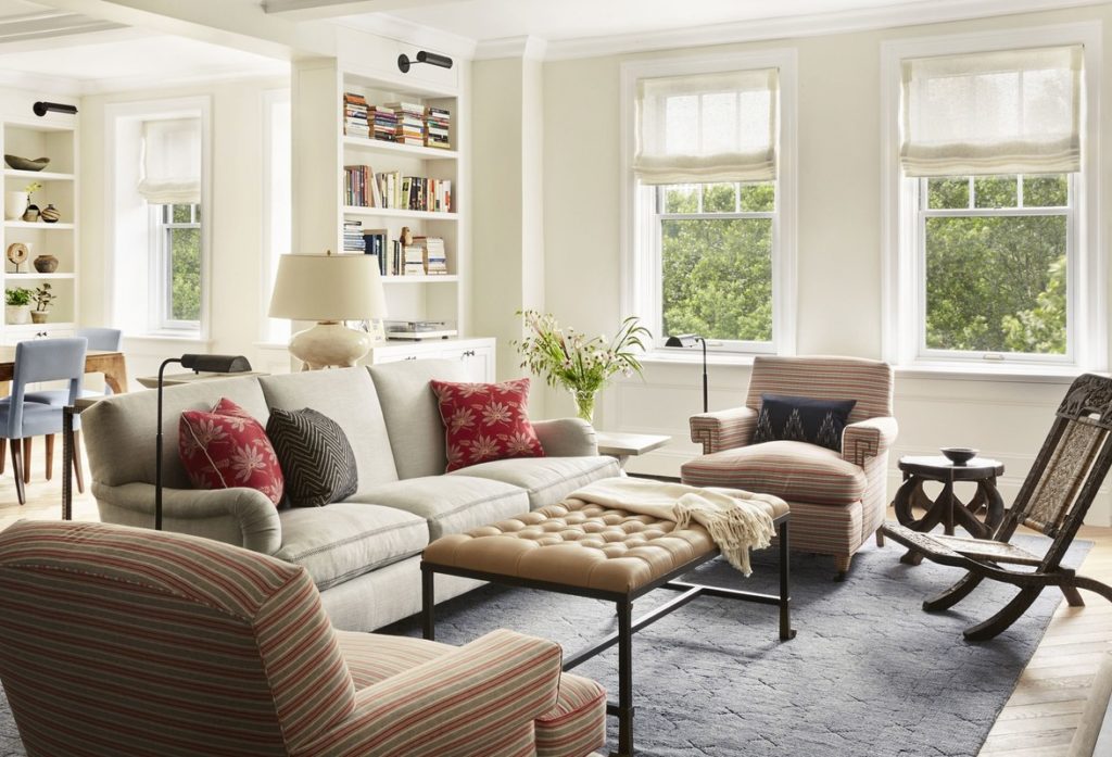
We designed the millwork in the living and dining rooms to mirror each other, making the apartment feel bigger and the spaces more seamless when walking between them. The cohesive color palate of the wall colors, custom rug, and textiles help, too.
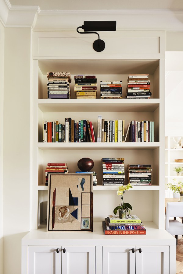
The dining room needed some architectural interest and here’s where the second layer of bookshelves came in. These built-in bookcases provide the perfect space for our clients to showcase a collection of objects or more of their beloved books. We had the plaster chandelier commissioned by NYC based sculptor and artist, Stephen Antonson.
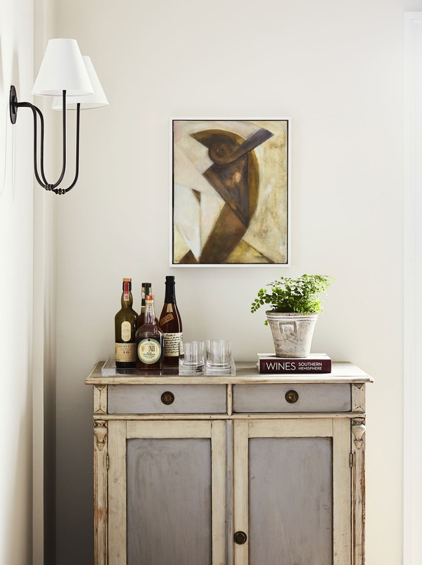
The bar is a Swedish cabinet we found antiquing in Massachusetts. It’s the perfect shade of blue and grey for this apartment. We love to include at least one piece of painted wood furniture in every project.
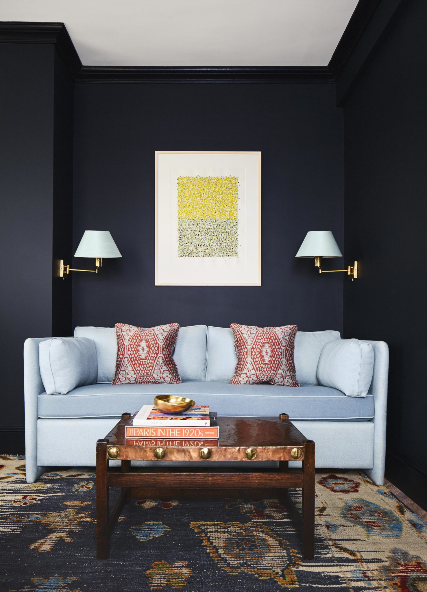
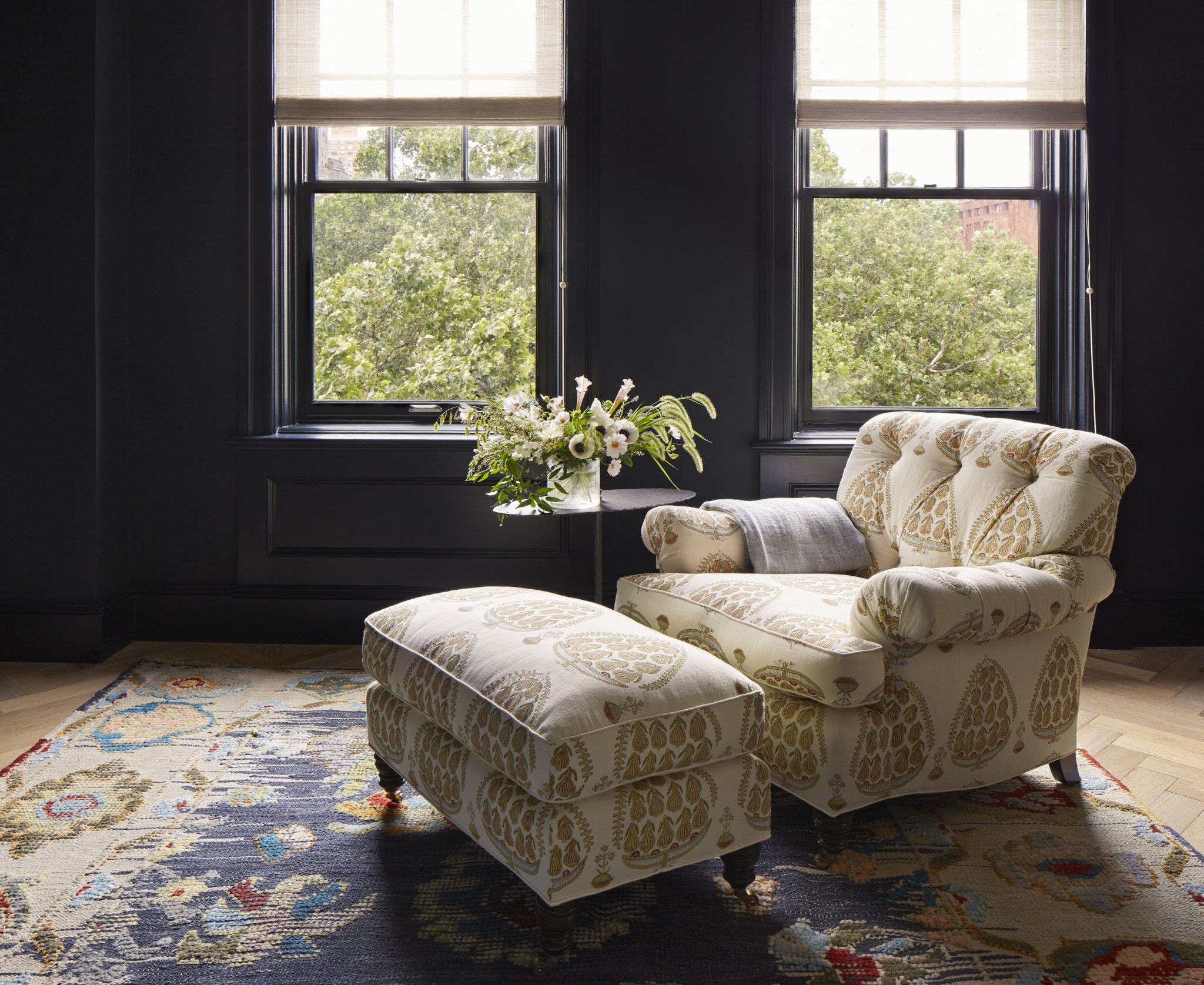
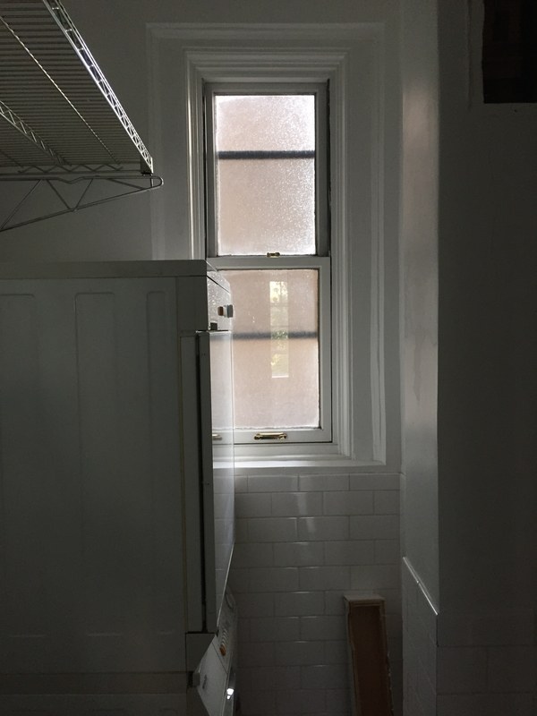
The home office previously had a door that led to a bathroom. This was closed off to create more space for the master bath as well as what would become the new home office. Here we removed the existing millwork and designed a built-in desk and shelves around the window on the left, with a small sitting area against the wall. Our client dreamed of having one room in the house painted darkly so we painted it Farrow & Ball’s “Blue Black.” We custom made the sleeper sofa along this wall to accommodate guest overflow. The comfortable chair, upholstered in a Raoul textile print is going to get a lot of use! The window shades were made by Conrad. They protect the fabrics in the room during the day, but also add a finished look to the room.
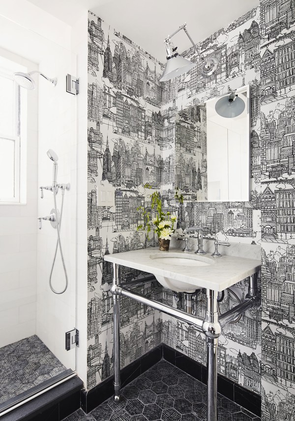
The former laundry room was converted into a third bathroom and powder room for guests. Whenever we can, we try to have fun in the powder room. This cartoon style black and white wallpaper depicting the famous monuments of NYC (including the arch in Washington Square Park, of course!) was the perfect bit of whimsy in this rather subdued apartment. Custom marble tile with silver etching on the floors is glamorous and durable for a heavily used bathroom.
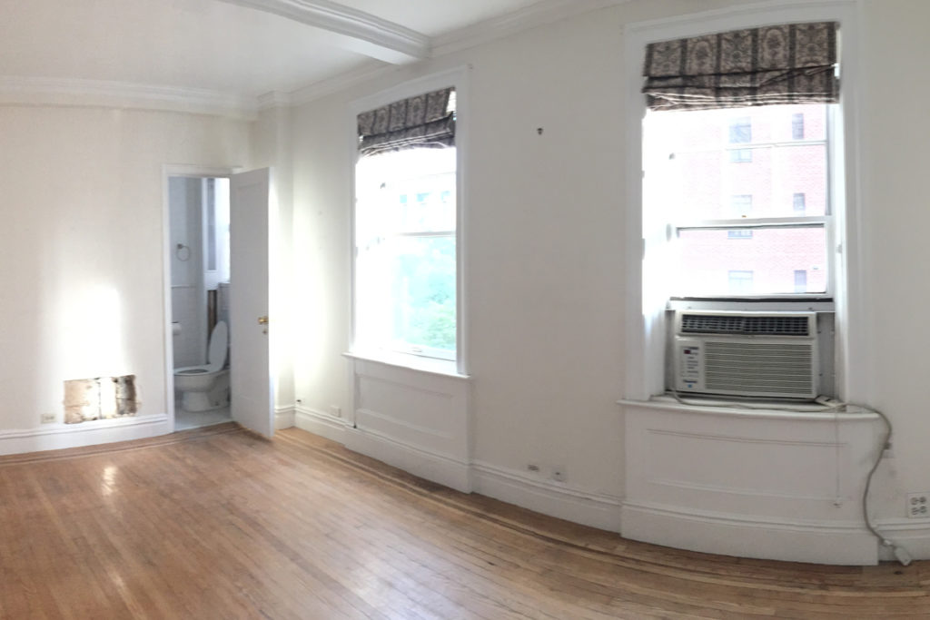
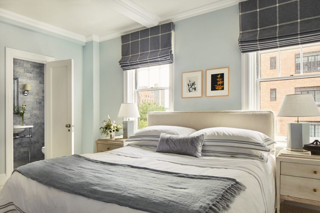
The master bedroom underwent the least amount of changes, though the master bath had a total overhaul. We love a blue bedroom! And so it seems, so do many of our clients 🙂 In this master, it was important to our clients that it feel neither too feminine nor overly masculine.
For more on this apartment, click here to see the story on AD.com! You can also see the final images in our featured projects section by clicking here.
 23 April 2021
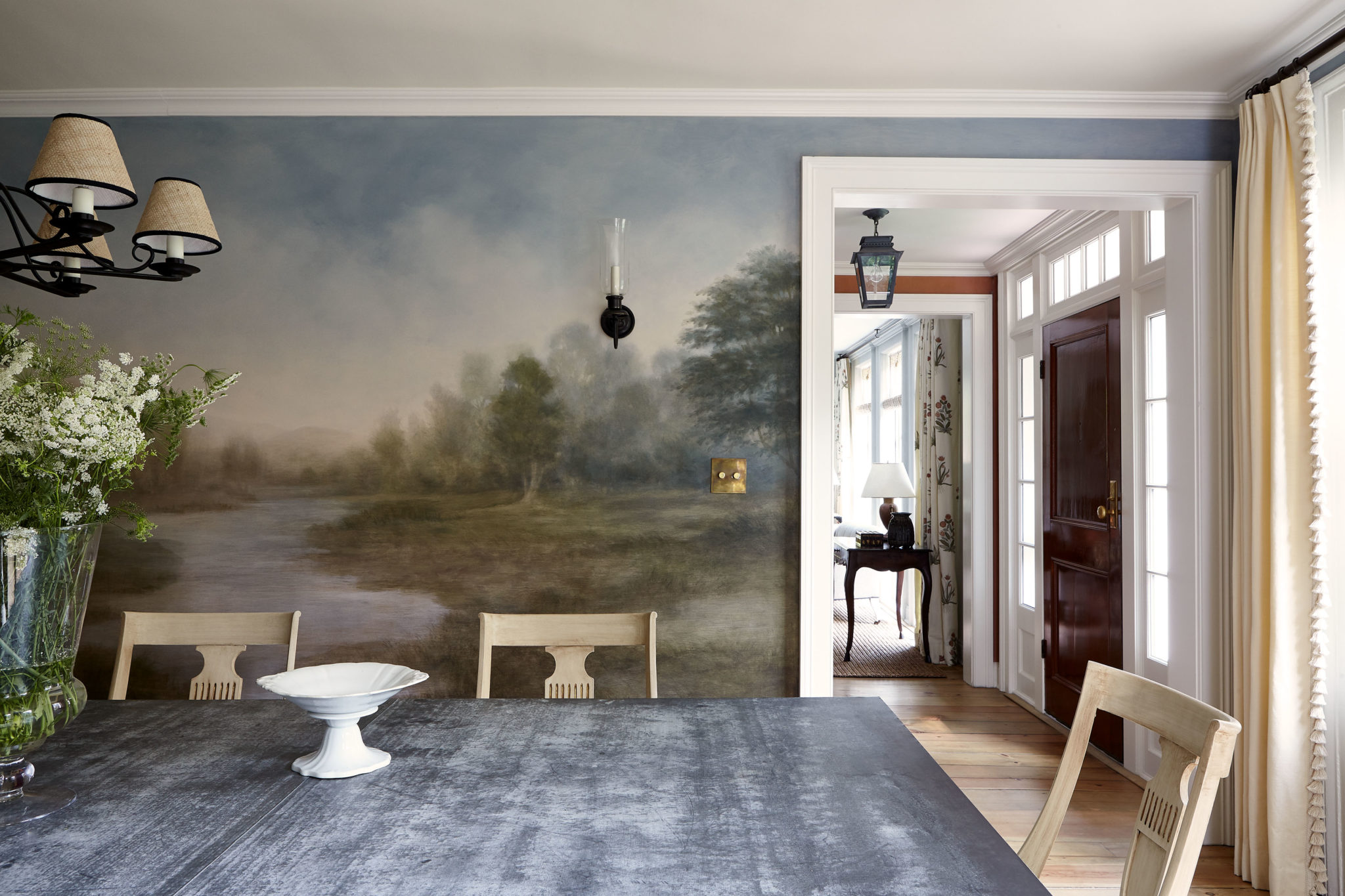
An atmospheric mural
Every house requires something different to make it sing. But there is always one special element that creatively jump starts a project--whether it be an idea, a textile, or a piece of furniture. From here, we start to build.
Read full post
23 April 2021
An atmospheric mural
Every house requires something different to make it sing. But there is always one special element that creatively jump starts a project--whether it be an idea, a textile, or a piece of furniture. From here, we start to build.
Read full post
 3 September 2015
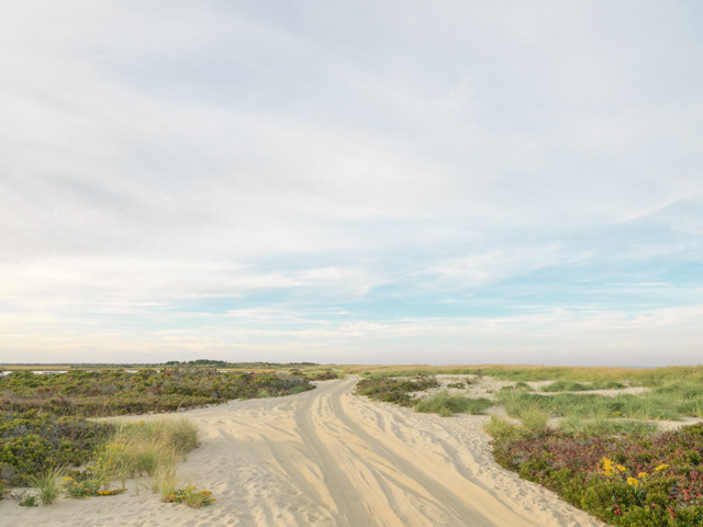
Nantucket seascapes by Daniel Sutherland
Summer doesn't have to end thanks to Daniel Sutherland's beautiful beach photographs.
Read full post
3 September 2015
Nantucket seascapes by Daniel Sutherland
Summer doesn't have to end thanks to Daniel Sutherland's beautiful beach photographs.
Read full post
 10 March 2014
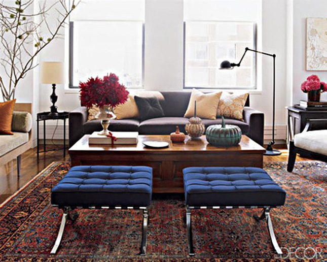
Start with a Persian Rug
Read full post
10 March 2014
Start with a Persian Rug
Read full post

7 years ago