Designing with a Neutral Palette
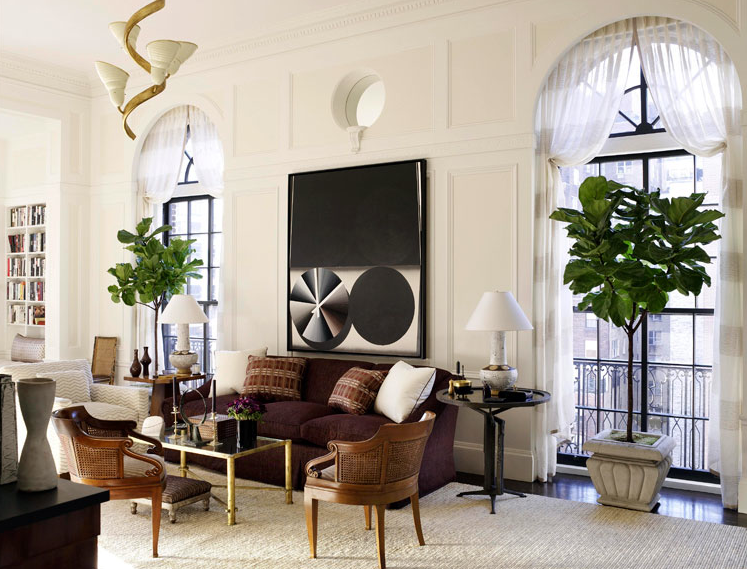
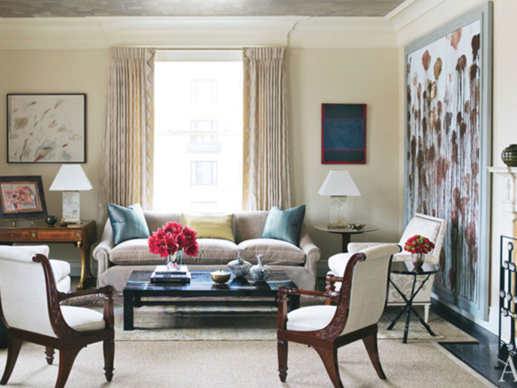
As colorists, we always find designing rooms with a neutral palette the most challenging. Rooms that achieve the desired effect of monochromatic textiles must have art on the walls and interesting non upholstered pieces to give the environment interest and life. The inspiration images from the clients were of rooms in beach and country homes featuring white walls, neutral linen upholstery fabrics, and an eclectic mix of antiques and art. The client shared with us that she feels happiest at her weekend beach house. Our challenge is to take this feeling and make it appropriate for Park Avenue. We set out to create a furniture scheme that includes interesting furniture shapes (neutral fabrics crave interesting/detailed/sculptural upholstered furniture), vintage and antique pieces with interesting lines, and neutral fabrics that won’t fall flat but give their living room a fresh look that feels a little bit glamorous but still like home. Designer David Kleinberg’s Manhattan living room, recently featured in the new book The Parish-Hadley Tree of Life: An Intimate History of the Legendary Design Firm is a wonderful source of inspiration.
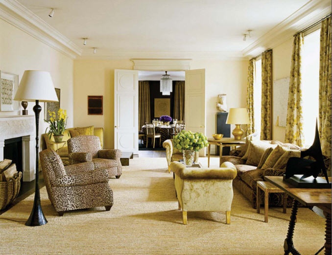
In this Jacques Grange interior the color scheme is simply tints and shades of cream, butter and, of course, animal print.
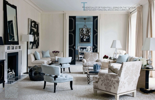
Below, the palest of white and soft robin’s egg blues prevail. Note that the ceiling is painted blue to add an element of continuity while the dining room is painted a stronger blue to ground the light and airy living room. The upholstered pieces themselves are all very tailored, yet different from each other.
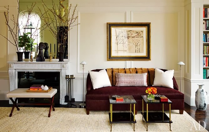
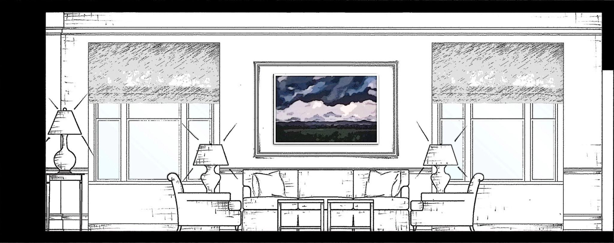
The art is the star in this neutral room — as it should be!
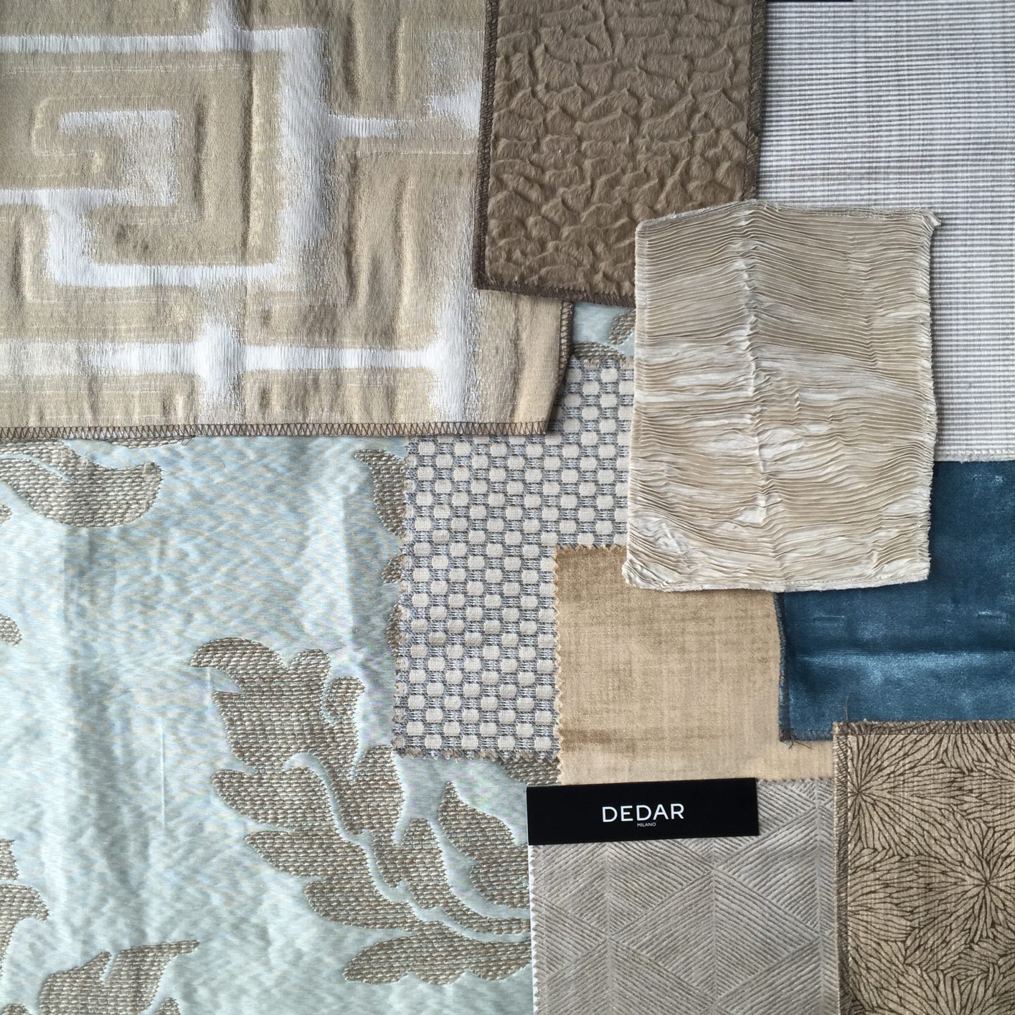
For this project, we have proposed a wonderful damask in a soft blue green in the dining room which opens up into the living room. The larger of the two sofas will be upholstered in a warm, camel color velvet that has a slight sheen to it, while the pair of square arm lounge chairs will be in a small scale dotted woven silk fabric in muted tones. For the Jansen style sofa on the opposite wall, we’re proposing a subtle geometric print for the Jansen sofa and a large scale Greek key motif custom designed rug. The end result should prove to be very sophisticated, but not too serious. The clients are very warm and inviting, and they want their apartment to reflect their personal style. And it will!
Neutral doesn’t have to mean boring. The right combination of texture and subtle pattern can bring a monochromatic room to life.
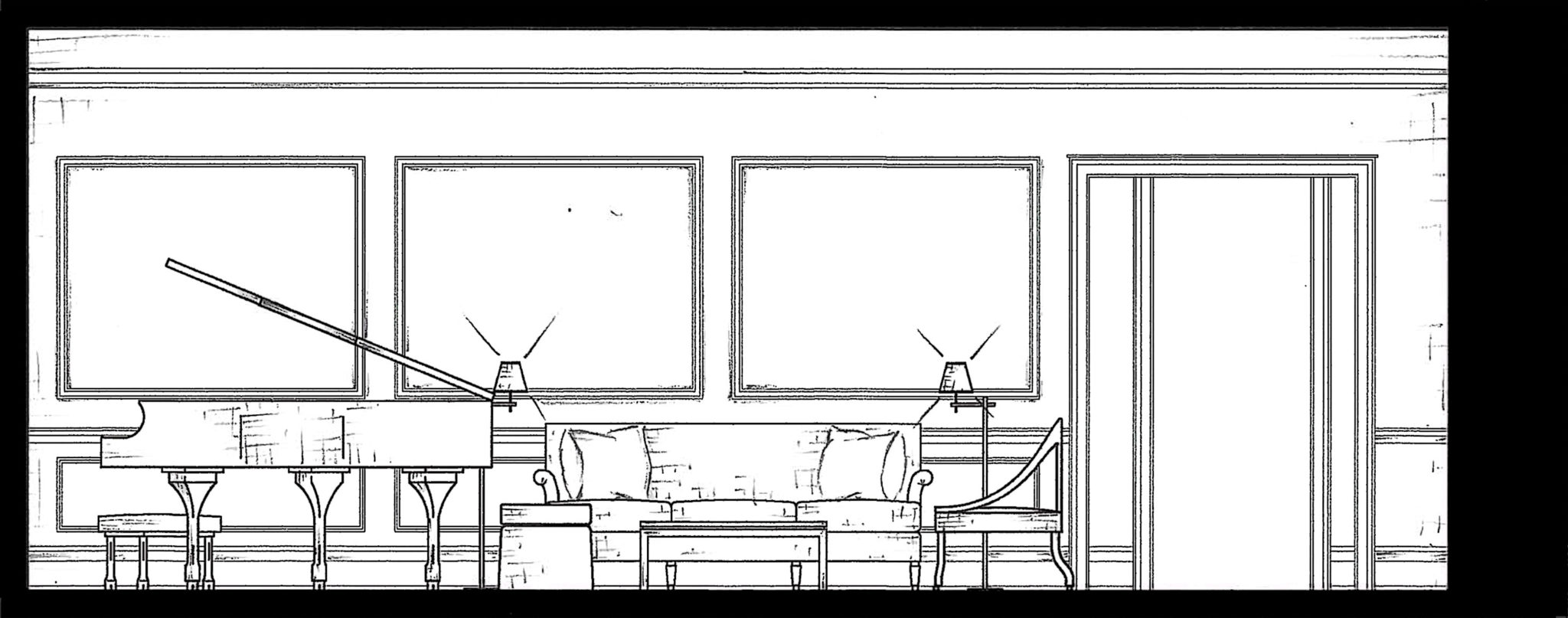
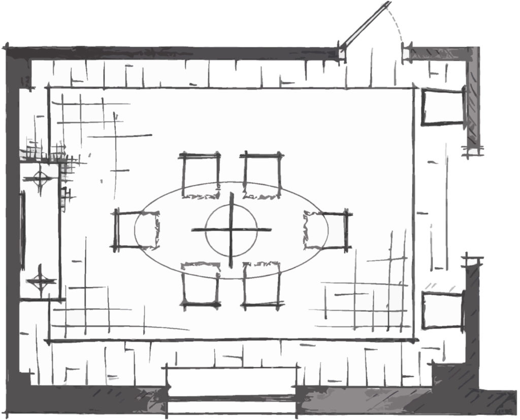
Below you can see the furniture plan for the living room. Our client loves to entertain and the husband plays the piano every night when he gets home from work so it was important to be able to incorporate their piano into the furniture plan even if it meant there was slightly less seating in the room.
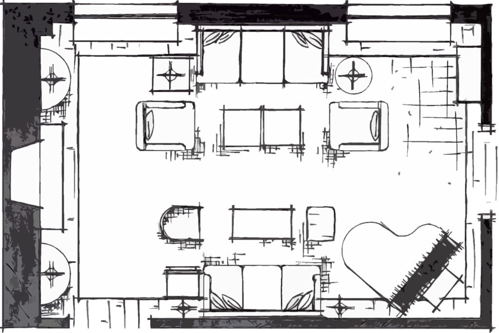
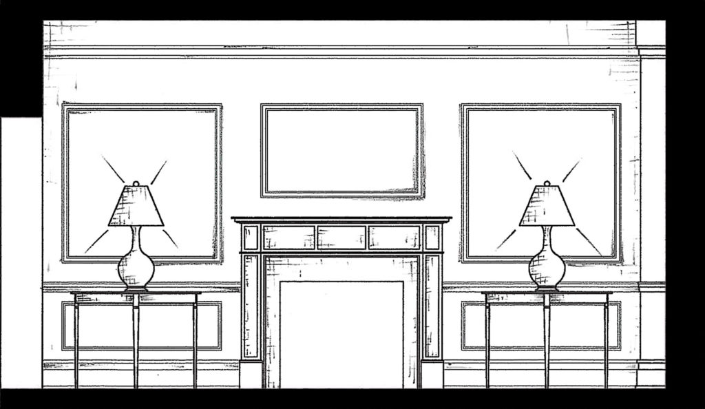
A grand piano has a prominent place in the room. We found a way to work with it so that we could still find ample seating for entertaining. The clients already have a collection of art, so in this scenario, we have worked with the colors and the orientation of their pieces. On either side of the fireplace, we added a pair of demi-lune tables, one of our favorite furniture pieces. Aside from adding soft lines to the room, it is the perfect opportunity to introduce additional lighting to a large room.
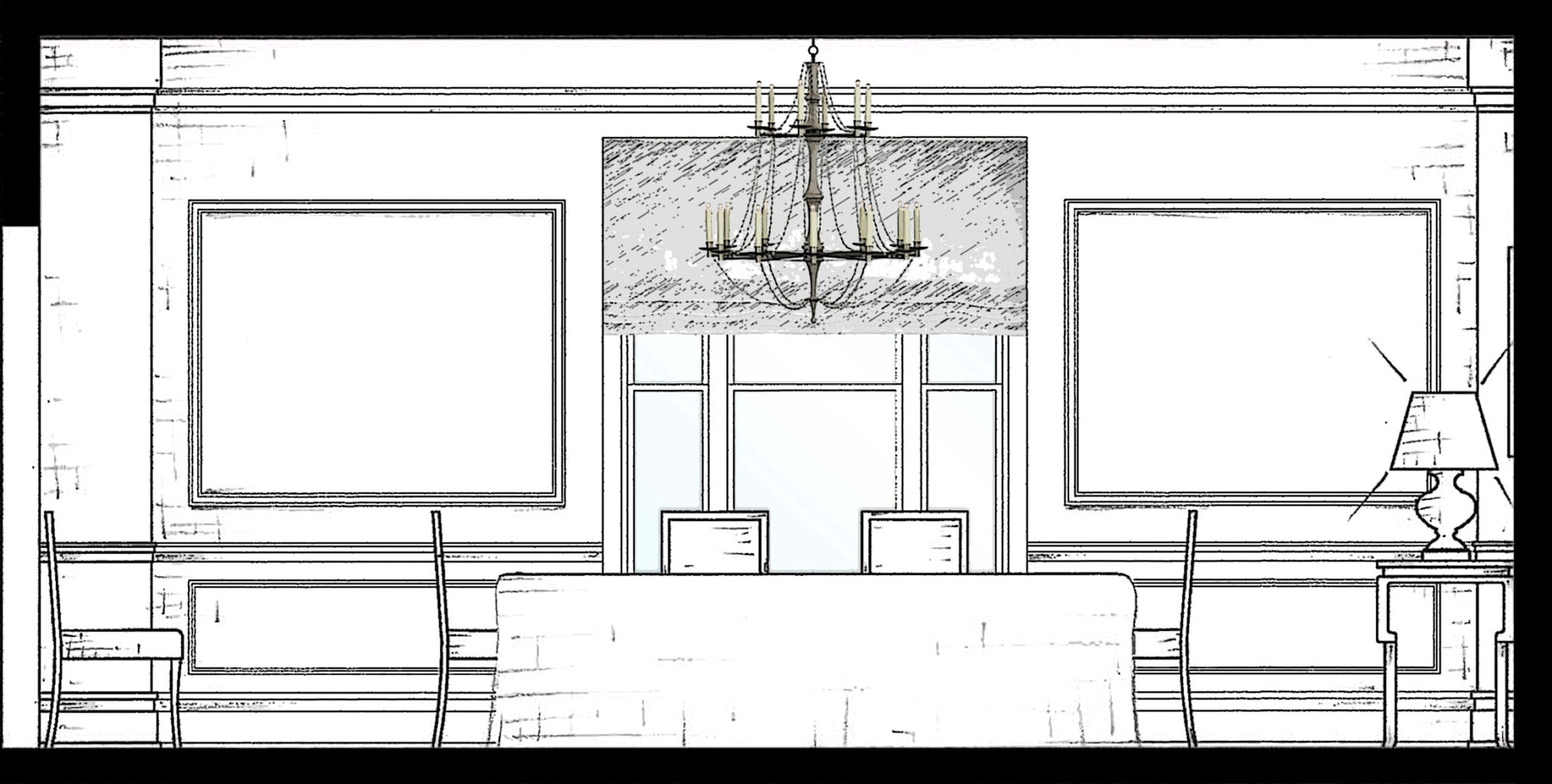
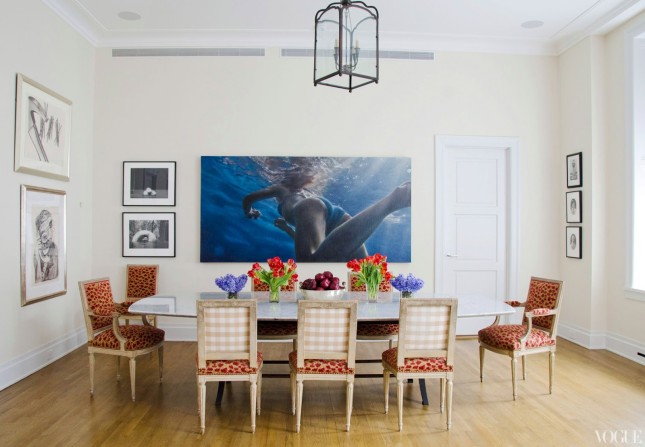
In the dining room, the client requested a skirted table on her the large extended oval dining table. We saw this as an opportunity to introduce an elaborate damask textile pattern (see above in the fabric scheme).
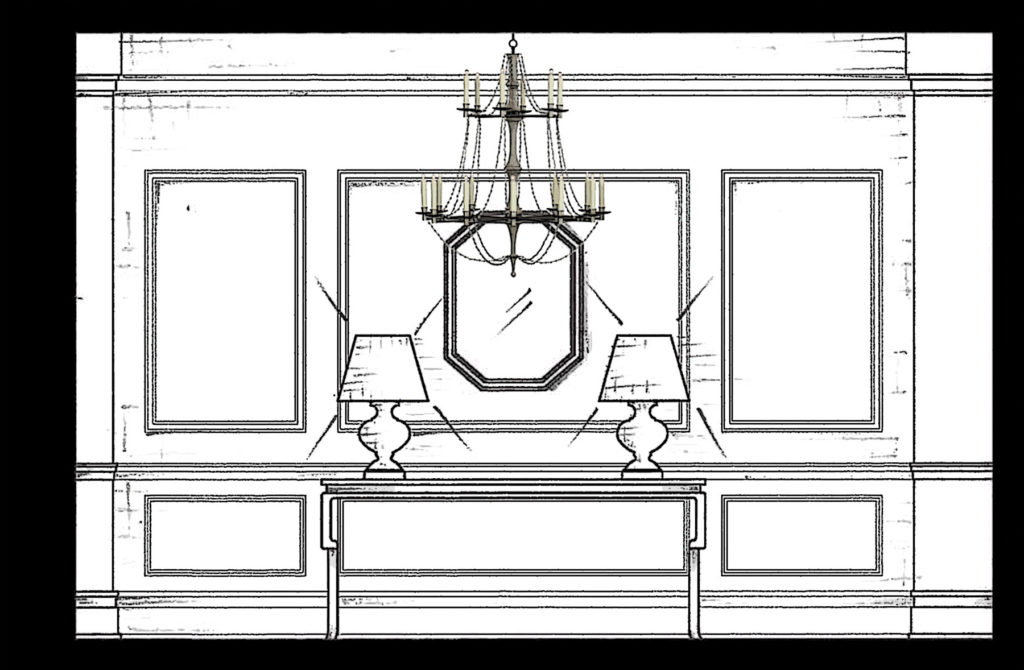
At the far end of the dining room, we’re planning on including a pair of interesting architectural lamps on this classical console table, again to introduce more light, but also interest. Every piece needs to add a bit of drama when the color scheme is so serene.
In the coming weeks, we’ll be finalizing decisions on all of the furniture pieces and corresponding fabrics. Looking forward to sharing all of the elements with you. In the meantime, hope you all have a wonderful and Happy Thanksgiving!
 19 August 2014
gingham
Not just for picnic blankets and preppy button downs, this classic pattern is having a revival in the world of interiors.
Read full post
19 August 2014
gingham
Not just for picnic blankets and preppy button downs, this classic pattern is having a revival in the world of interiors.
Read full post
 12 December 2018
The Power of Decorative Painting
A sneak peek of some of the special finishes we're creating for an apartment downtown.
Read full post
12 December 2018
The Power of Decorative Painting
A sneak peek of some of the special finishes we're creating for an apartment downtown.
Read full post
 31 October 2017
Five Fabulous Finds
A few of our favorite found treasures.
Read full post
31 October 2017
Five Fabulous Finds
A few of our favorite found treasures.
Read full post

10 years ago
10 years ago