gingham
We often think of gingham in the context of that great menswear-inspired blouse you break out mid-summer. However, gingham isn’t just a pattern to find in the closet. Today we’re showing you how one of our favorite patterns translates into the world of interiors. Whether it’s a “more is more” approach, or just a peek, gingham is a classic pattern that is equally elegant as it is casual.
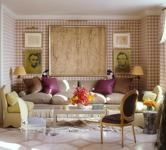
Gingham upholstered walls and draperies act as the perfect backdrop for this Manhattan apartment, above, designed by Jeffrey Billhuber. The pattern adds visual interest but the uniformity allows it to act almost as a neutral. Gingham is one of those patterns that actually works quite well in big doses.
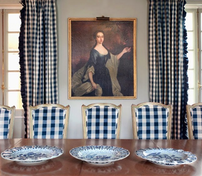 Navy and white gingham dining chairs and draperies help to give off that French Provincial air in this dining room, above. There’s something about gingham that suggests a level of sophistication that rarely feels stuffy. A great trim on the curtains and some blue and white china also add to the elegance.
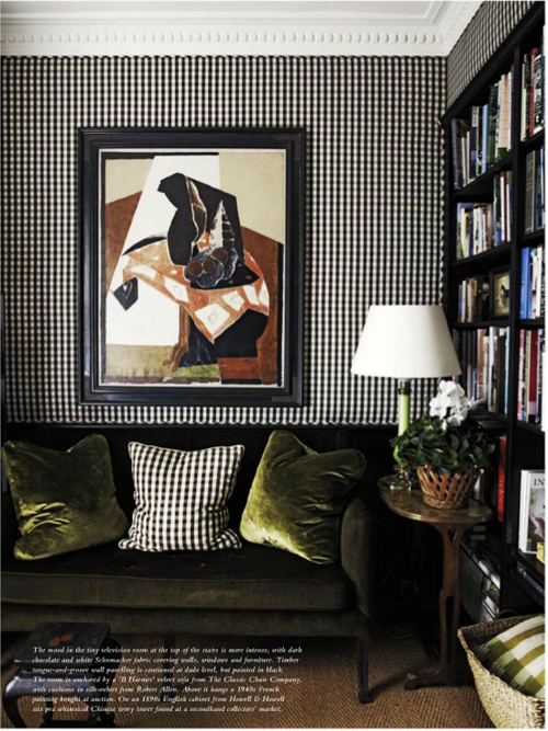
A library, above, gets an modern update with a classic pattern. Black and white gingham, shown here in a smaller scale, adds a graphic pop while also giving off that menswear vibe we love. I also love the contrast between the scale of the contemporary art piece and that of the pattern.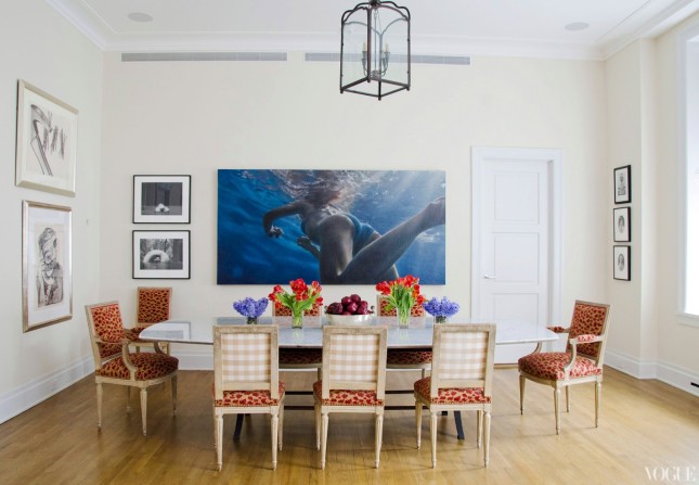 If wall-to-wall gingham isn’t your look, try playing with the pattern in a smaller dose like these dining chairs, above. Having just the backs upholstered helps break up the continuity of a busy pattern on the front and also adds a little element of surprise. Have you ever used gingham in your home?
 13 March 2015
Restoration Hardware's Diamante Rug
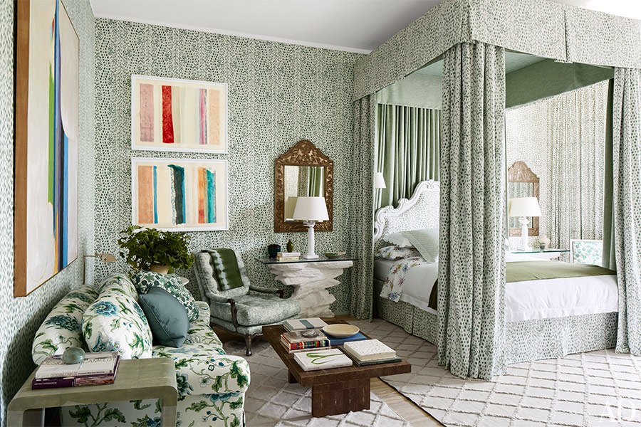
We spy some super chic and affordable rugs from Restoration Hardware in this issue of Architectural Digest!
Read full post
 31 January 2014
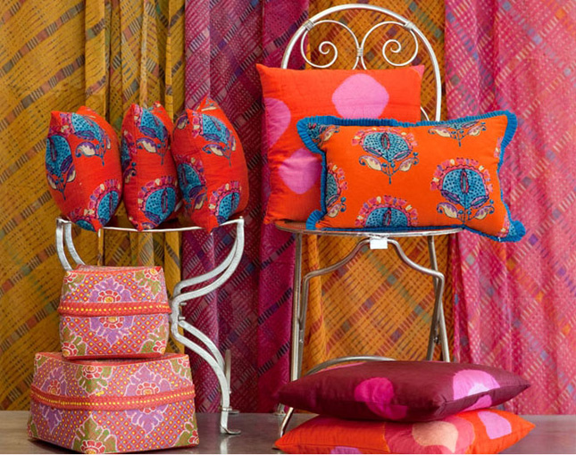
Cheerful, Happy fabrics from Tulu Textiles
Read full post
 11 November 2013
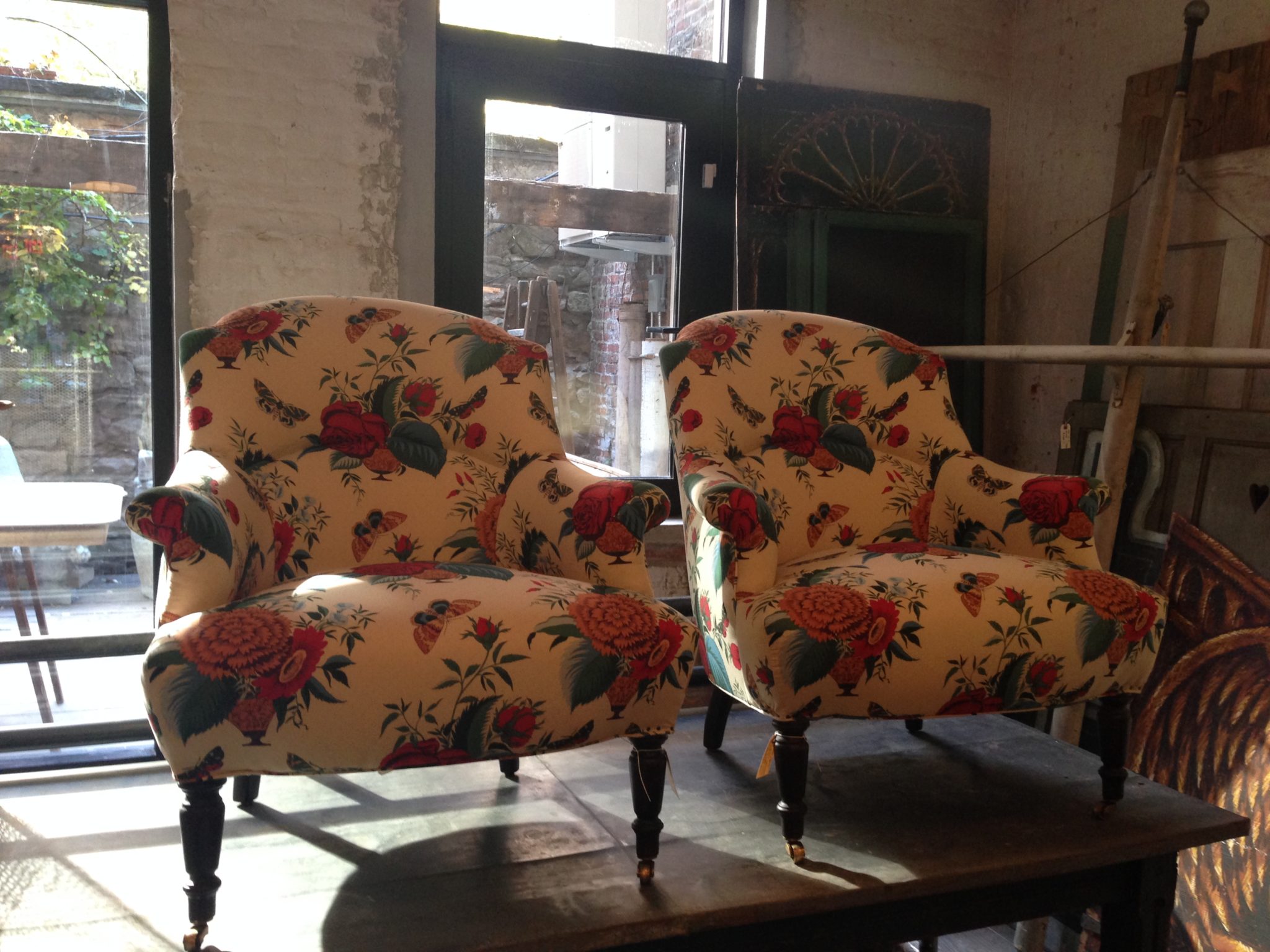
Tissus Tartares for John Derian
Read full post

