The Process of Adding Interior Architecture
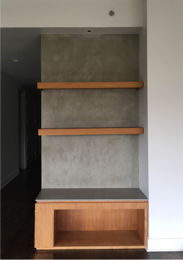
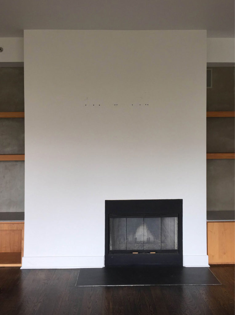
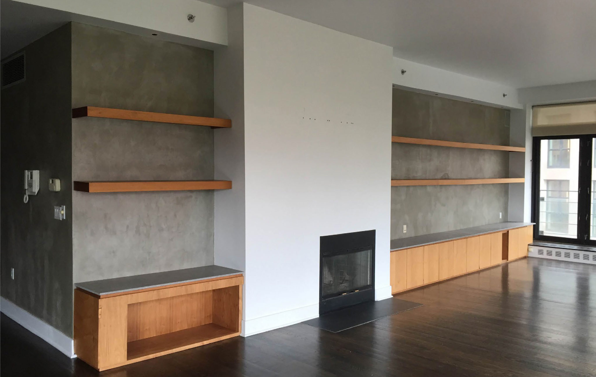
As designers, the nuts and bolts of what we do is problem solving. Every space we take on has its own set of “existing conditions.” It’s our job to come up solutions that will meet the needs of our clients, both in terms of functionality and within the budget. In an apartment in Tribeca we are currently designing, one of the elements of the apartment that needed to be redesigned and reconfigured was the main wall of the large living room. They wanted to add a bar, and create a more clutter free environment. Here’s what it looked like Day 1. We like to start our design process by measuring the existing space and drawing the existing furniture plan, as well as the elevations of the walls. This helps us know what’s possible.
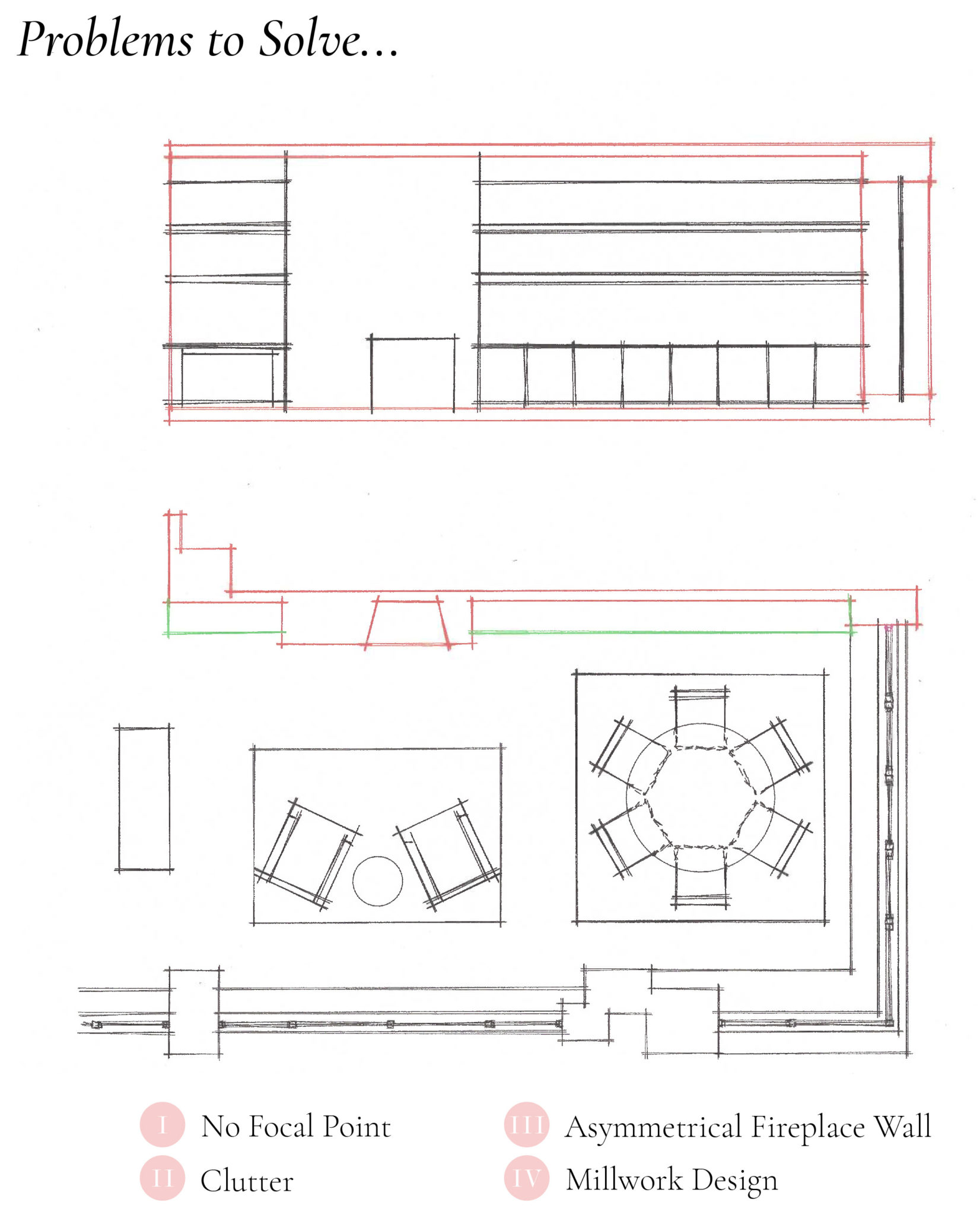
The problems we identified are fourfold. Firstly, the fireplace is off center, so there is no focal point for a furniture plan to be grounded by. And there’s too much room for clutter! We clearly need to come up with a design for additional millwork for storage but also to ground the room. The clients hoped to include a bar in the apartment. We identified the perfect location as seen in the photo on the left.
We began to search for inspiration photos of interior elevations which we could reference, and demonstrate to the client how the space could be transformed to accommodate their needs. This one in particular caught our eye.
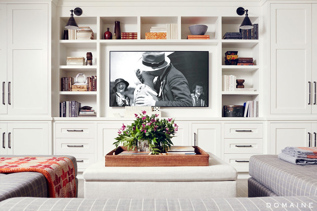
Storage is a priority for the couple who want to be able to put things away and have a feeling of light and airiness instead of using the space to display photos and other accessories. For this reason, we decided to make the bookcases deeper, and to add slide back doors to conceal the TV when no one is watching it. We also wanted to find a way to shorten the wall where the shelves in the existing space are now.
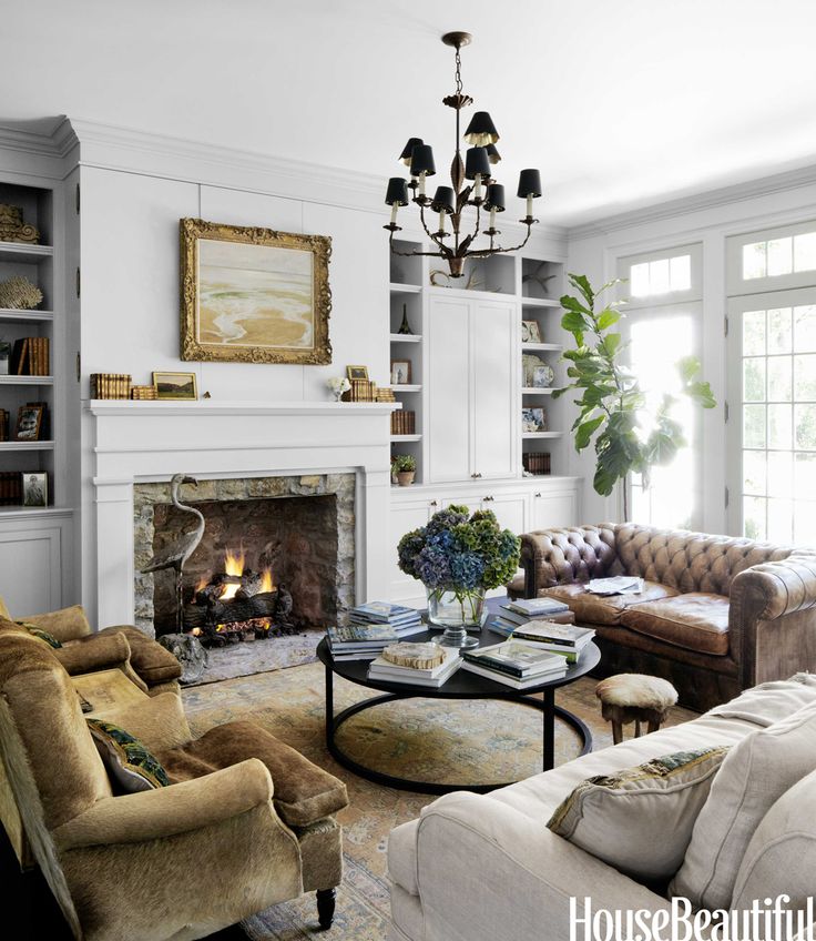
Creating symmetry on either side of the fireplace will help the room feel more balanced.
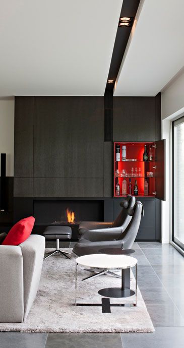
We were inspired by this wonderful bar, tucked away to one side and lit inside.
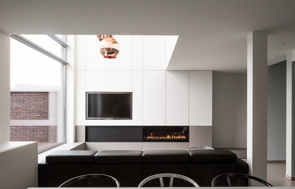
We love the modernity of these panels, below, and they inspired us to go for a more modern profile on the cabinets.
Take a look at our elevations, and you can see how we took our inspiration elements and made aspects of them work for this specific space. Below, you can also see the new furniture plan, anchored by a mantelpiece that is more of a central focal point of the room. Symmetry prevails!
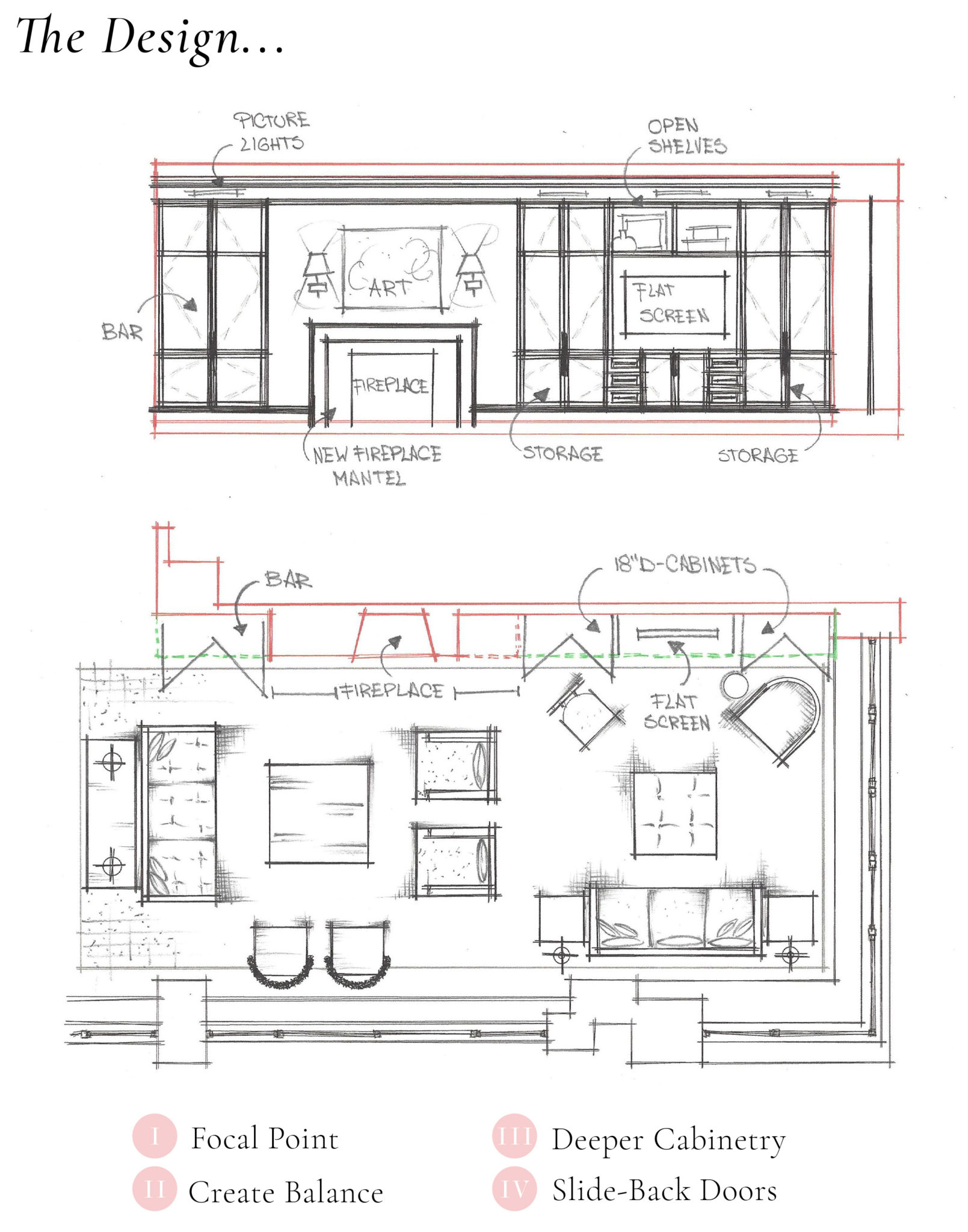
We love sharing our work with you all. Everyday brings a new challenge! You can also see the final images in our featured projects section by clicking here.
 15 November 2018
Brooklyn Heights Brownstone: The Living Room
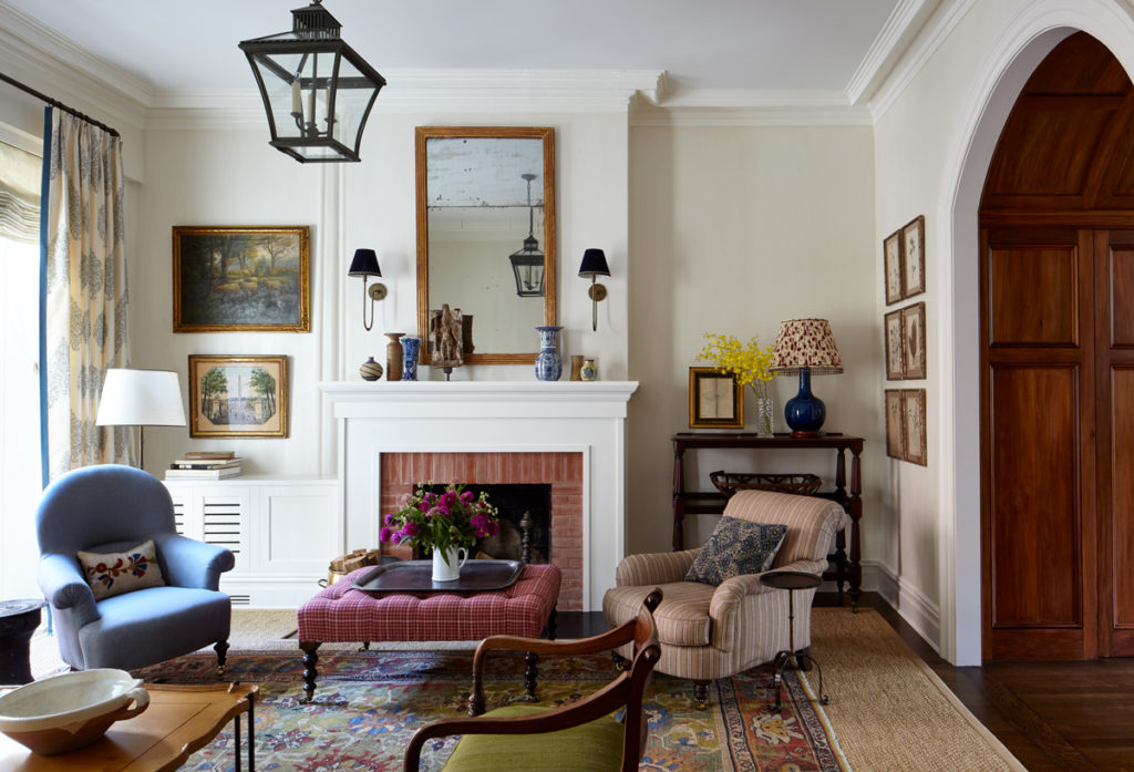
A colorful Persian rug and rich, vibrant textiles lay the groundwork for a cheerful space to entertain, and live in.
Read full post
 12 January 2015
Repurposing Great Pieces
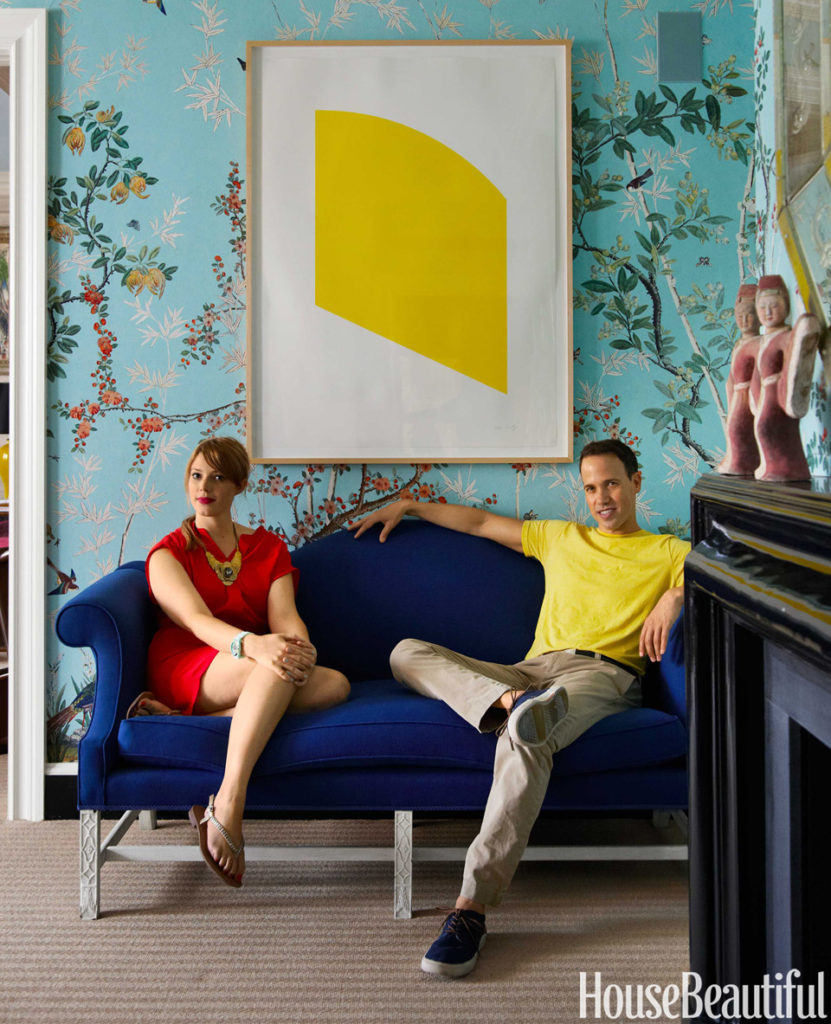
Two Miles Redd-decorated apartments, One client, all of the same furniture. See how one of our favorite interior designers created a totally new environment using all of the key pieces from his client's first apartment.
Read full post
 18 August 2014
Ferran textiles, wallpaper and bedding
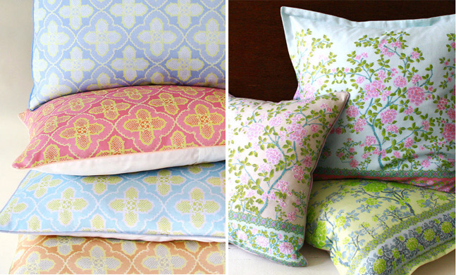
We're loving the inspired color combinations and unique patterns of this USA-made brand.
Read full post


10 years ago
10 years ago
10 years ago
10 years ago
10 years ago
10 years ago
10 years ago