Choosing Kitchen Renovation Materials
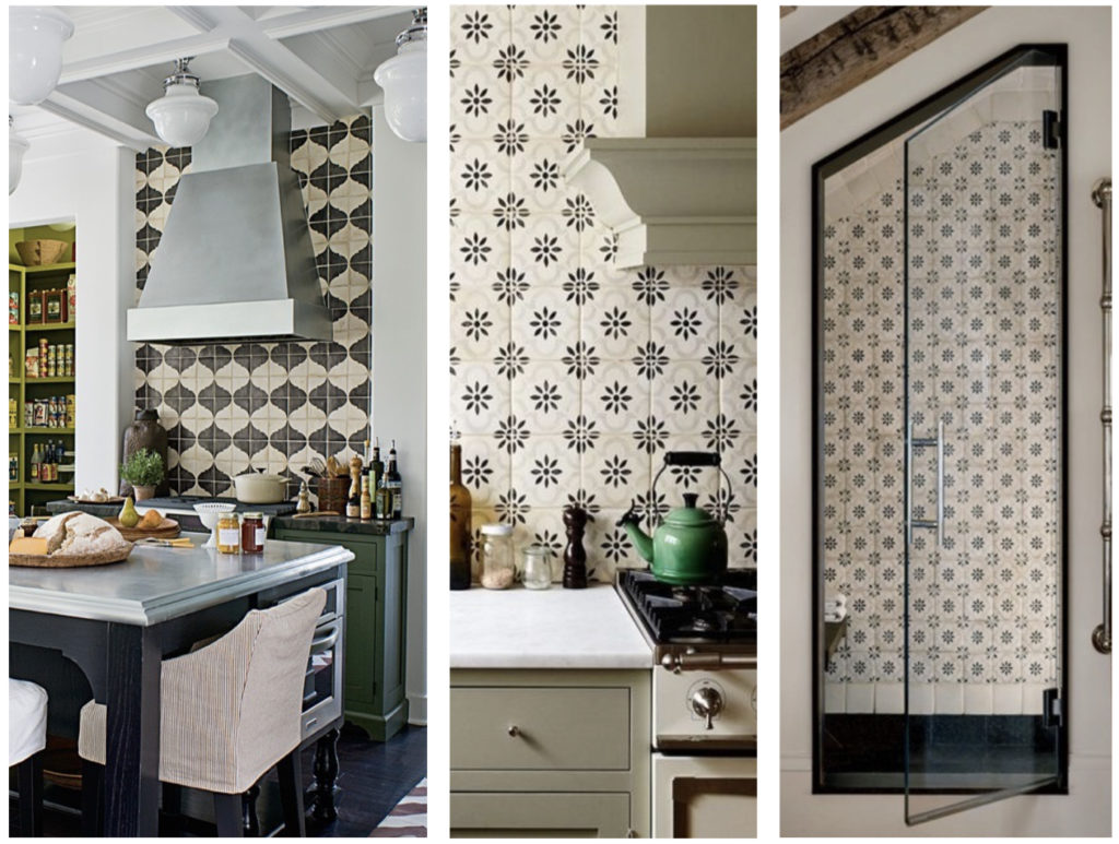
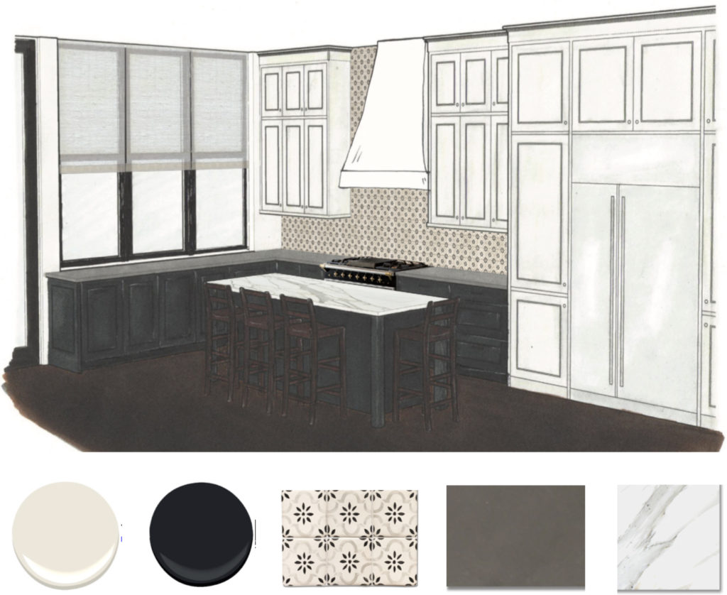
For a brownstone renovation project we’re working on in Brooklyn Heights, we provided our clients with 3D renderings and inspiration photos to ease the challenge of imagining how specific materials, colors, and lighting combinations can look. We thought we’d share our process, and hope you’ll weigh in on your personal favorites. In Material Scheme 1, for example, the drama comes from the hand painted black and white terra cotta tiles which dominate the wall space behind the oven and counter top. We proposed pairing this with painted black lower cabinets and island, with creamy white upper cabinets.
Kitchen Material Scheme 1
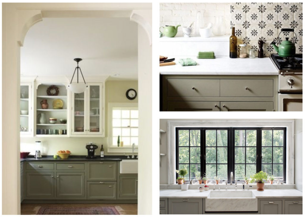
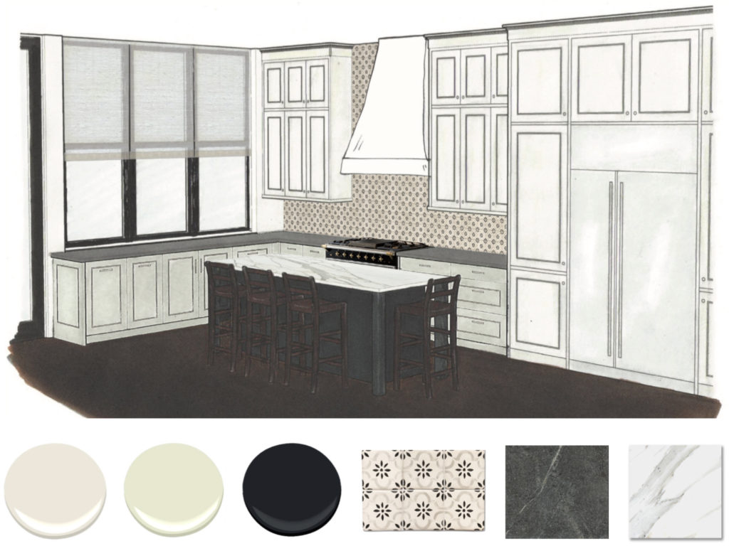
In Material Scheme 2, we kept the dramatic black and white terra cotta tile, but paired it instead with a softer green paint color on the cabinets, with the island still painted black to speak to the tile. Oh, and we’ll paint the inside of the window frames black, too.
Kitchen Material Scheme 2
In Material Scheme 3, we proposed a square crackled hand-made ceramic tile in a pale green color paired with the creamy white paint color on the upper cabinets, while maintaining the painted black lower cabinets and island.
Kitchen Material Scheme 3
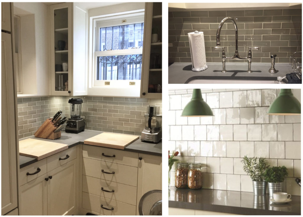
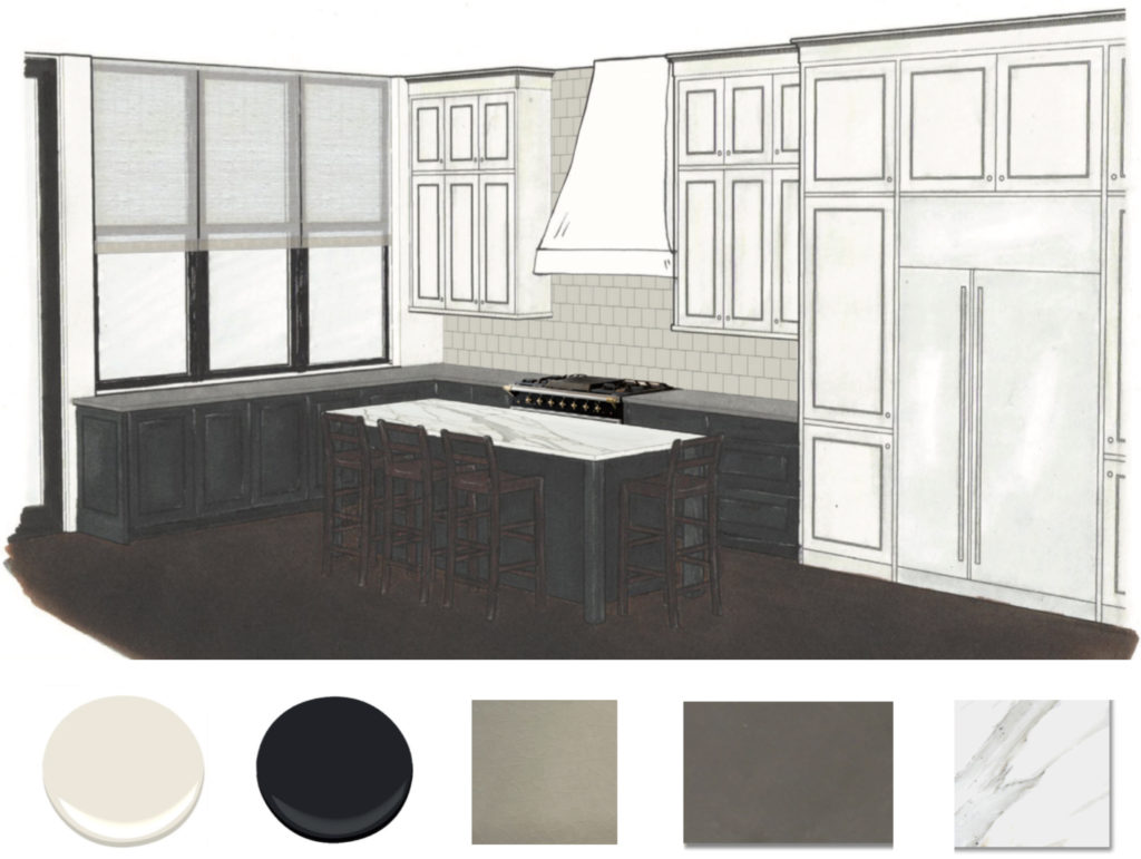
For lighting decisions, we use the same system of providing inspiration photos and renderings of the finished room. Here are three different 3D renderings of the actual room, once renovated, with three different lighting concepts. As you can see, these images are rough, and don’t have the nuance of the final photos of the space, but they do help one to imagine how the combinations will look together.
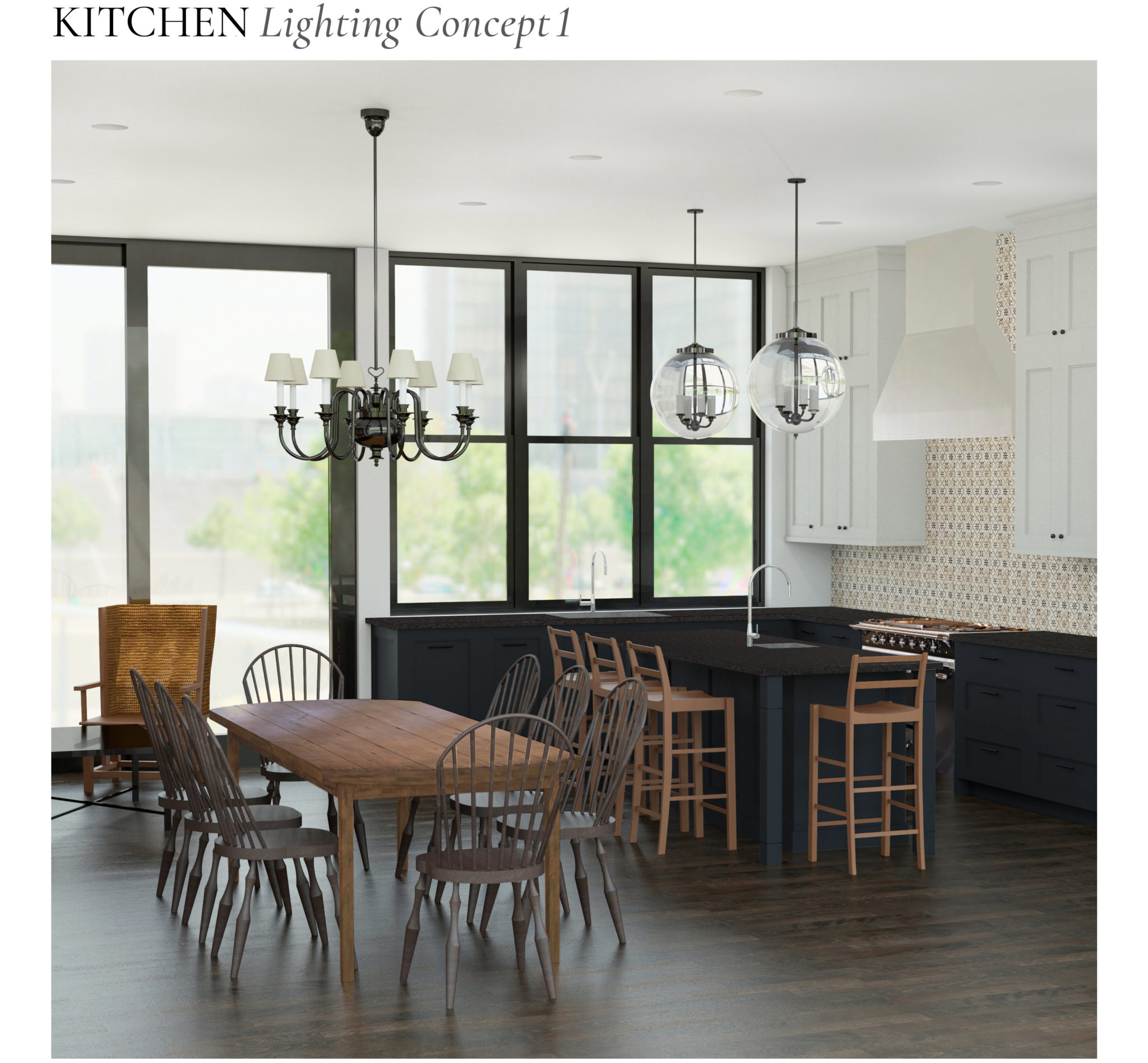
The round glass pendants rendered above are made of thick milk-white hand blown glass and wrapped in a hand-woven wire fabric, referencing historical factory lighting.
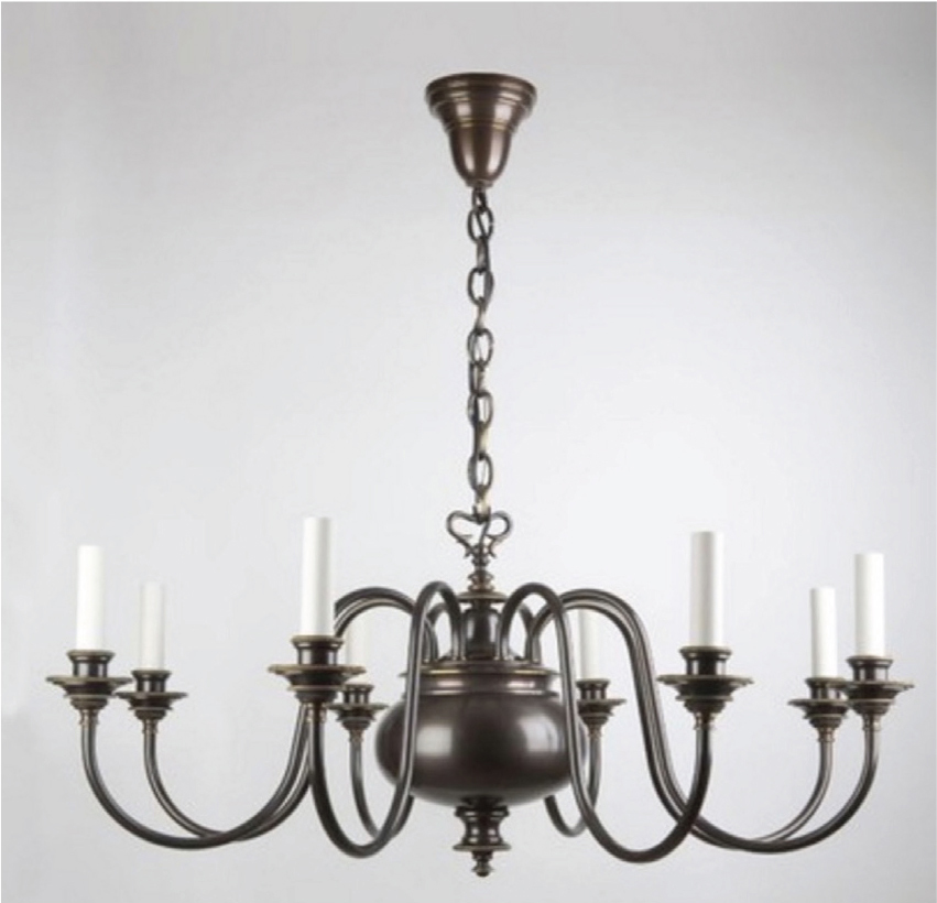
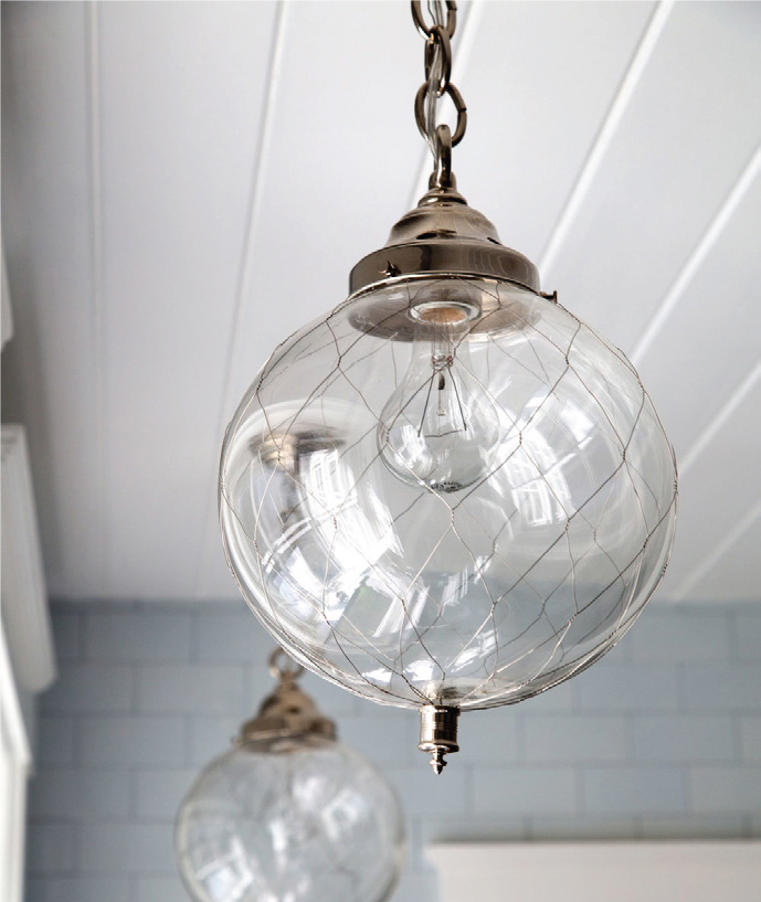
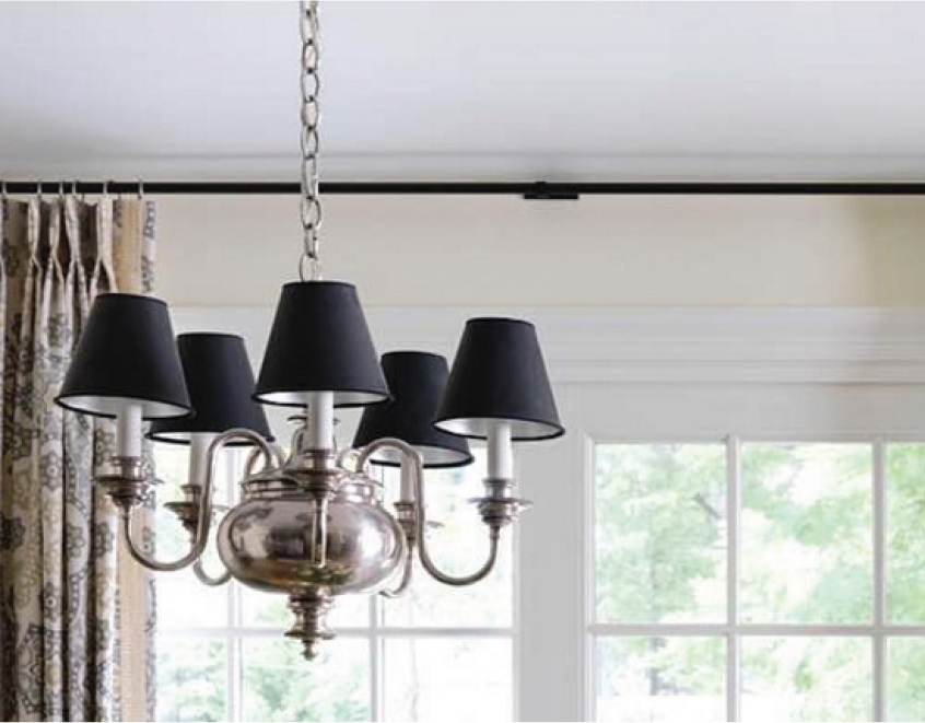
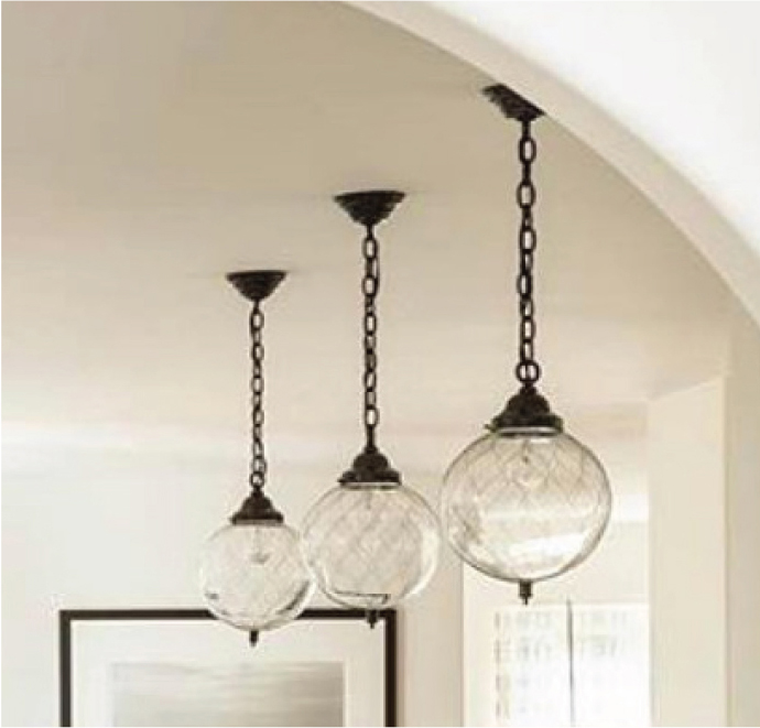
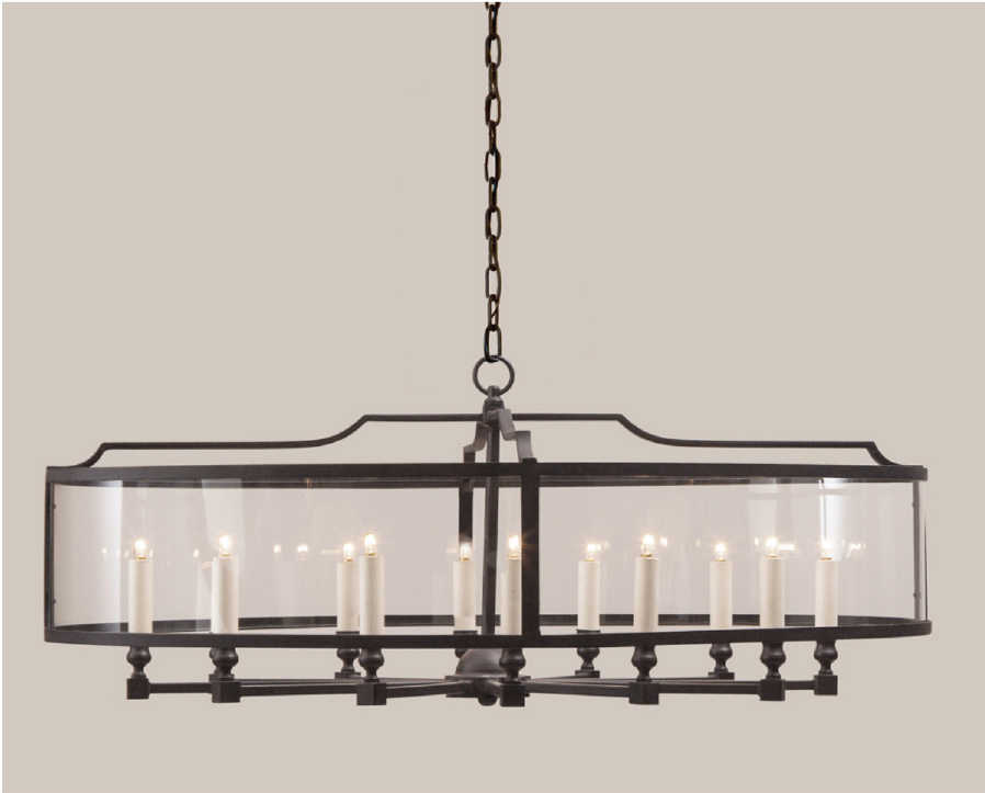
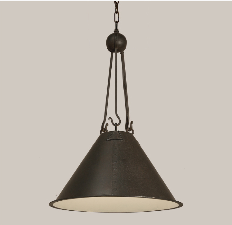
In this second lighting scheme, a slightly heavier look with iron and metal fixtures.
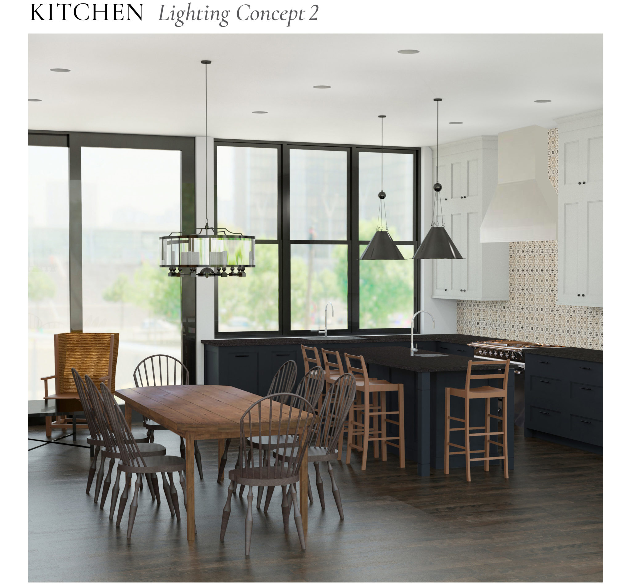
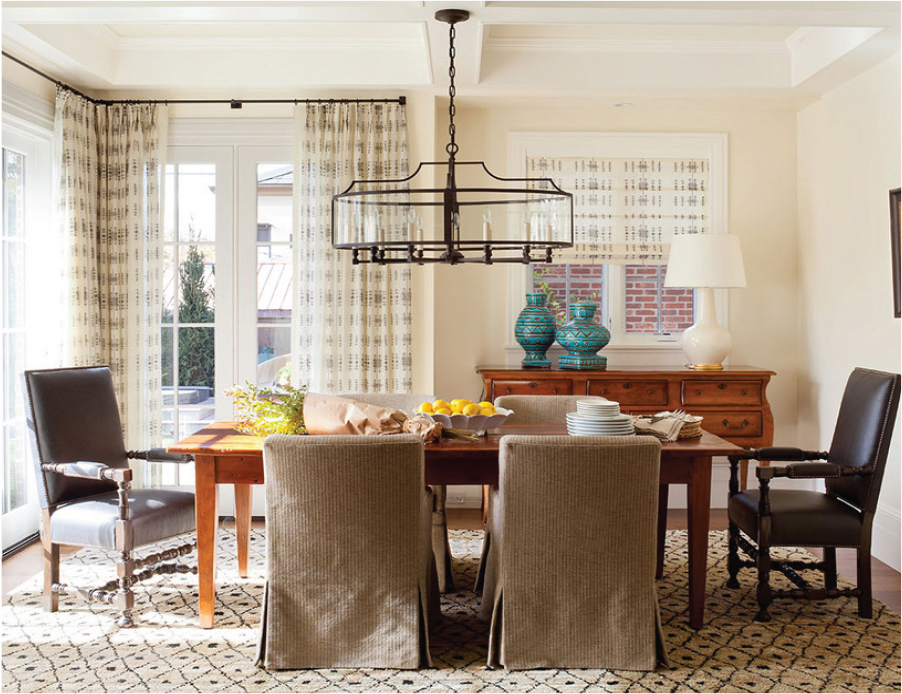
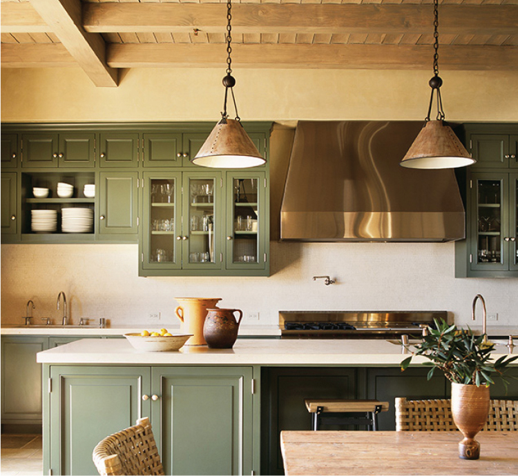
This alternate pairing has a more industrial feeling. The crescent shaped hanging pendant is enclosed in glass to provide protection from the glare of multiple small candelabra. The cone shaped hanging fixture is one of our favorites because the interior is painted white.
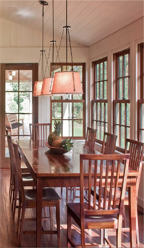
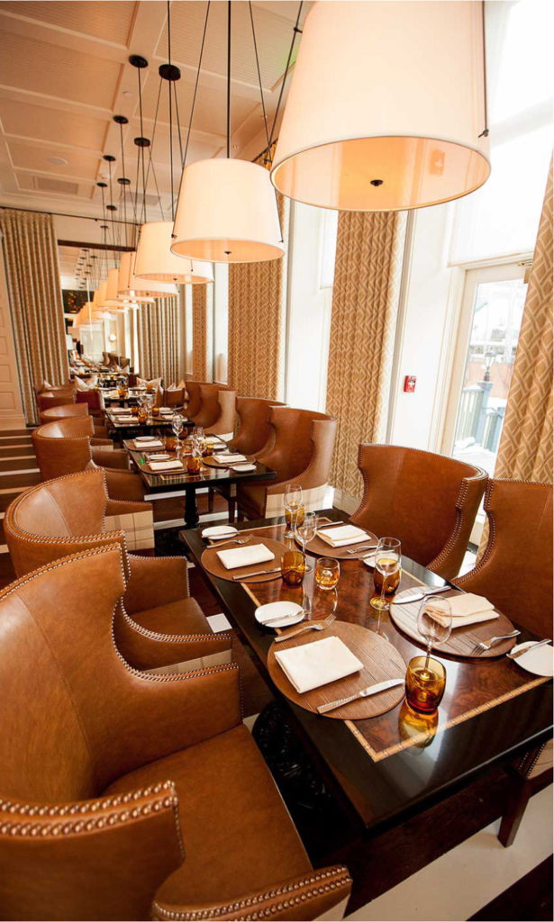
Lastly, these fabric covered hanging fixtures (they can also be lacquered) change the look of the kitchen entirely to make it feel more contemporary.
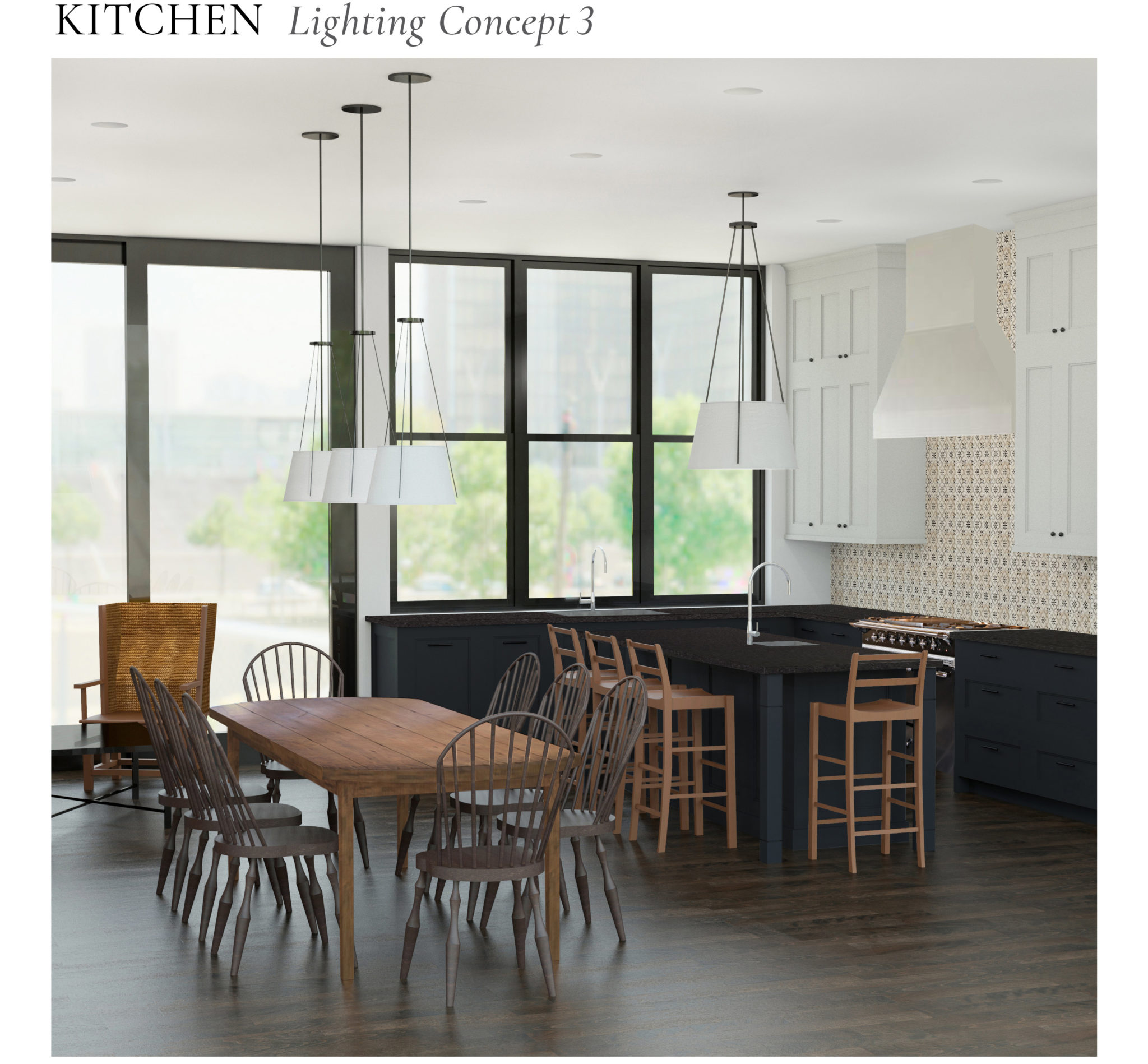
These pendants come with a white diffuser, which keeps dirt out of the interior of the fixture, but also makes the light less severe. They have a kind of transitional appeal.
Do you have any personal favorites? Click here to see photos from the final project.
 15 July 2015
The Simplicity of Rush Matting
Simple and soft under foot, this classic floor covering is popping up everywhere from elegant city apartments to casual beach homes.
Read full post 24 August 2017
Sourcing and Placing Art
Selecting artwork carefully and featuring it selectively can be one of the most impactful elements of a decorated space.
Read full post
 12 January 2015
Repurposing Great Pieces
Two Miles Redd-decorated apartments, One client, all of the same furniture. See how one of our favorite interior designers created a totally new environment using all of the key pieces from his client's first apartment.
Read full post


8 years ago
9 years ago