Designing An Entryway in a Period Home
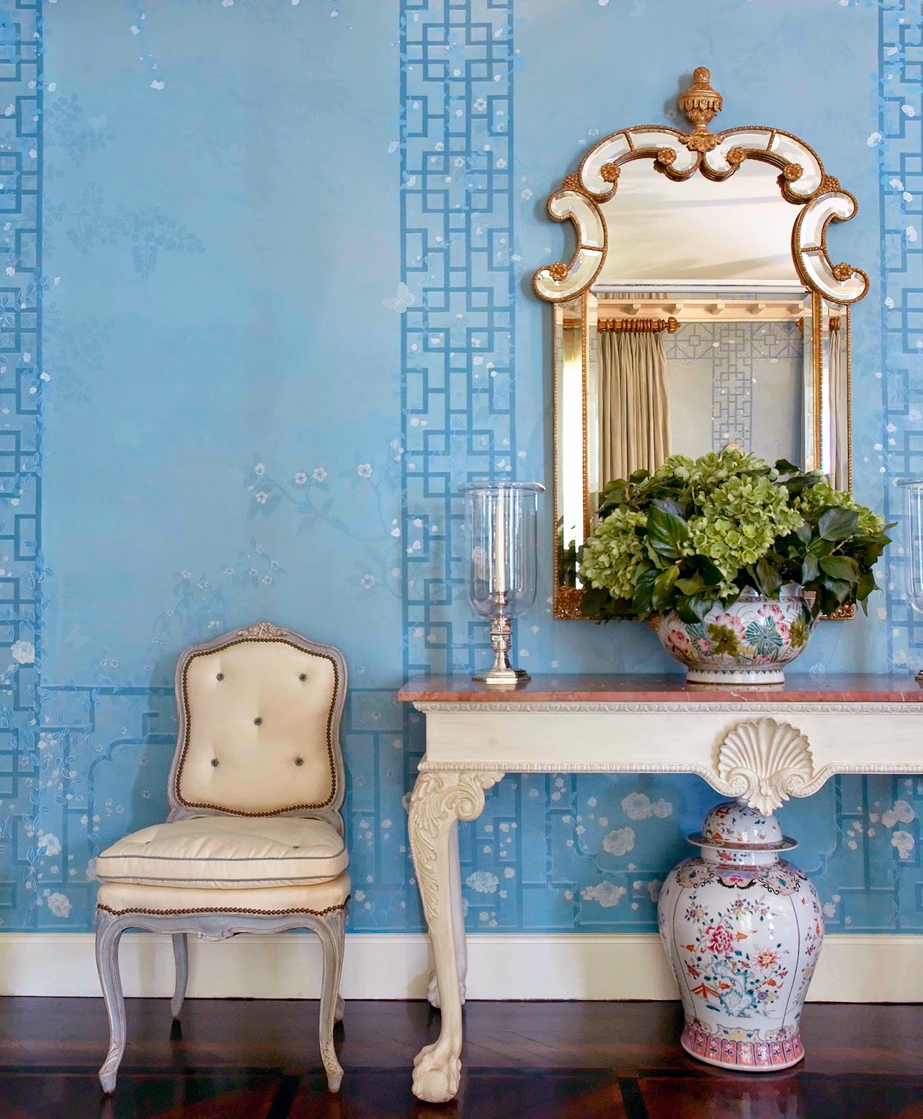
The entrance to every home is an opportunity to make a first impression, and, ideally an inspiring place where you pause before taking in the rest of the rooms stemming from it. For us, it’s often the space we devote the most time scheming. And for our clients, it’s usually the space they find hardest to commit. In a 1920’s Georgian home we’ve been decorating over the course of the last year, our creative minds have touched many of the rooms including the living room, the sun room, the library, dining room and master bedroom suite to great effect. And finally, we are about to make decisions about the entry way, which up to now, has remained woefully unfinished. We always start with inspiration photos of rooms we admire, and with the benefit of Pintrest and Instagram, it is easy to keep a file which we can return to when we need to. This Georgian style console, in an entry designed by Markam Roberts thrilled us, but our client had an aversion to the ball and club feet. Still, we all loved the idea of a marble top console table paired with a delicate side chair (or two), and a spectacular mirror.
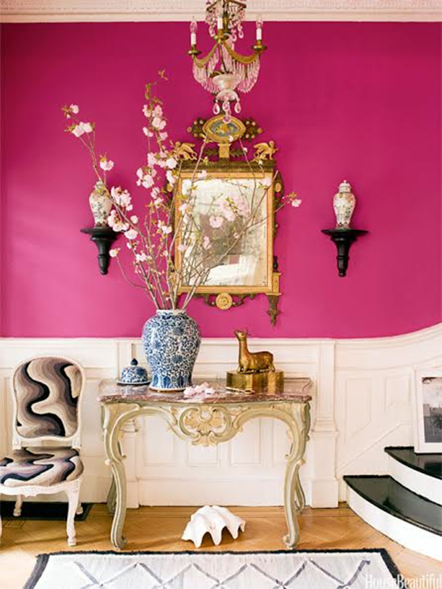
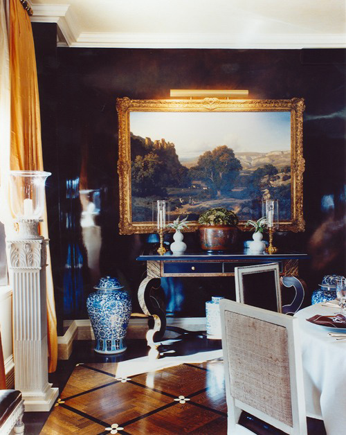
 This dramatic entryway has many of the same elements, with the addition of wall brackets on either side of the mirror. It’s old school, but it works, especially on this unexpected vibrant pink painted wall. The updated swirly textile on the chair adds to the feeling of whimsy and modernity even in the context of the other very refined furniture pieces.
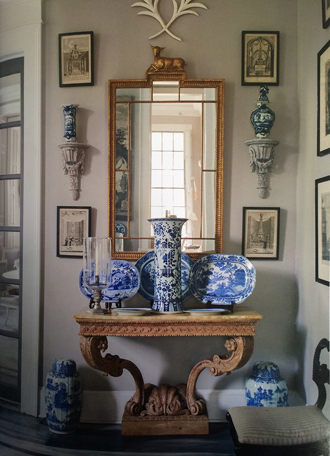
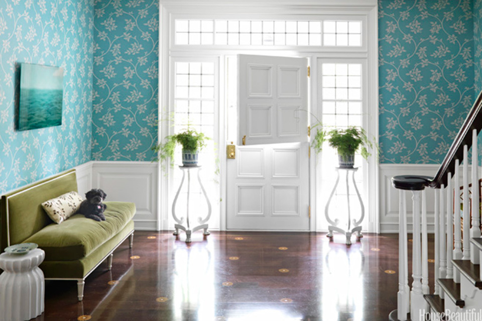
 Here are the wall brackets again, paired with mini artwork and blue and white porcelain platters and urns. This image is from the home of Furlow Gatewood, an antiques expert and longtime associate of John Rosselli, who has just published a beautiful book, One Man’s Folly with Rizzoli.
 Our search for the perfect pairing requires patience and more leg work than you can imagine. We troll online sources like 1st dibs and others, attend auctions here in New York and elsewhere, and visit trusted dealers in New York and Connecticut to comb their inventory for the pieces with the perfect proportions, and the best value. We try to come up with as many alternatives as possible, (somehow it usually ends up being lucky three)-before we present them to our client. Here are three of the best combinations we presented for this particular entry.
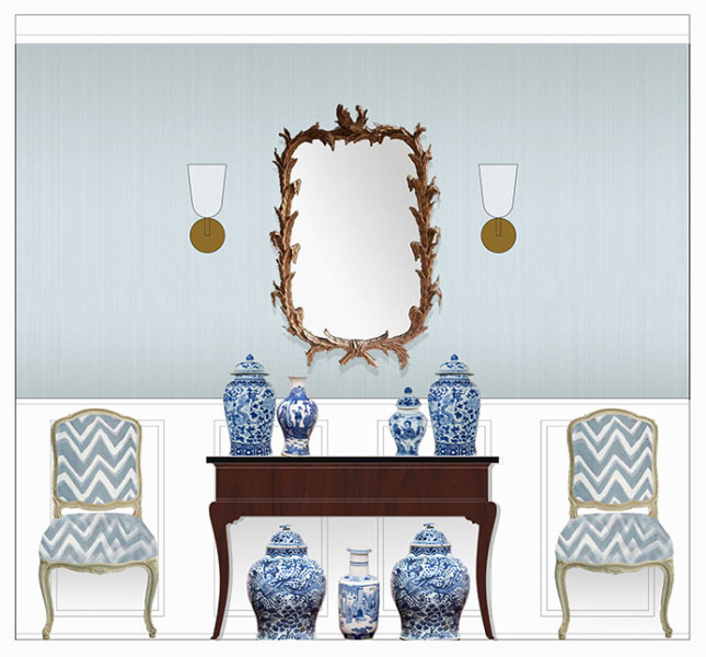
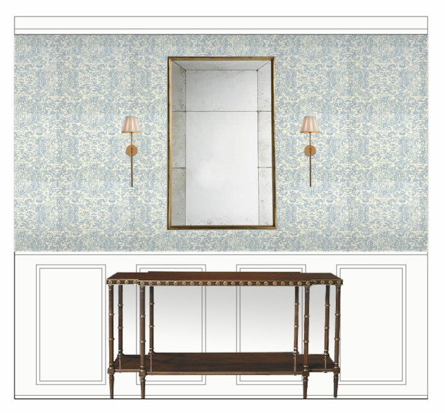
 We show our recommendations in photographs first, then once we’ve all agreed upon our favorite pairing, we create renderings in CAD of how the pieces we favor will look in the clients rooms. These renderings are not perfect, as they have no perspective or depth, but they are accurate depictions of scale, so it can be a wonderful guide, and a tool to help one imagine how the pieces will look assembled in the real space. Below, we’re proposing having our decorative painter apply a stippling, or mottled treatment to the walls, in a soft, but cheerful robin’s egg blue. The vintage mirror is an Italian hand carved gilded wreath mirror. The table is an antique English mahogany console with very elegant, yet simple lines. The English reproduction sconces are the owners own. It’s okay to use what you have, especially if it suits the space well in proportion and style.
 In this rendition, the walls are covered in a pale blue and beige damask wallpaper. A bone inlay mirror, modern light fixtures, and a Karl Springer style lacquered console push the envelope for this home, which is otherwise furnished with more traditional pieces in updated colors.
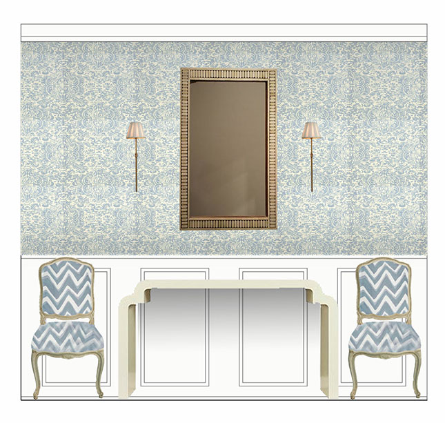 And in this third composition, a reproduction of a Parisian paneled mirror is paired with a new two tiered console table, and updated custom sconces.
 Lastly, the floors. In the home of our client, the floors are currently a flat mahogany, but to bring the entire space into a new light, we worked with our decorative painter and many hours at CAD to devise a pattern and interpretation that would bring the floors to an equal level of synergy. Below, an inspirational photo from a Markham Roberts entryway, guided our vision.
 In another home, we admired the combination of the multi-color wood floors, with a dark ebony stripe criss-cross pattern embellished with and floral pattern.
 The boldness of the decorative floor pattern in this interior, with alternating white boxes, was another launching point.
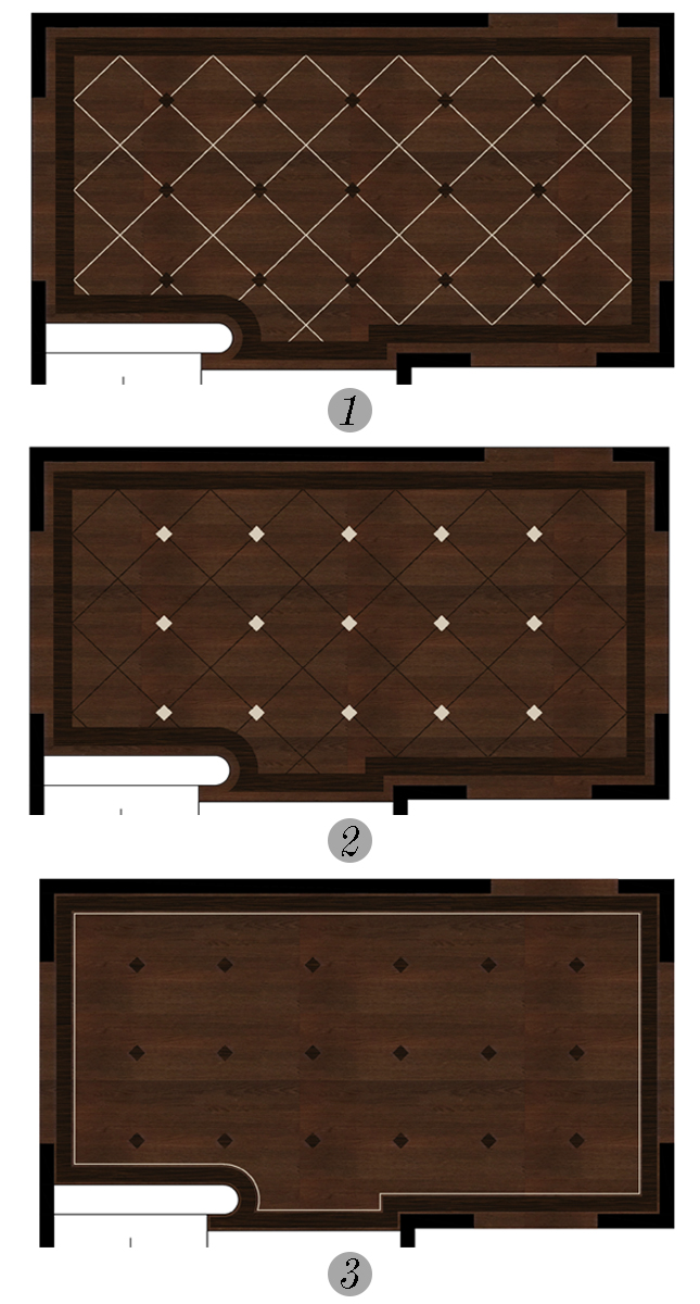
Here are the patterns we developed in CAD for the floors. They are the actual dimensions of the entry of our client. It’s an exercise in geometry figuring this out!
 We’re meeting with our client today to come to final decisions on all. Just thought it would be fun to share with you what our design process is like. It’s an adventure every day. Follow us on Instagram to see how this entry progresses!
 7 August 2014
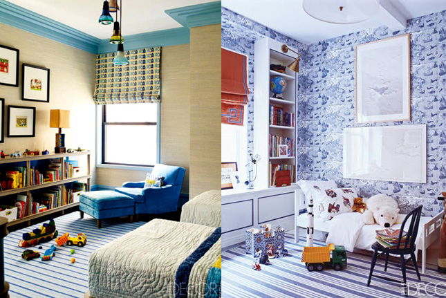
Designing a baby boy's nursery
Gone are the days of pastel pink and blue, baby nurseries are going bold with punchy color and graphic pattern.
Read full post
7 August 2014
Designing a baby boy's nursery
Gone are the days of pastel pink and blue, baby nurseries are going bold with punchy color and graphic pattern.
Read full post
 5 January 2015
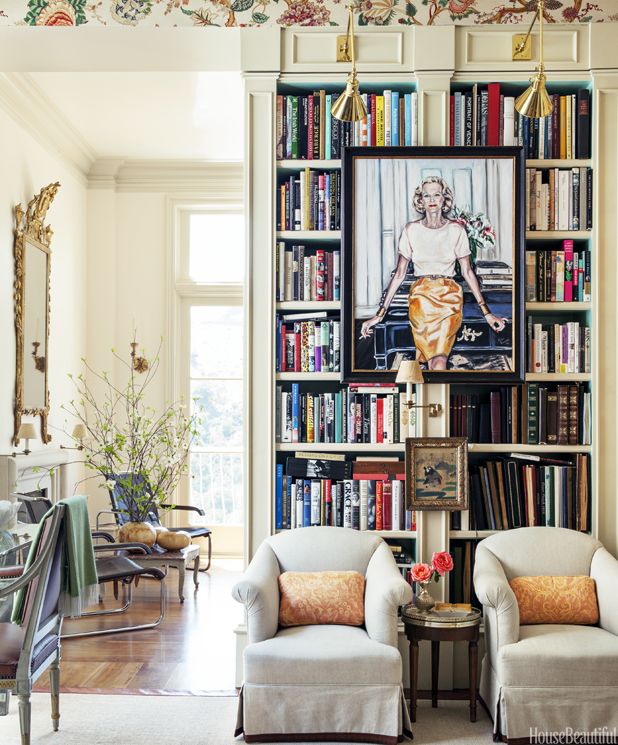
Incorporating Art into bookcases
Adding a treasured piece of art to your bookcases is an easy way to add interest to your shelves; done well, it can eliminate the need to accessorize all together!
Read full post
5 January 2015
Incorporating Art into bookcases
Adding a treasured piece of art to your bookcases is an easy way to add interest to your shelves; done well, it can eliminate the need to accessorize all together!
Read full post
 15 July 2015
The Simplicity of Rush Matting
15 July 2015
The Simplicity of Rush Matting
Simple and soft under foot, this classic floor covering is popping up everywhere from elegant city apartments to casual beach homes.
Read full post
10 years ago
10 years ago
10 years ago
10 years ago