Brooklyn Heights Brownstone: The Living Room
Let’s talk about Pinterest. In the wrong hands, it can put the kibosh on the creative process; used well, it can quickly guide us to key insight about our client. Happily, for this project, our client’s Pinterest board became a meaningful window into what made them tick: Audubon prints, 19th C pastoral paintings, traditional Colefax and Fowler prints (Bowood was there). A quick scroll through and it was clear our client had a flair for traditional English interiors — and we loved it! From here, our mission was to create a cohesive narrative that weaved its way throughout the house. But before we could get to the pretty part, we had a major renovation to undertake! When the 1846 Greek Revival style brownstone was purchased, it hadn’t been updated in some time and needed to undergo significant construction to bring it up to today’s standards. Beyond a top to bottom renovation, our client ambitiously extended the back of the house to create a much larger kitchen and dining area (more on that soon!). Fast forward two years and we’re thrilled to share this very special house with you.
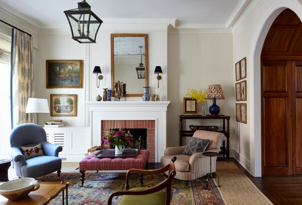
The very first thing we bought for the house was the colorful antique Sultanabad rug for the living room. It became the driver for the blue, red and green color story that we eventually incorporated throughout the home. Fortunately for us, our client loves pattern — from stripes and tweedy wools to floral prints and paisleys — nothing was off limits. In furnishing the living room, it was important to include a mix of antiques from different periods and countries. The English mahogany tea trolley was found on a shopping trip together with our client and now lives to the right of the fireplace. With ten feet tall ceilings, it was critical to fill the room with a variety of light sources at different heights so this tea trolley was a wonderful find in form and function. Architecturally, the room was left largely untouched with the exception of the mantle. The original fireplace had a very serious black marble mantle that was just not our client’s taste. A simple brick surround and Federal-style tall, classical wood mantel piece was designed and painted a crisp white to give the room a warmer, less formal feeling.
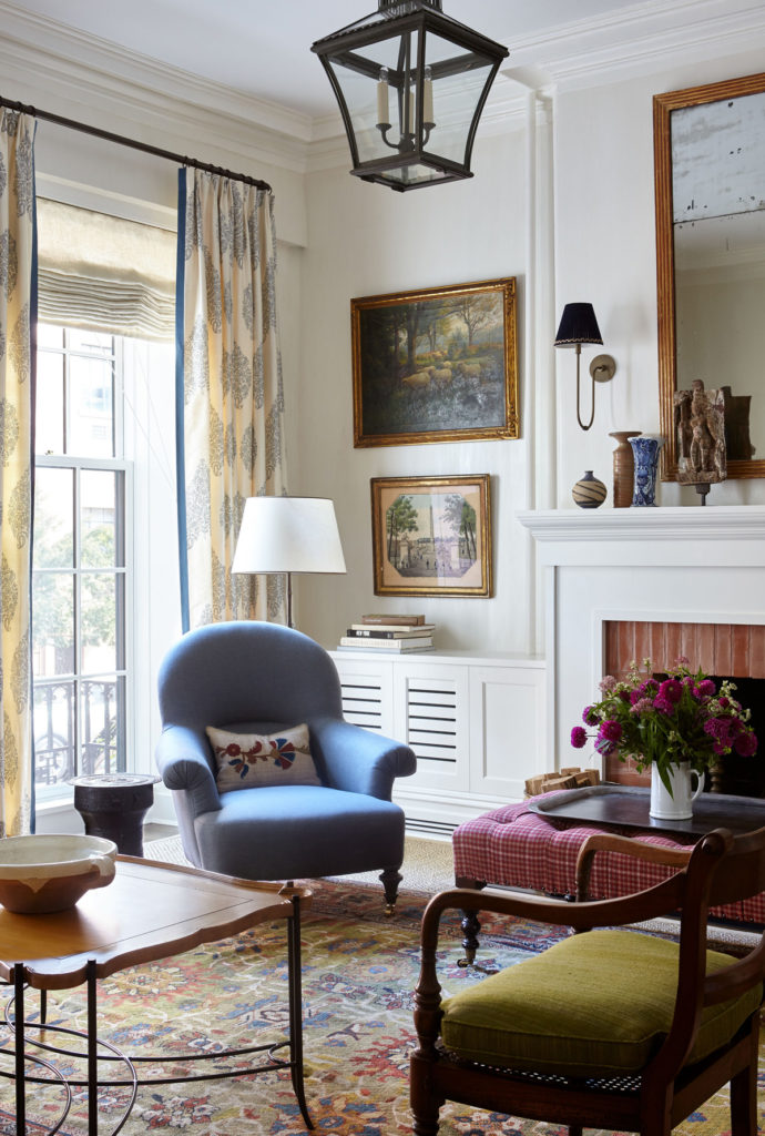
A large scale paisley print on the curtains references the typical Persian influences of English country homes.
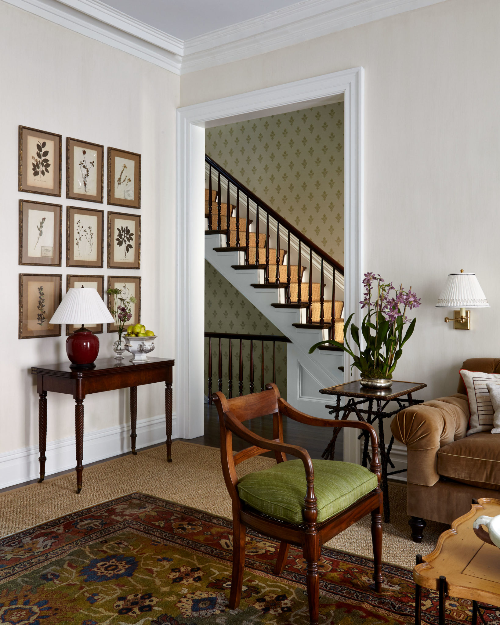
A collection of fifteen 19th Century French herbiers hang on either side of the archway leading into the dining room.
Our mission was to create a cohesive narrative that weaved its way throughout the house.
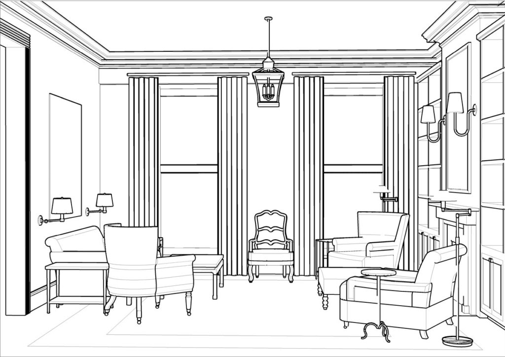
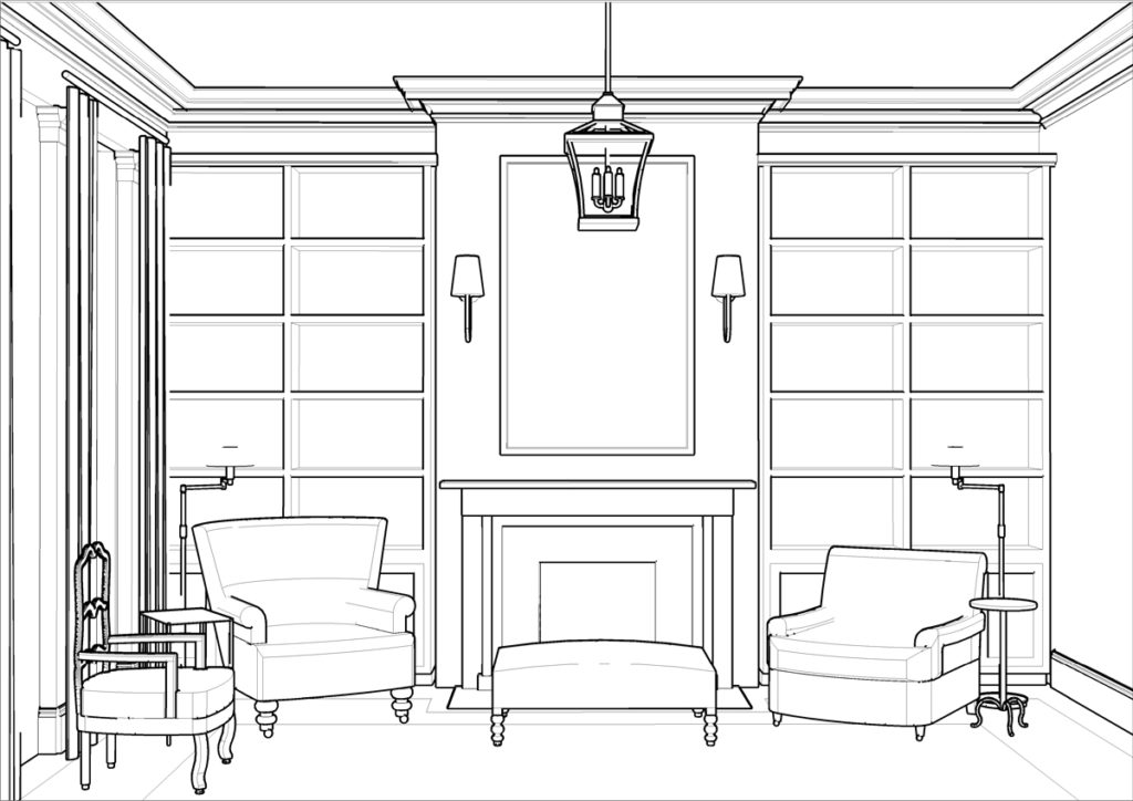
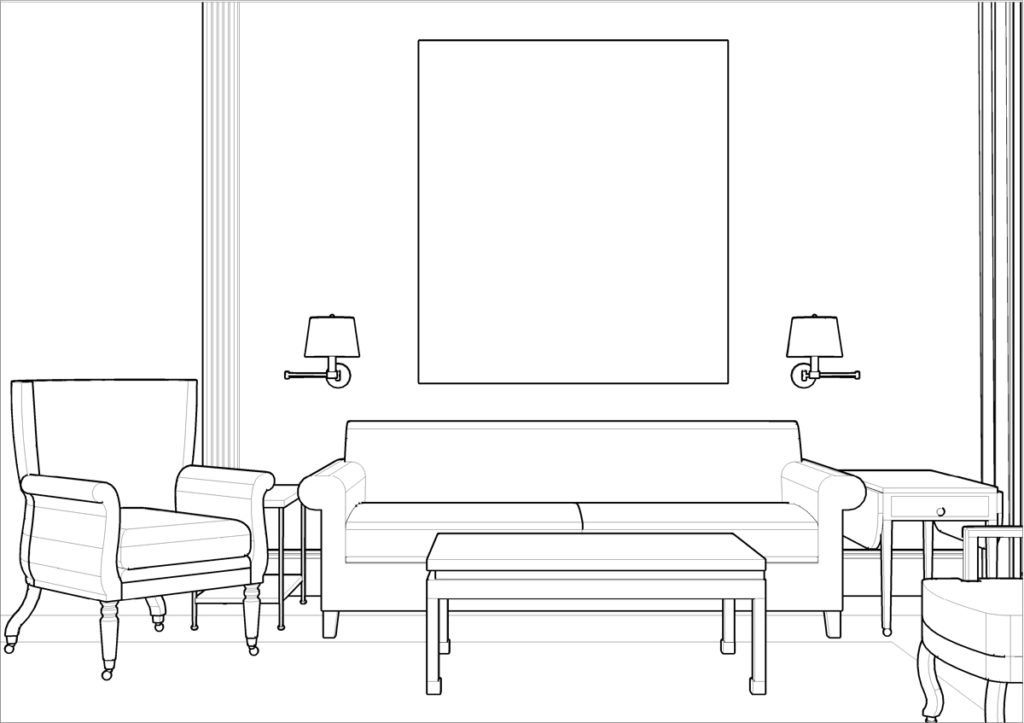
It’s always fun to look back at the renderings created at the start of a project to see where we deviated from the original design and where we stayed true to it. At one point we had considered adding built-in bookcases on either side of the fireplace, but as the project progressed, we ultimately decided that having bookcases in the living room and the upstairs library felt redundant. In the end, we wanted the parlor to feel more formal and so the bookcases were scrapped.
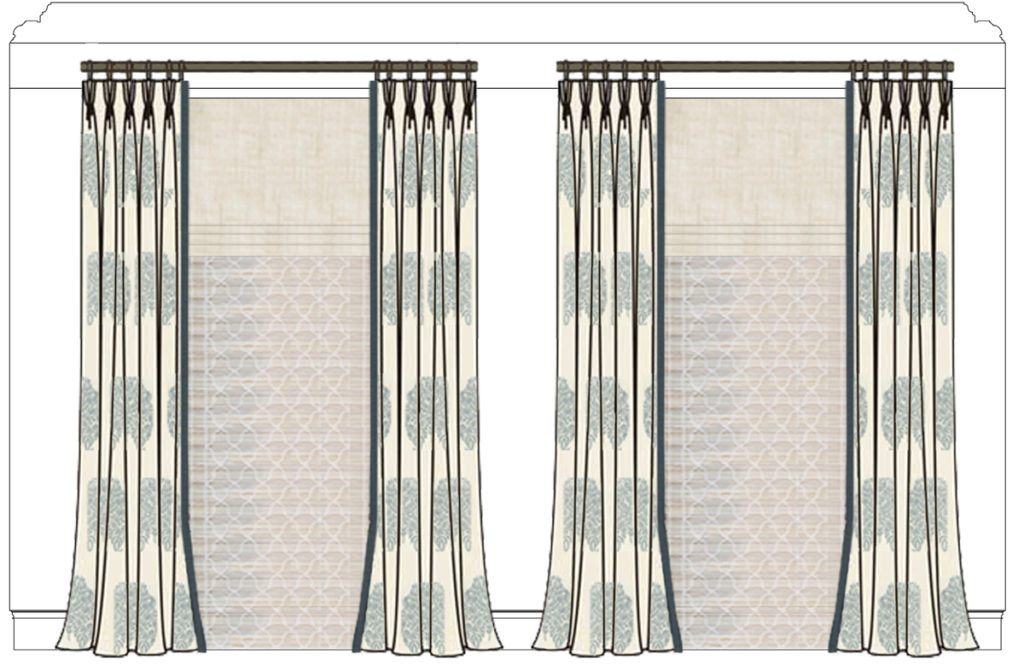
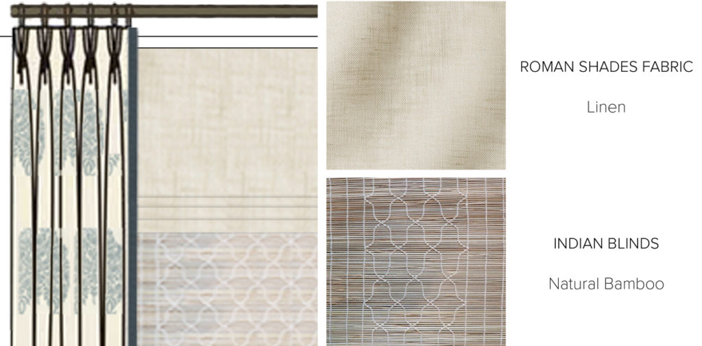
Privacy on the parlor and garden levels are always an issue in brownstones. In order to create a layered window treatment design that provided both privacy and light, we devised a three part concept. While you can’t see it in the photo above, we installed Indian chik blinds behind the linen roman shades. Most of the time the Indian shades hang halfway down the window to provide some privacy as well as add a lovely bit of texture and pattern to the room. The roman shade which is automated and fully lined is meant to be used for maximum privacy and can be controlled from anywhere at any time. Modern technology at work!
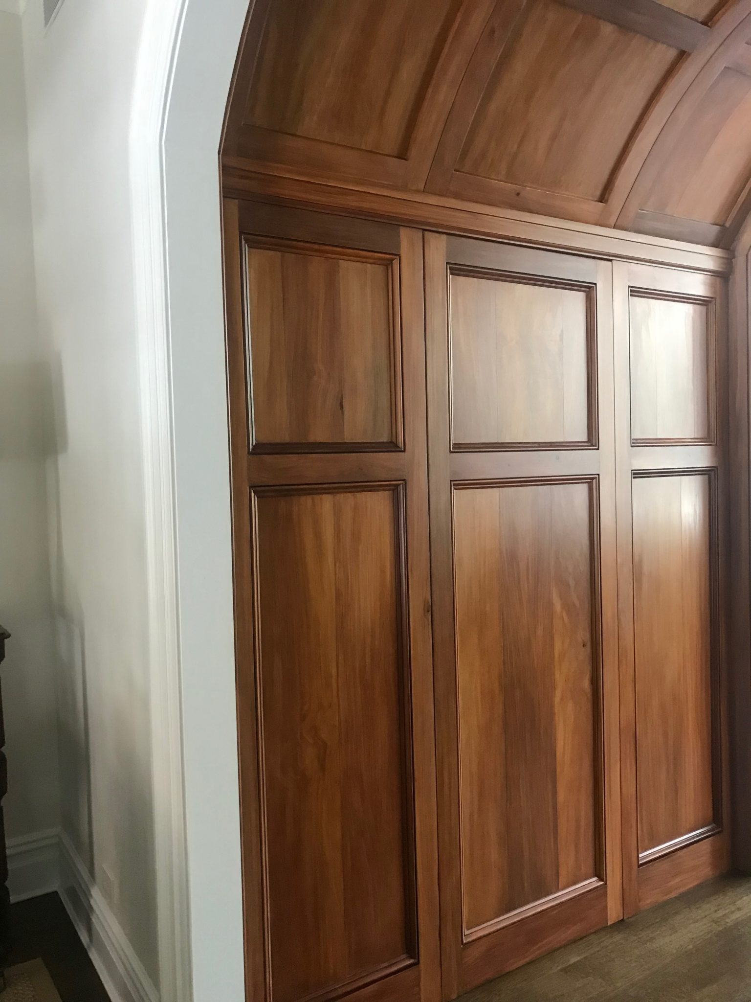
One of the things we love most about working on a renovation project from the very beginning is that it affords us the chance to have an impact on the interior architecture. For example, in this house, there was a simple hallway separating the living room and the dining room. It was the client’s dream to have an archway somewhere in their home, and this ended up being the perfect place for it. In collaboration with the architects Baxt Ingui, we helped conceive this large arched hallway (below) to connect the original formal parlor with the updated and expanded kitchen. To give the new architectural element some gravitas, we had the walls and ceiling paneled, then painted to look like wood. It now contributes a wonderful element of charm and originality to the house.
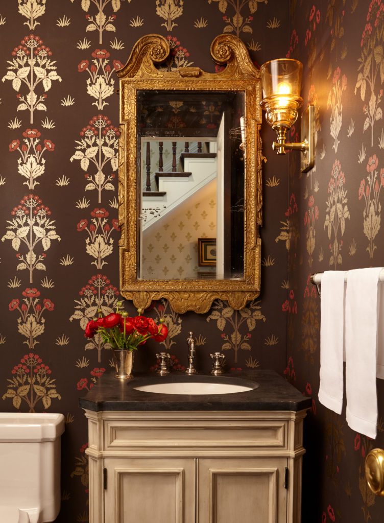
The powder room walls are covered in a traditional William Morris wallpaper, nodding to the period of the home. An antique mirror paired with new sconces made from amber colored glass creates a pairing that speaks to the old and the new.
We’ll be sharing more on this home in the coming weeks. Stay tuned!
 10 March 2016
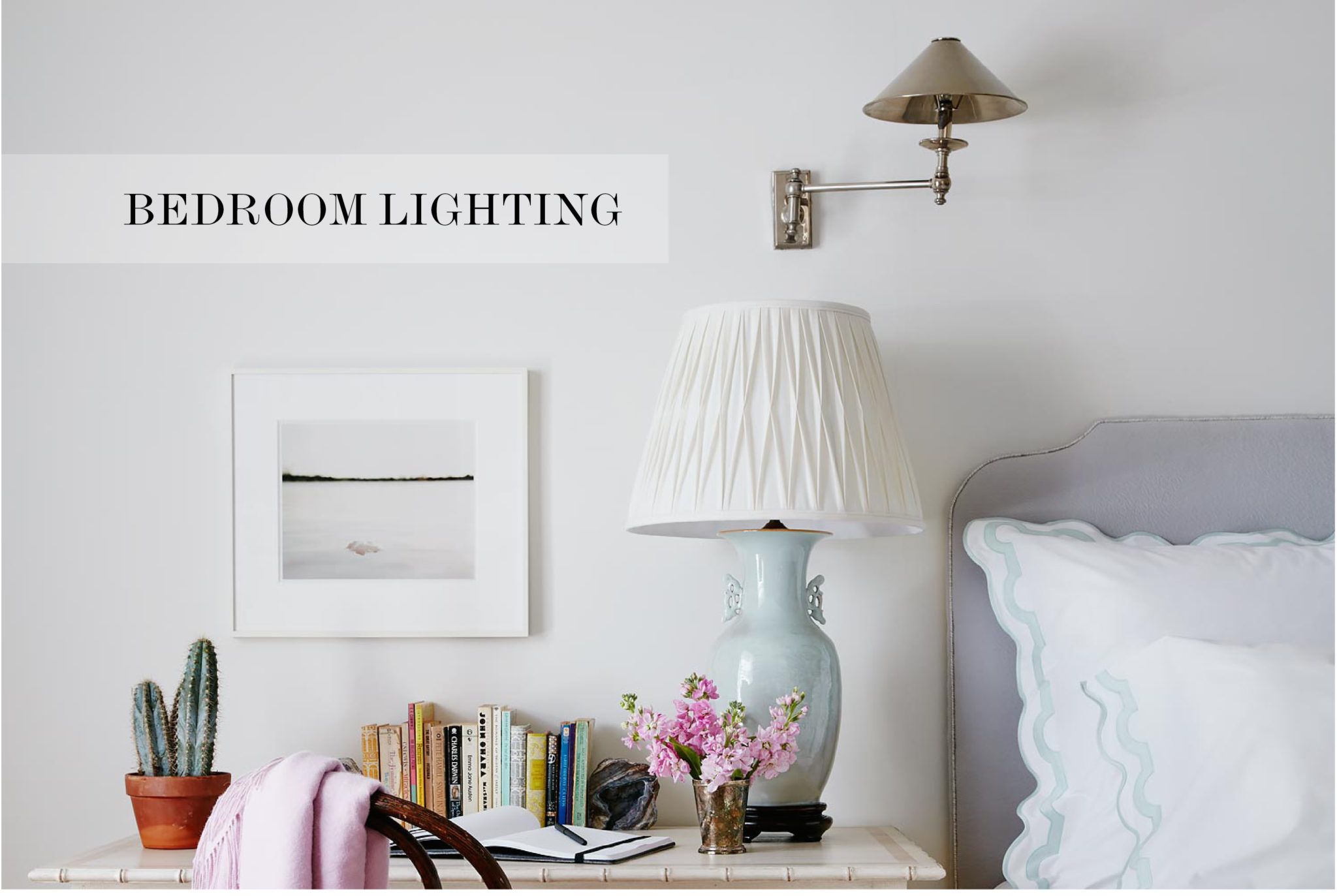
A Guide to Ambient Bedroom Lighting
Providing sufficient and varied lighting in a bedroom is the best way to create an inviting and soothing space.
Read full post
 23 April 2015
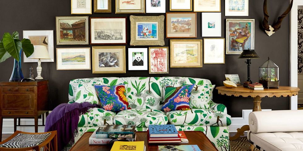
Josef Frank Textiles
This Austrian-born designer and architect created fabrics that make us smile.
Read full post
 27 February 2015
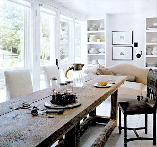
Mixing it up with reclaimed wood
Whether you live in a traditional old house or a sleek modern apartment, there are lots of ways to make a reclaimed wood dining table work for your space.
Read full post

