Renovationing a Washington Square Park Apartment
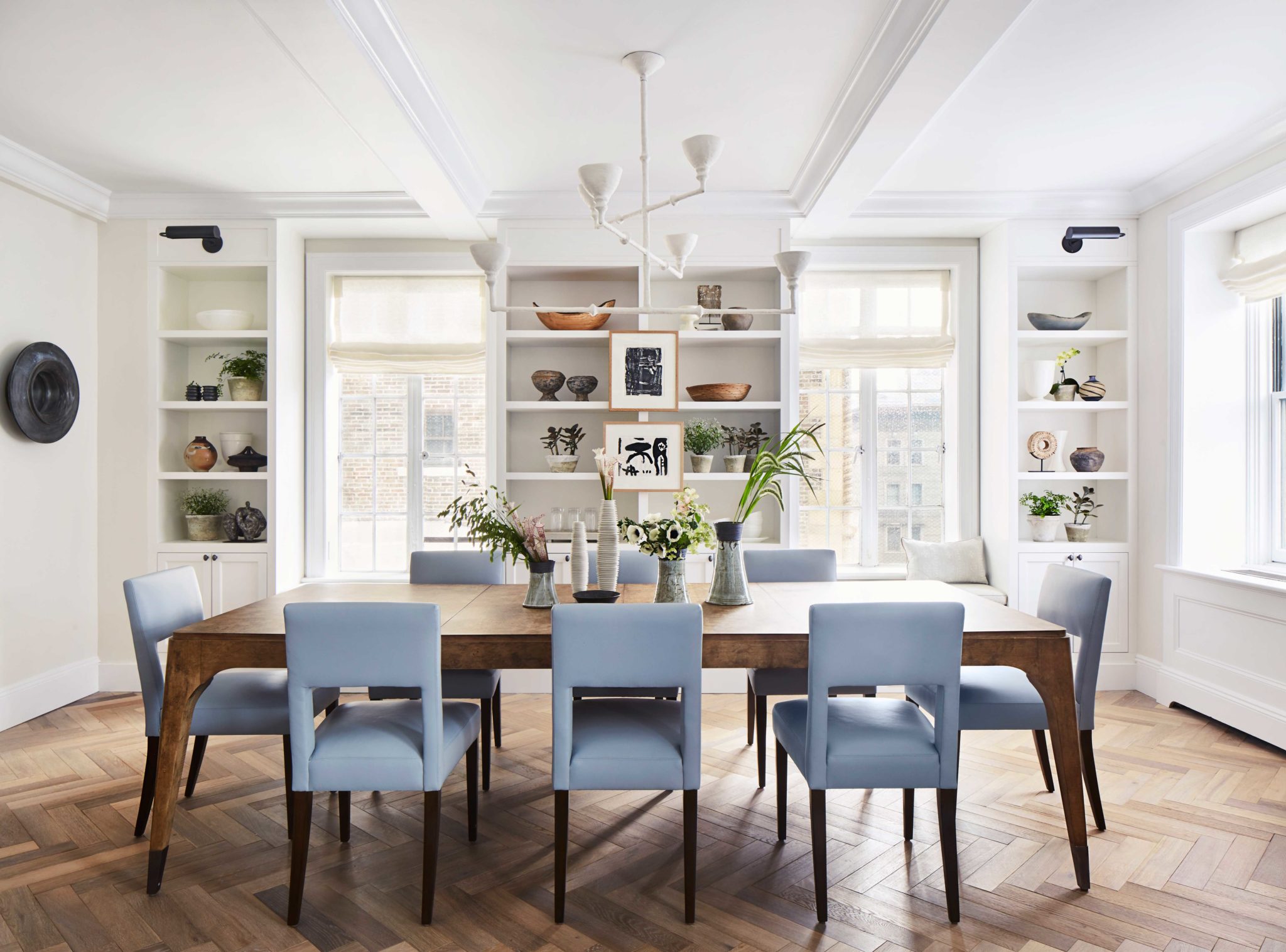
We love starting from scratch with our projects, and fortunately we had the opportunity to do so in a charming pre-war apartment overlooking Washington Square Park for a fearless young couple. The apartment was quite unchanged in terms of its layout when the client first purchased it, and they had big dreams about how to update it in a way that kept its integrity, but modernized it, too. The drawings below show the process of how we approached changing the flow of the rooms, including opening up the kitchen to the living room, and changing how the living room and dining room open into each other. The apartment has multiple exposures, many of them overlooking Washington Square Park and the NYU buildings below. One of the most significant modifications we proposed was to open up the two main rooms to one another, anchoring the new opening with functional bookcases.
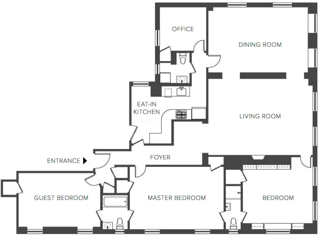
Existing Conditions Floor Plan
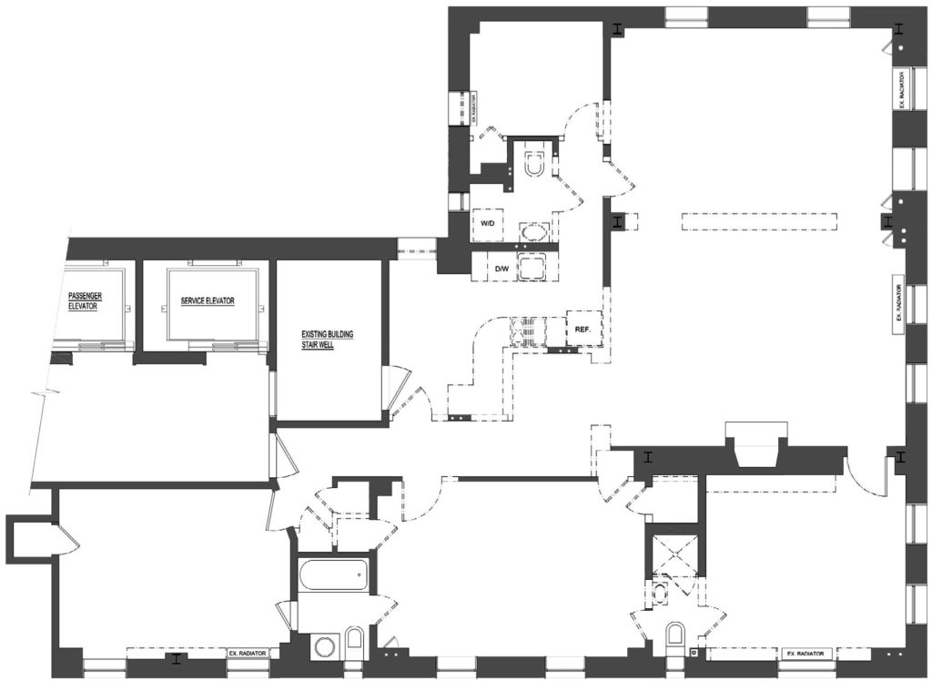
Demolition Floor Plan
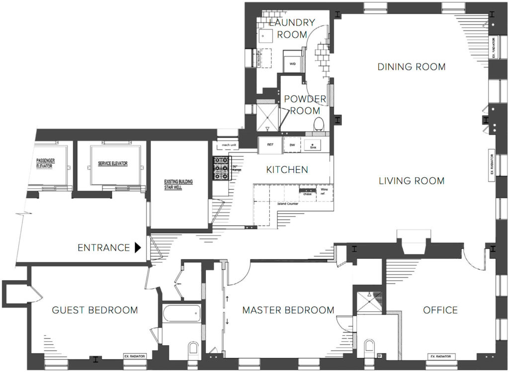
Construction Floor Plan
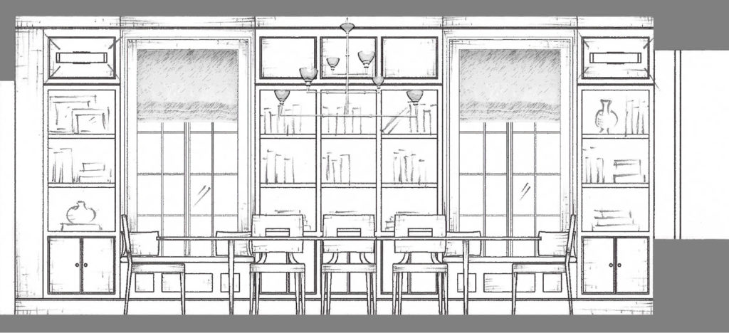
In the dining room, which is a rather large room, we added more shelving, and charming window seats to perch on. The couple love to entertain, so this room had to feel very special. Because this project required a fair amount of construction, we created 3D renderings to illustrate how the newly opened up spaces would look.
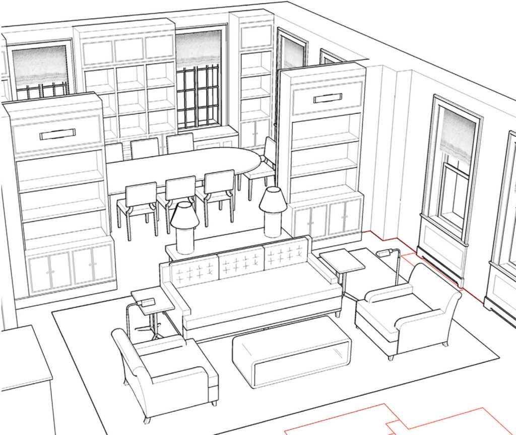
We’re so excited about how these rooms now flow into each other. It feels very modern, but still respectful of the period of the building. The furniture we’re designing is a mix of traditional forms with a more modern edification. All of the upholstered pieces are being custom made for comfortability and so that they suit the new space, and the needs of a family.
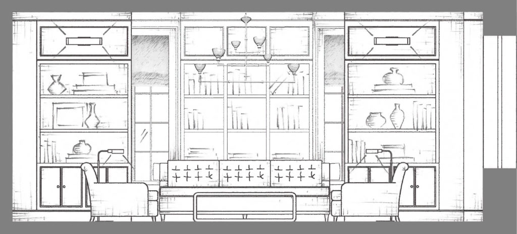

In terms of lighting, we proposed a hand cast plaster chandelier designed by Stephen Antonson for over the dining room table. We knew this would be a focal point for both rooms, so this investment was key. In many pre-war apartments, there is no recessed lighting, so we took great care to include plenty of ambient light. You’ll notice the light fixtures attached to the front of the bookcases, as well as innocuous floor lamps in the living room. A pair of clear glass lamps will also be strategically placed on the console table behind the sofa.

The original floors in the apartment were in very bad condition, so the couple chose to replace them throughout. We helped them to select a gorgeous European white oak herringbone floor. It has not been installed yet, but we cannot wait to see it in place. Below is a digital rendering of some of the textiles that will be going on the upholstered pieces. This is a great way to see how we take every surface and material into consideration with the goal of creating rooms that feel cohesive, but also layered.
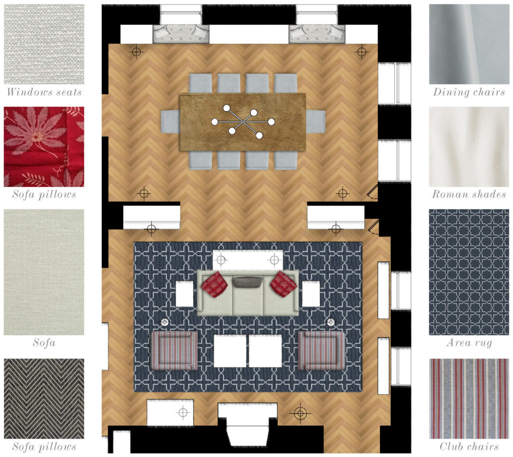
The palette of red, charcoal grey, and pale blue was dictated by the colors we knew the client responded to and liked.
Don’t forget to share your comments and let us know what you’re up to. We love to hear from you! Click here to see final images from this project.
 2 December 2018
The Ultimate Party Apartment
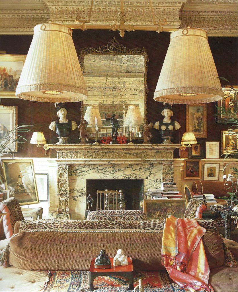
Jeweler Kenneth Jay Lane's glamorous duplex as featured in Wendy Goodman's new book, May I Come In?
Read full post
 11 July 2017
A Very Personal Project
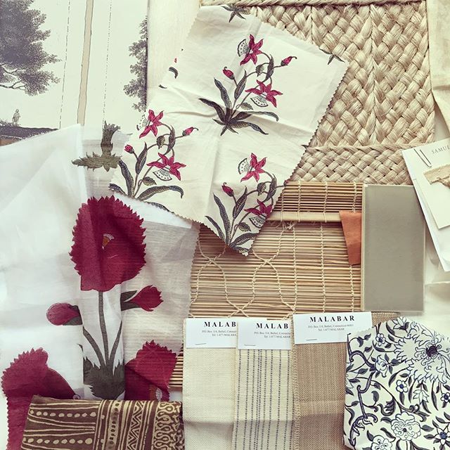
Having lived in the same 1920’s Dutch Colonial home for 15 years, my husband, son Jack and I have decided to make a bold step and move to a new home.
Read full post
 11 November 2018
Five Fabulous Finds
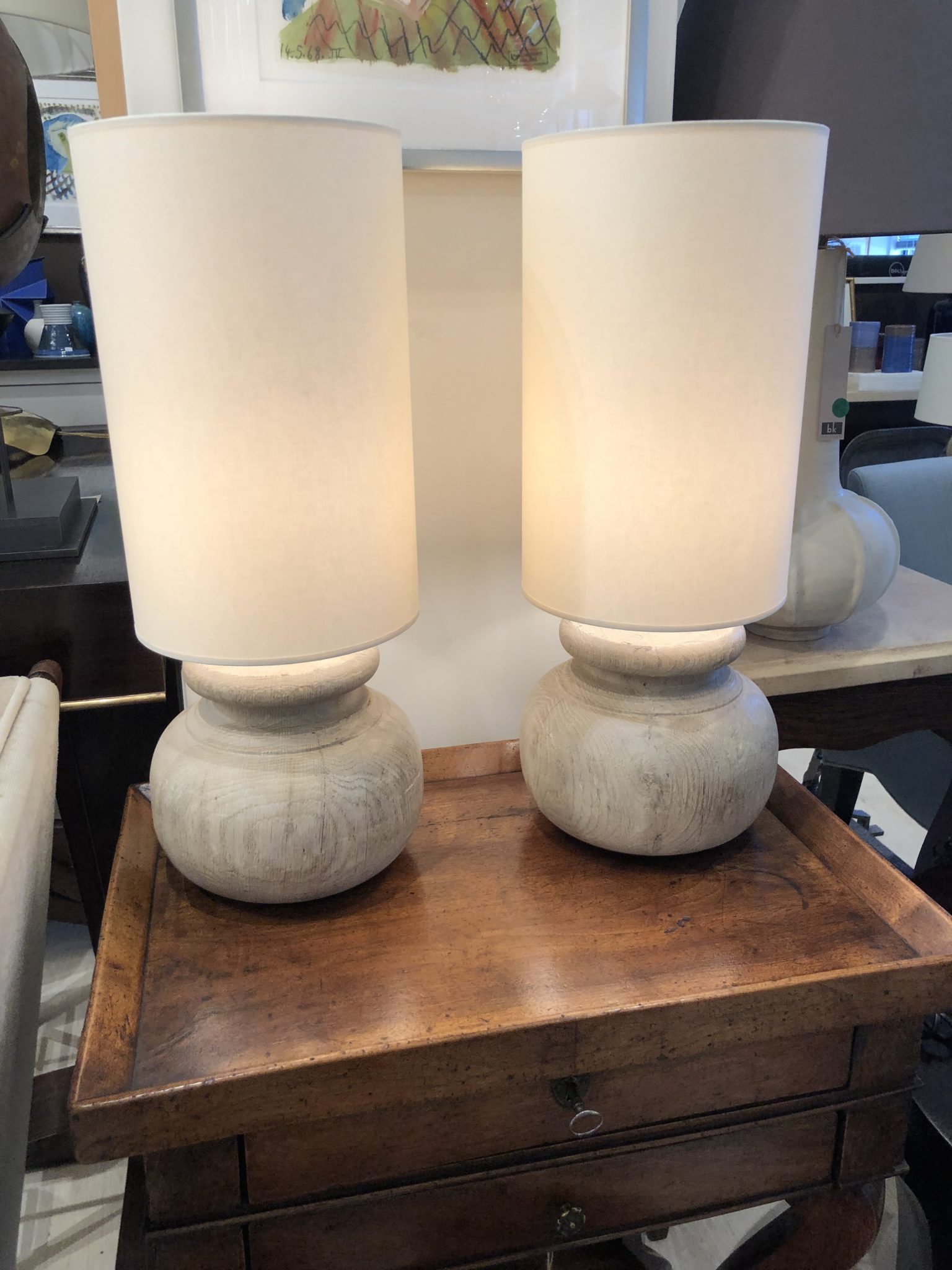
Recently found vintage and antique pieces that bring character and charm to our rooms.
Read full post


9 years ago