Our Project in Domino
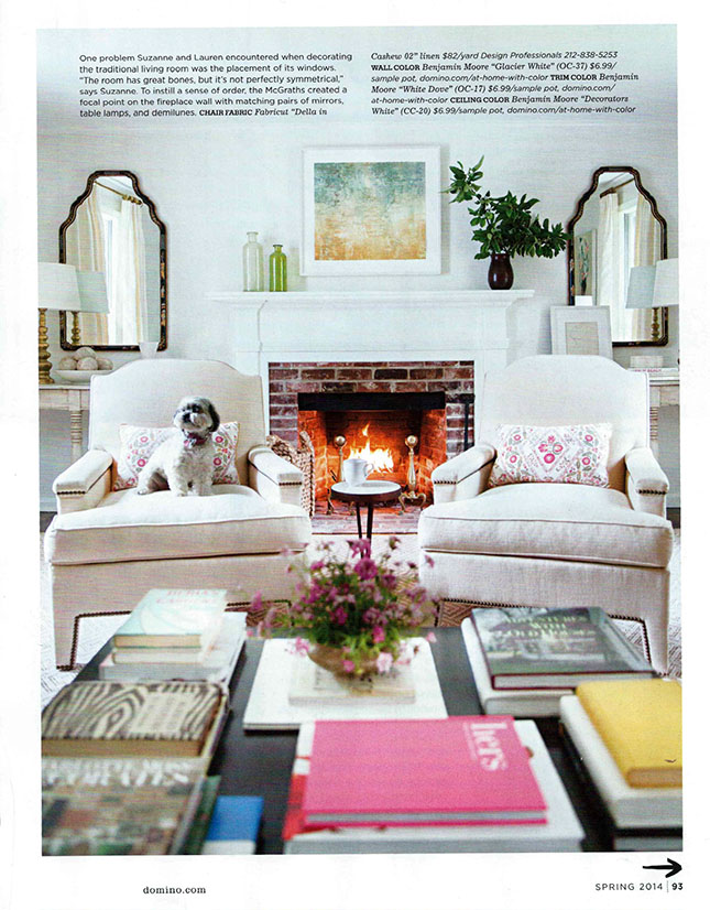
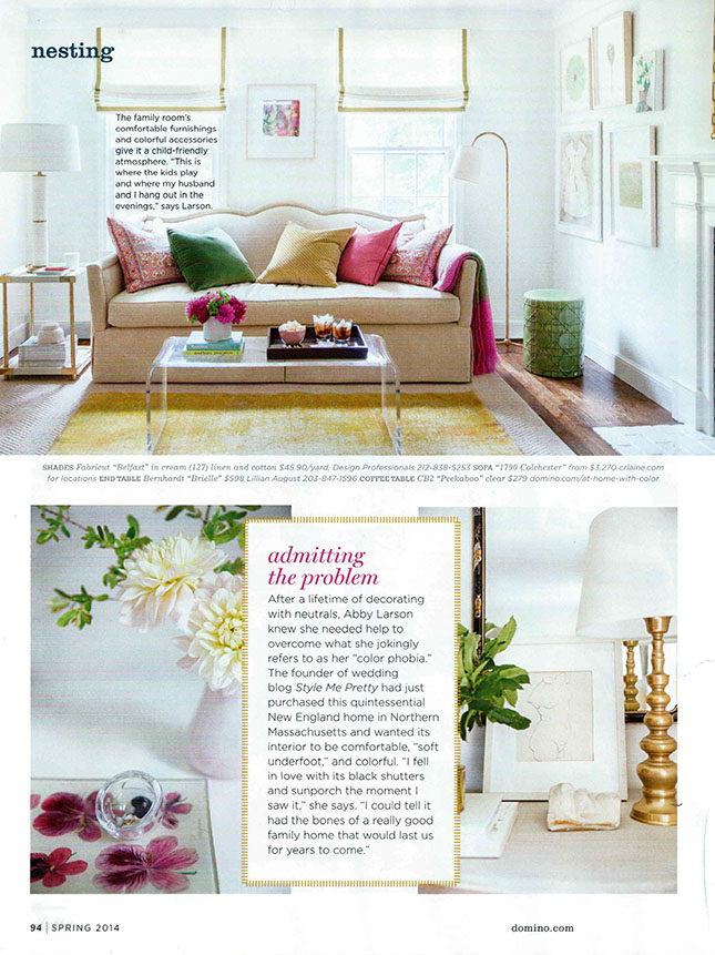
We’re so excited today to show you one of our most favorite projects we worked on last year that is in the new issue (out on newsstands!) of Domino magazine. It’s the Massachusetts house of Style Me Pretty’s Abby Larson, who contacted us last year to decorate her charming New England abode. As the article mentions, Abby wanted the house to be grounded in neutrals–she loves white–but with strategic pops of color to give the house a playful, family friendly vibe that she and her husband and two kids could really kick back in. It was such a pleasure working with Abby; she had a real vision–the best type of client! She also really understood the value of buying well-made, investment pieces that she could take with her to her next home and that would fit in seamlessly no matter where she ends up. A prime example of the Good Bones, Great Pieces philosophy! Take a look at the story below, we apologize for the poor quality of these scans, but we couldn’t wait to share with you!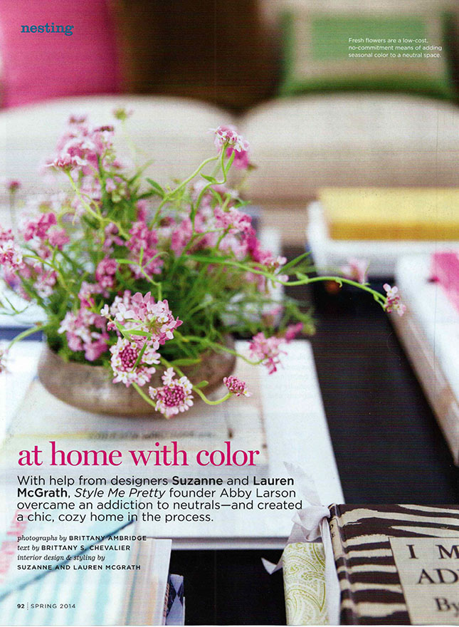 Abby is a creative and she often works from home. She wanted her living room to be entertaining-ready, but more importantly, a place where she could put her feet up and relax with her family. Nothing in this room was too precious or delicate that the kids couldn’t sit on it or touch. While white upholstery fabrics aren’t typically our first recommendation for families, Abby had always envisioned these pieces being white, so we had everything super-duper stain-guarded. A big coffee table (durable enough to put your feet on) for Abby to display all of her favorite coffee table books was essential.
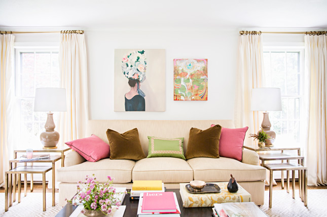
 Another view of the “formal” living room, not included in the story, shot by the talented Brittany Ambridge. This room was all about tints and shades of creamy white with gold accents. What brought color in was the art and accessories–a good tip if you like color but don’t want to commit to a brightly hued sofa. Neutral upholstered pieces are also a great recipe for flexibility in later years–sick of pink and green? All you have to do is change your pillows and a few accessories.
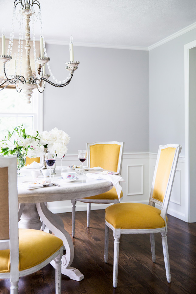
  The “pop” colors that wind through this house are brown, yellow, pink, orange, and green. We painted the walls of the dining room one of our favorite Farrow & Ball colors, Cornforth White, which is not a white at all, but the perfect grey. The color pop in this room became the upholstered seats and backs of the dining chairs.
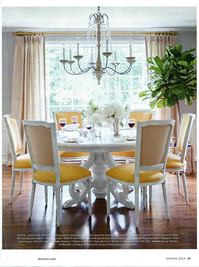 Here’s a better photo of the dining room:
  The family room, where the kids spend most of their time is on the other side of the front hall, opposite the living room, so it was important that it felt like an extension of the living room.
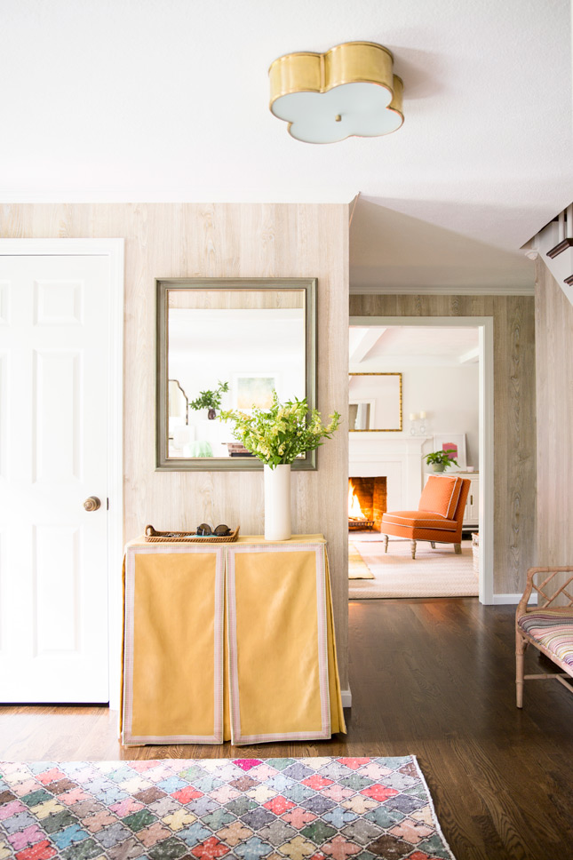
  The first thing we did in the entryway was put up a wallpaper with some texture and dimension. This faux bois paper by Nobilis was the perfect solution for this foyer that needed some dressing up. There wasn’t enough room for a real piece of furniture so we covered up the preexisting (and perfectly sized) Target-bought console with a custom-made table skirt. Now the foyer greets guests with a smile and helps set the tone for the rest of the house.
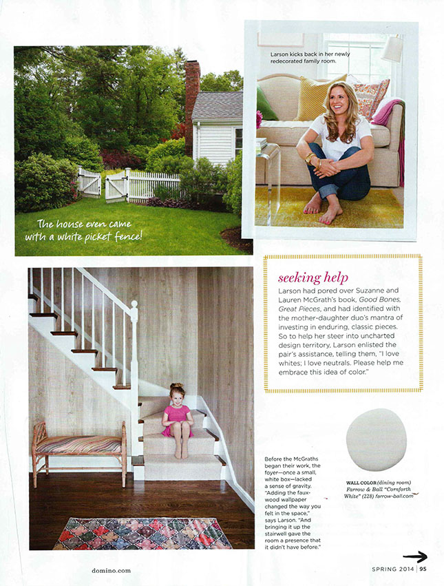
  Below right, Abby looking great in the family room!
 Abby wanted the bedroom to be serene and soft. In this room we introduced soft pink through the pillows on her bed and a pale yellow and grey on the honeycomb patterned carpeting.
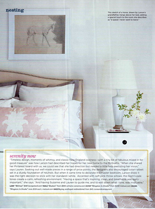 We hope you enjoyed this little tour of Abby Larson’s home. To see more on the evolution of this project click here, here, and here. Have a great day!
 8 August 2014
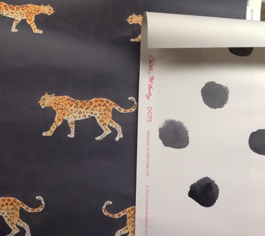
Caitlin McGauley x Studio Four
Read full post
 2 December 2014
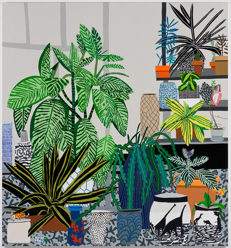
Jonas Wood
With comparisons to modern masters like Vincent Van Gogh and Henri Matisse, this LA-based painter blurs the boundaries of figuration and abstraction with his dead-pan take on contemporary American life.
Read full post
 30 January 2019
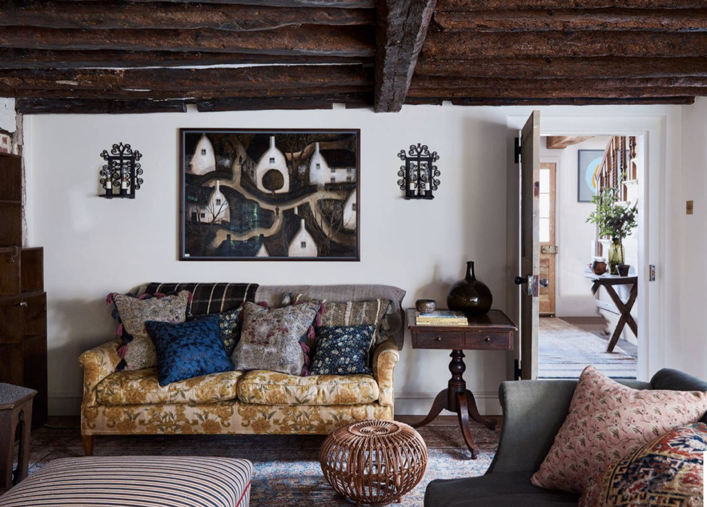
Bringing A Historic Farmhouse Up to Date
It's no secret that we love older homes so when we were asked to help respectfully renovate a period farmhouse on Long Island, we jumped at the opportunity.
Read full post


10 years ago
10 years ago
11 years ago
12 years ago
12 years ago
12 years ago
12 years ago
12 years ago
12 years ago
12 years ago
12 years ago
12 years ago
12 years ago