Old World Glamour on Park Avenue
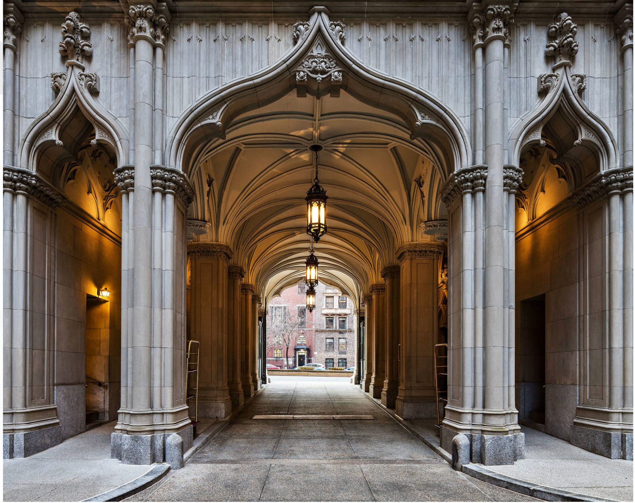
With every space we design, a narrative emerges as we delve into what makes our clients tick. In decorating this Park Avenue apartment for a family with three young children, some of the first conversations we had were about the homes our clients had grown up in, and in turn, how they wanted their own home to feel. Glamorous was a word that came up again and again. Quickly a story started to develop in our minds, one inspired by classic New York apartments where glamour was king and antiques were meant to be lived with and passed down from one generation to the next. We immediately started to amass a Pinterest board full of images of interiors lived in by Bunny Mellon, Jackie Kennedy, and Babe Paley. Below, the building is one of the last remaining pre-war buildings with a drive through central courtyard entered through tall Gothic archways.
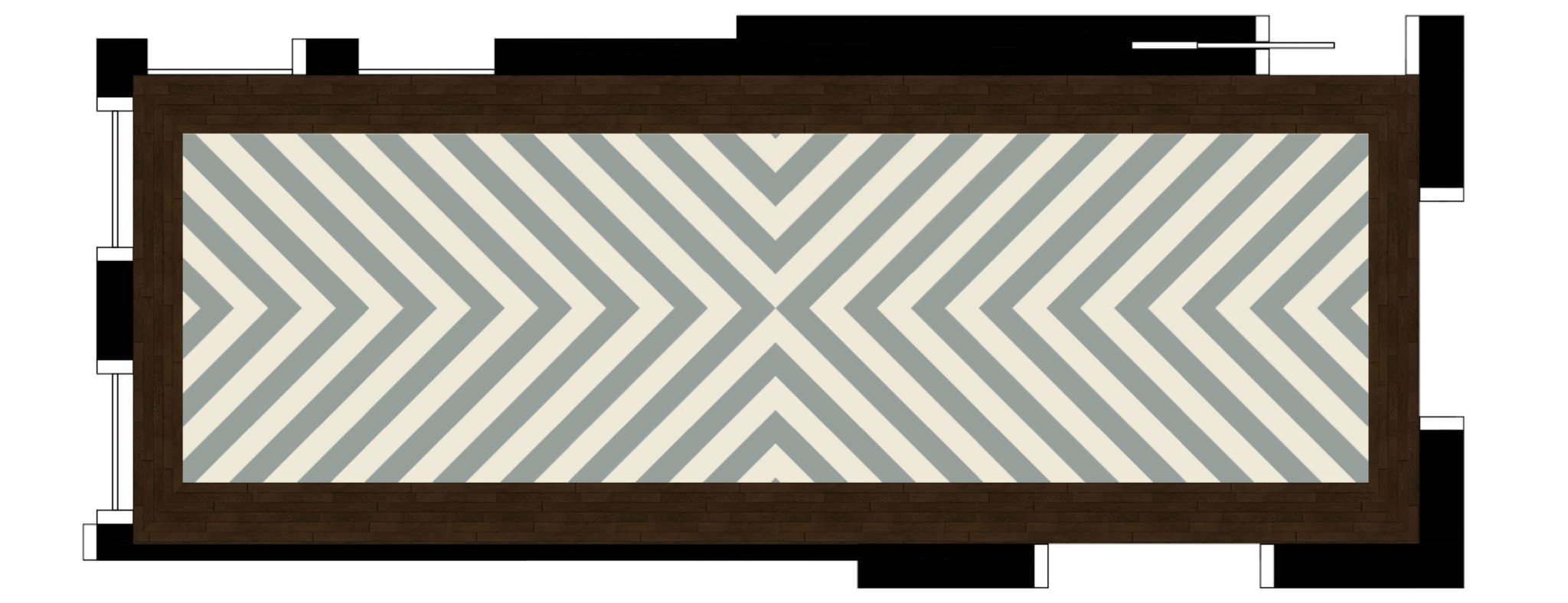
We set out to enhance the walls with decorative finishes in a soft color palette adding texture whenever possible. One of the first areas of attention was the large foyer. With no natural light and extra large proportions, we needed to make a statement while at the same time give the space a brighter, lighter feeling. We designed a blown out herringbone painted floor inspired by those made famous by David Hicks, with an aged, slightly scuffed patina oft used in the homes of Bunny Mellon. To help bounce light around the room, silver leaf was applied to the ceiling trays. Subtle texture was added to the walls in a barely there plaster herringbone. Below are a few early digital renderings of the space.
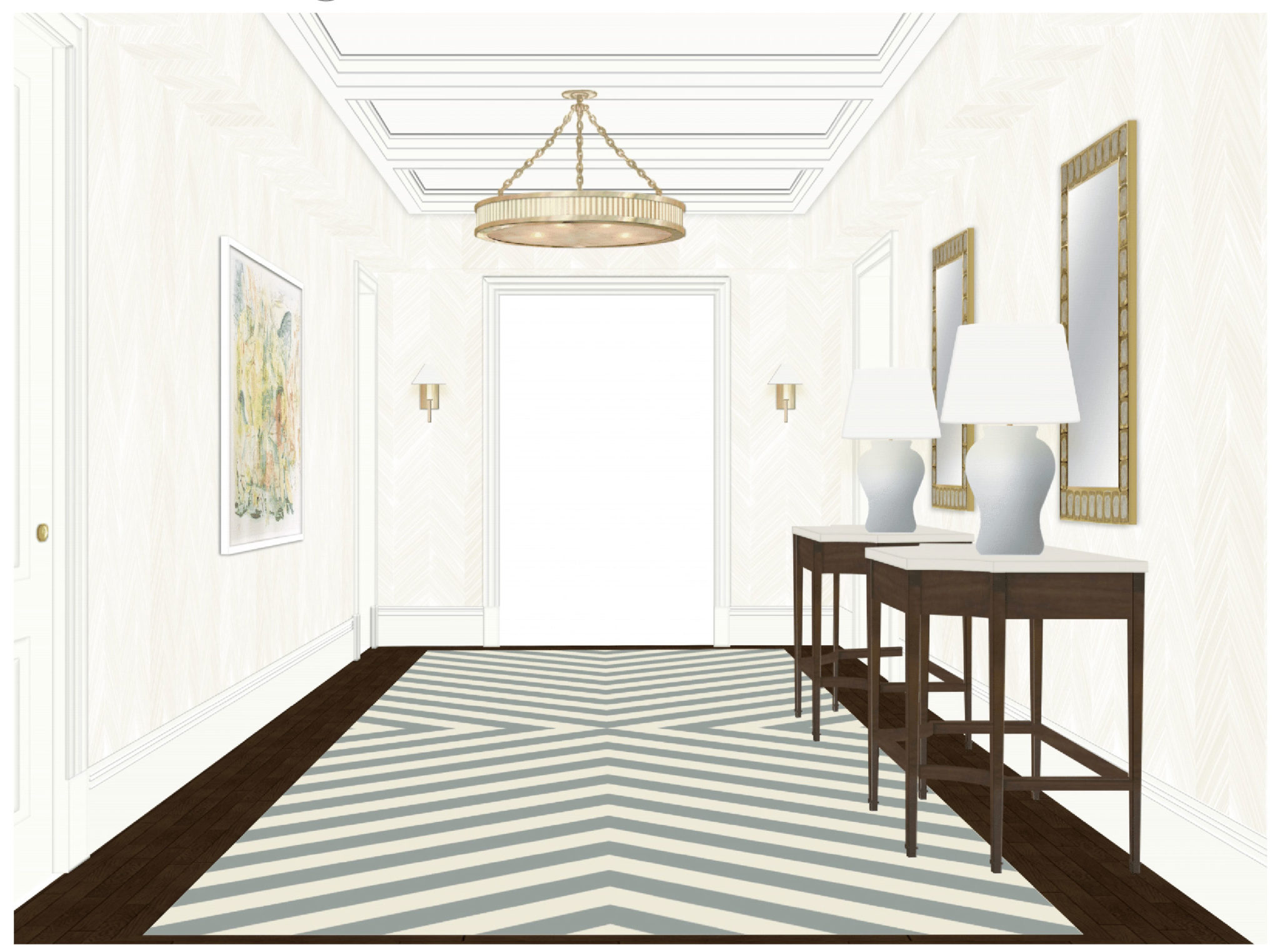
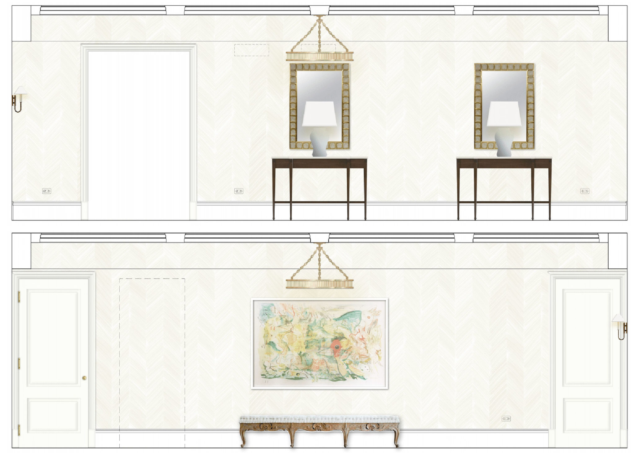
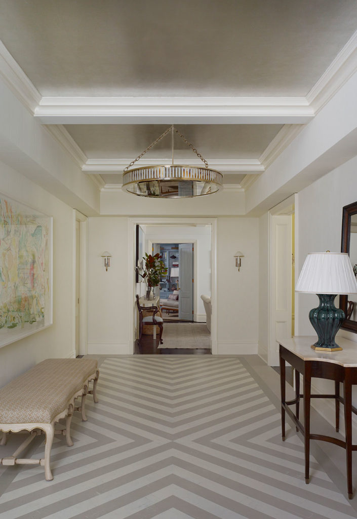
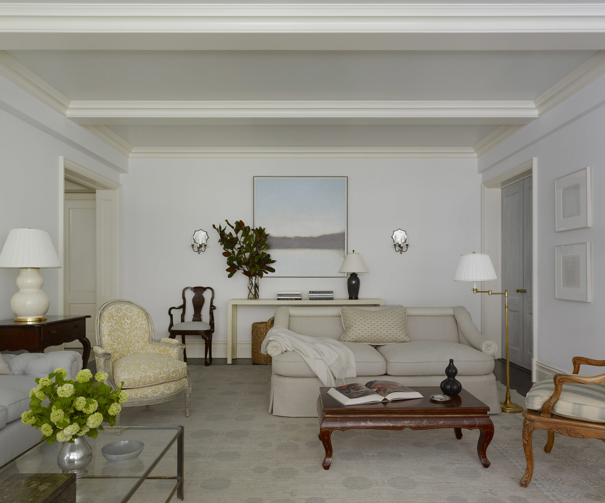
With a few changes, the completed space was quite close to the initial rendering, drawn up six months in advance.
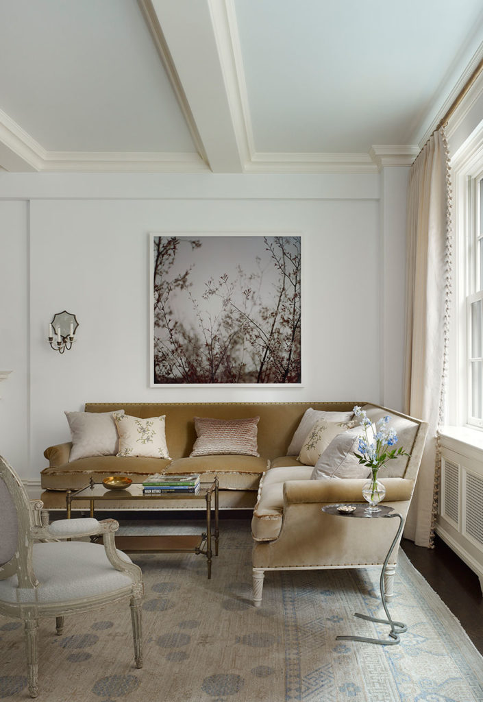
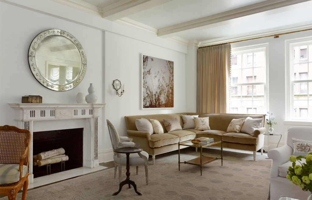
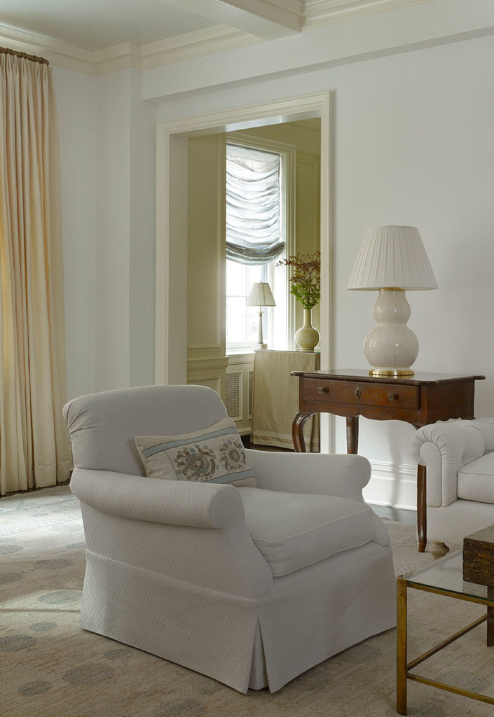
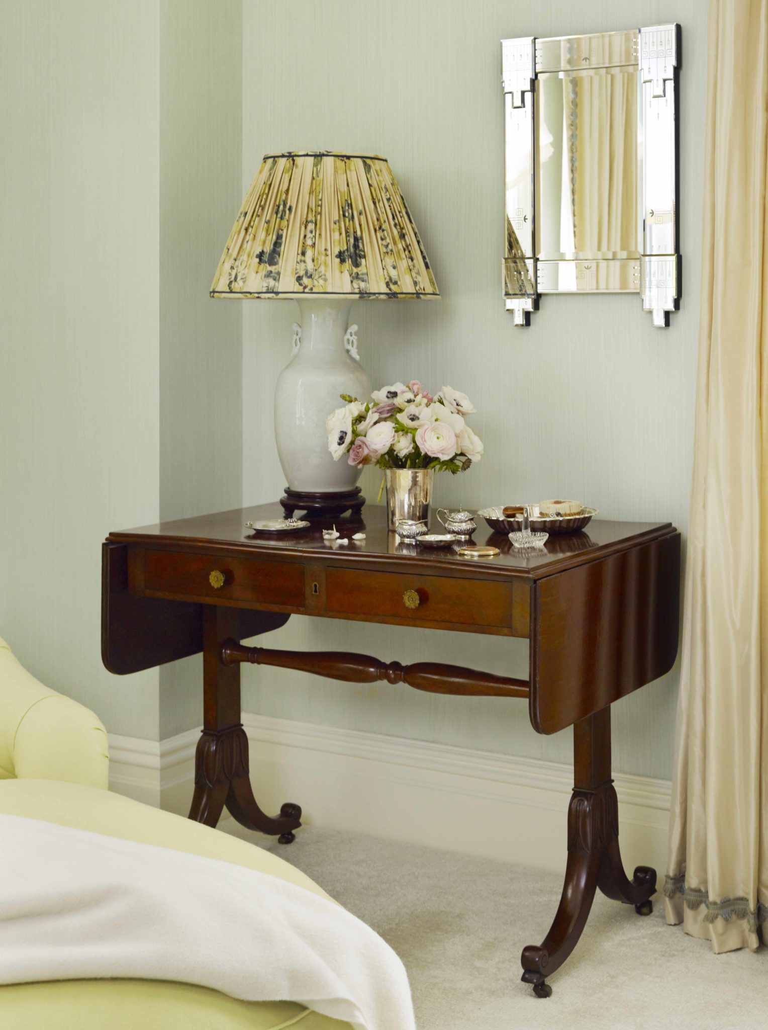
We curated a collection of French, Italian, Asian and English antiques throughout. Pairing these fine pieces with the clients’ contemporary art collection kept the rooms feeling fresh and youthful, while honoring the period of the apartment. Cool blue walls in the living room were a lovely departure from white, bringing to life the Samarkand rug woven from antique threads of many shades of blue.
To maximize the amount of natural light, we kept the windows largely unadorned, except for a pair of sumptuous draperies stacked on either side of the two windows. We selected etched sunburst wall sconces fabricated by EF Caldwell & Co., one of the premier designers and manufacturers of electric light fixtures from the late 19th Century.
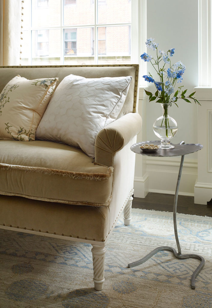
Moss fringe was added to the seams of the corner sofa seat cushions with small brass nail heads detailing the base. For the remaining custom upholstered furniture, we designed updated traditional shapes covered in crisp off-white and pale blue textiles. The pillows were designed and made using vintage and antique textiles and tapestries. Note the Venetian style window treatment in the adjacent dining room, made from a pale blue silk.
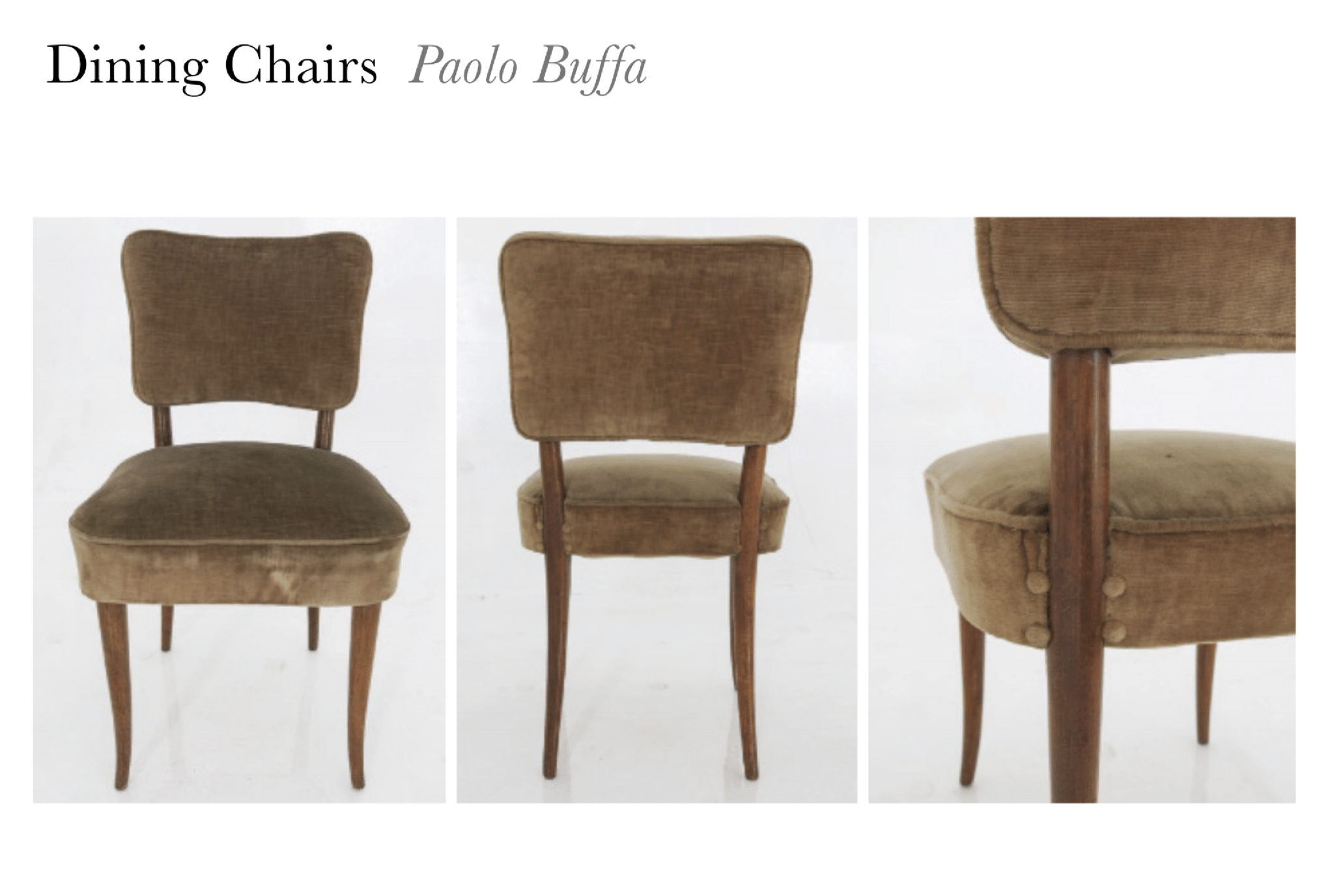
In the dining room, having found a rare English Regency spider leg table, we wanted to pair it with dining chairs that were somewhat unexpected and modern feeling. On one of our antiquing trips, we discovered a beautiful set of dining chairs designed by Paulo Buffa, but there were too few for a large family that likes to entertain. We had 8 chairs made in the style of this famous mid-century Italian furniture designer in cerused oak to bring some contrast to the dark floors and dark table. Below, the original chairs that served as inspiration.
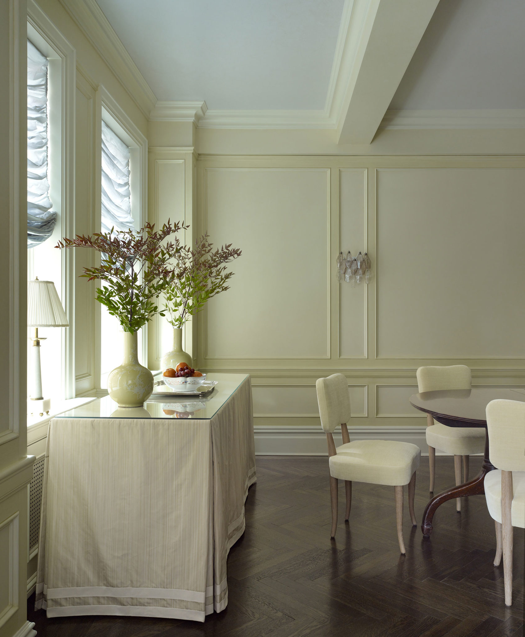
A smokey-pink Venini chandelier and matching sconces in the dining room (heirlooms the clients’ grandfather brought back from Italy after the war) make the space feel like home. The ceiling was painted a pale lavender, to complement the two tone glazed yellow walls and trim.
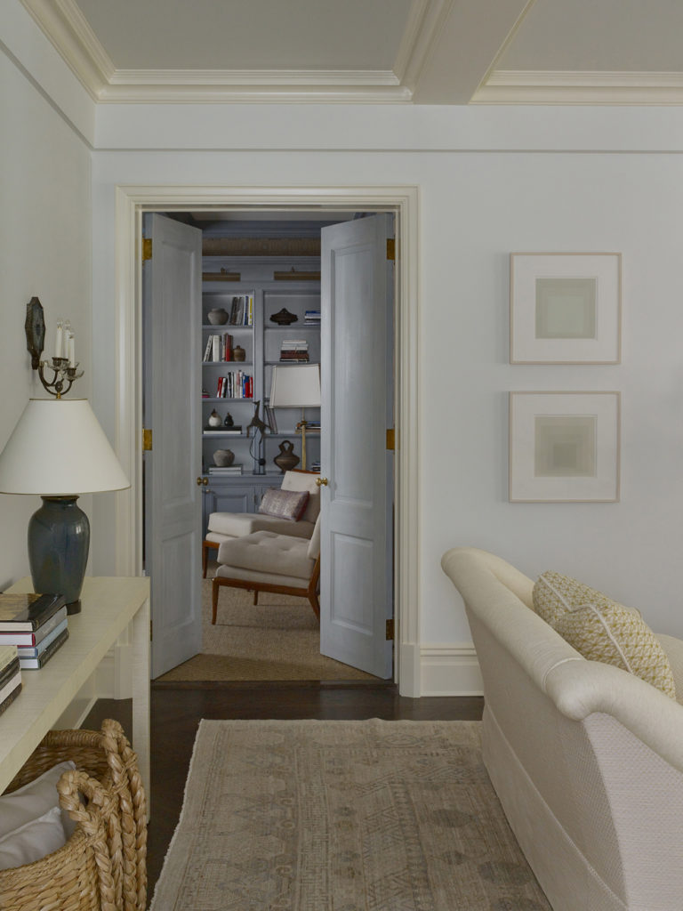
A set of doors that open into the library offered the perfect opportunity to make a thoughtful and somewhat dramatic statement. The tall doors were faux finished to look as if they were found in Sweden.
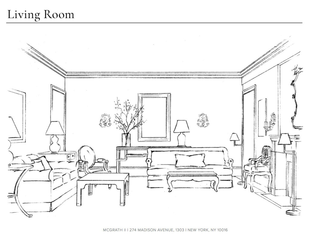
With every project, we like to sketch the main rooms to help our clients visualize how all of the different elements we are proposing will come together in a cohesive, beautiful way. With just a few tweaks, this living room below remained largely as we originally drew it.
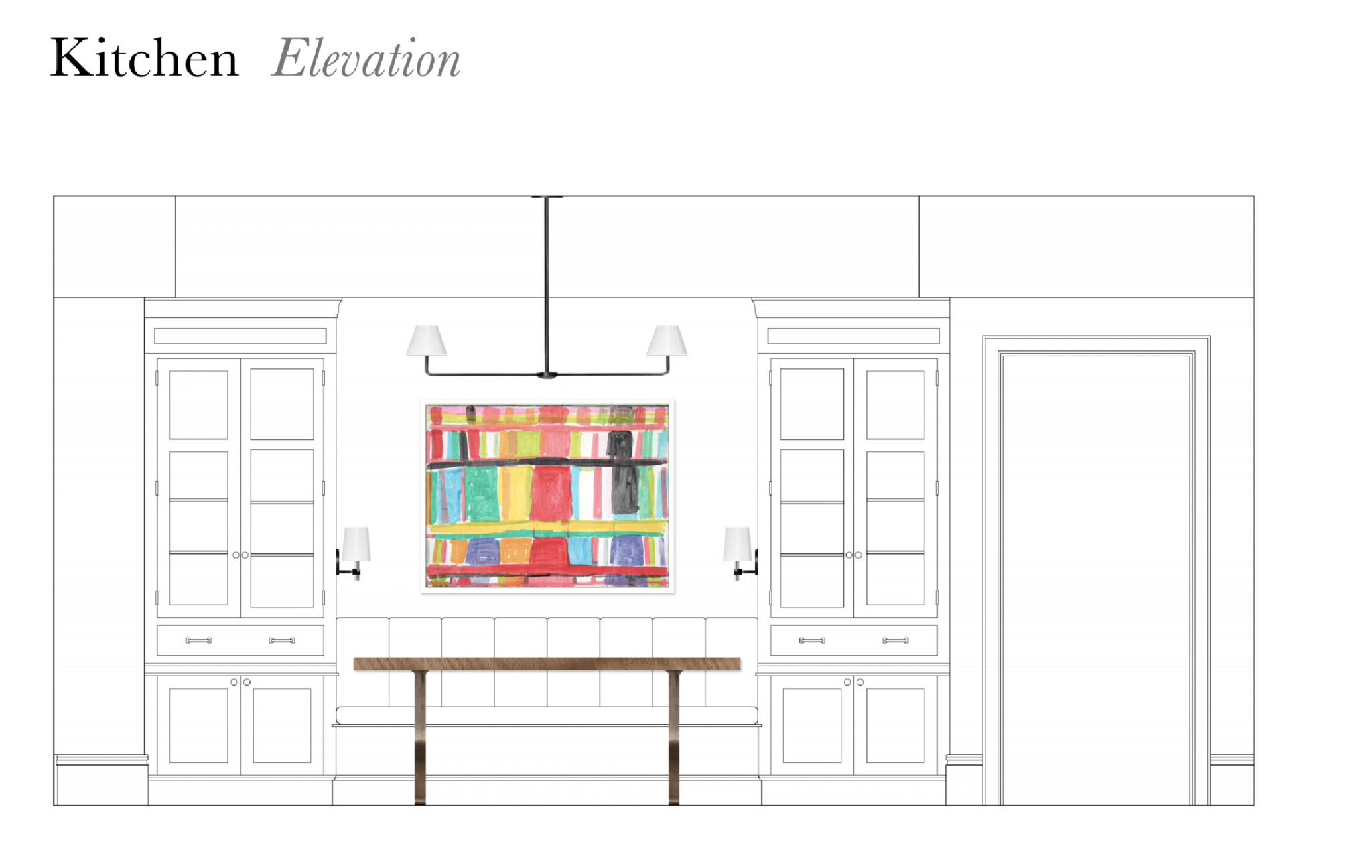
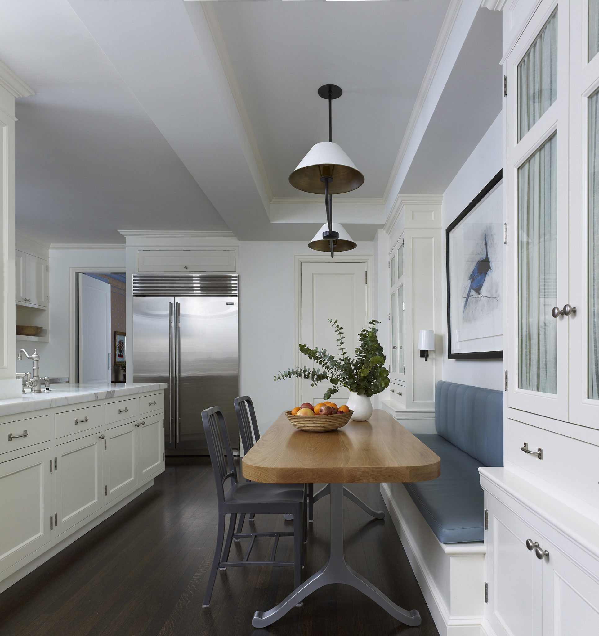
For the family kitchen, we updated a family eating space, adding a custom dining table and banquette in a channelled washable leather. Shirred linen with a subtle stripe hides any clutter behind the glass cabinets and a chic new light fixture completed the look.
In the library, we were inspired by the colorful and whimsical motifs from Indian block print textiles, designing a stencil pattern over burlap covered walls. The mix of playful, global prints and textiles with some more serious antique pieces gives this room great functionality as a space for the children to gather after school and for the adults to relax in at night.
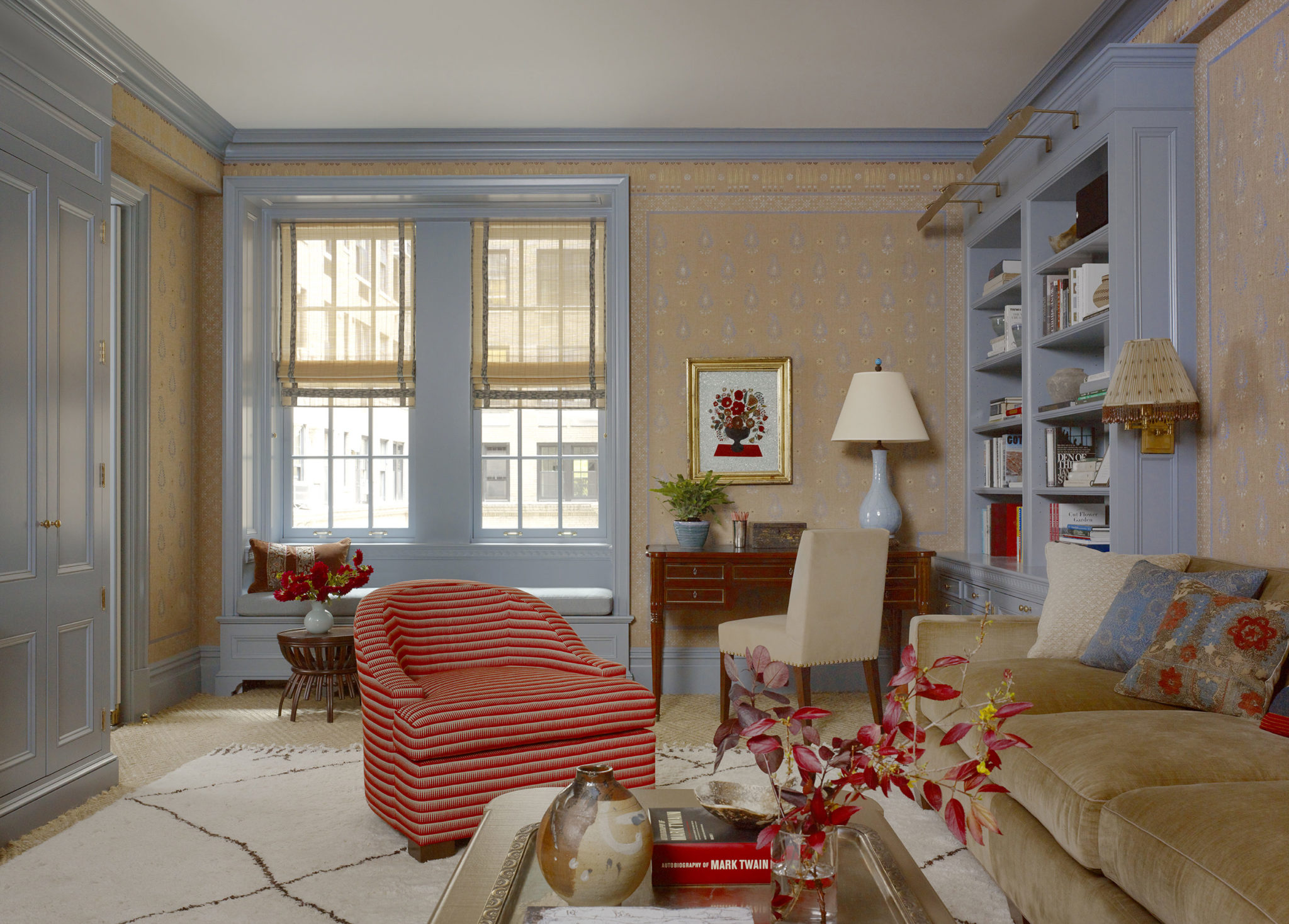
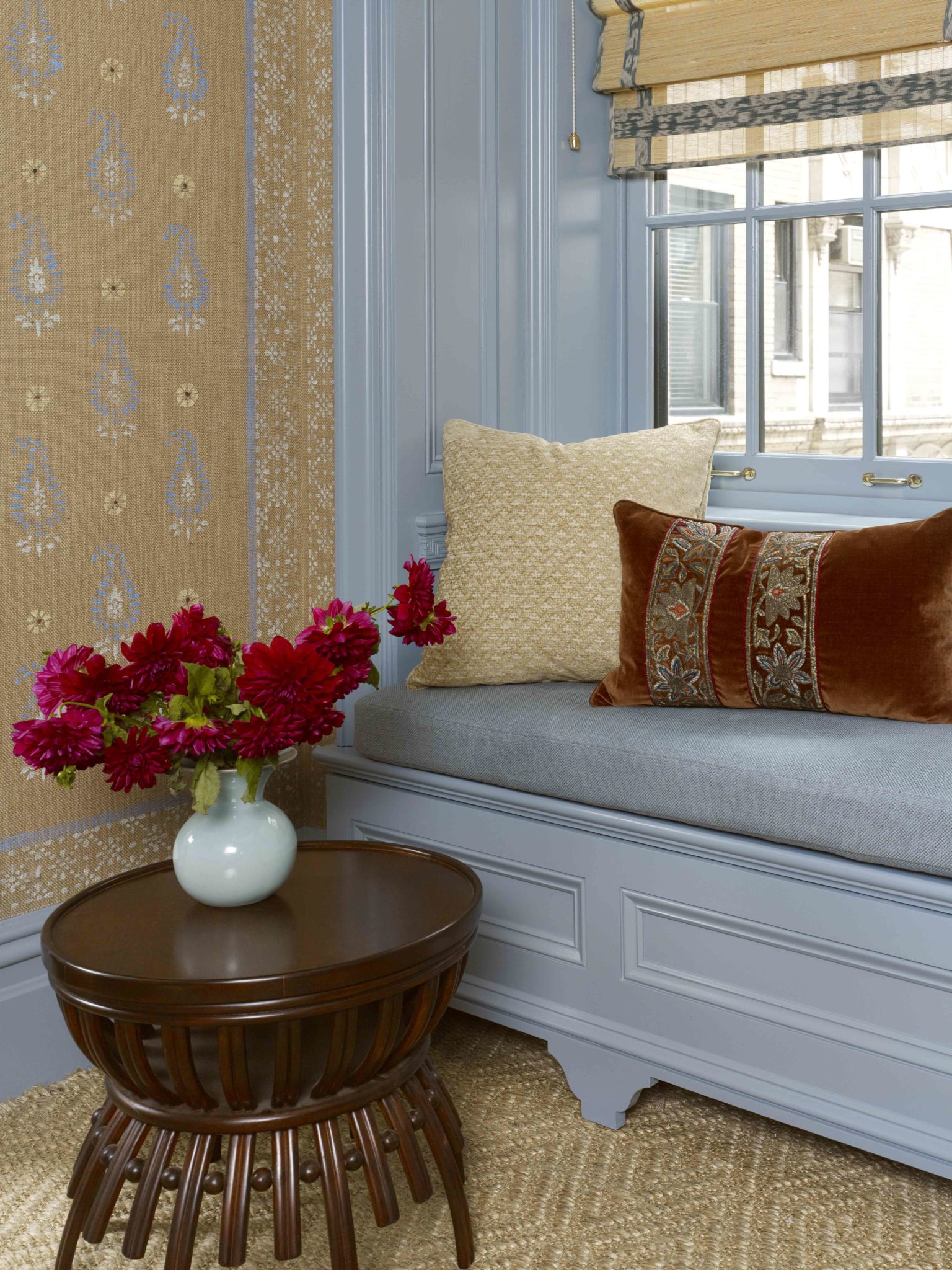
A detail view, showing the multi-color stencil pattern up close. The custom woven window shades were embellished with pieces of found antique ikat.
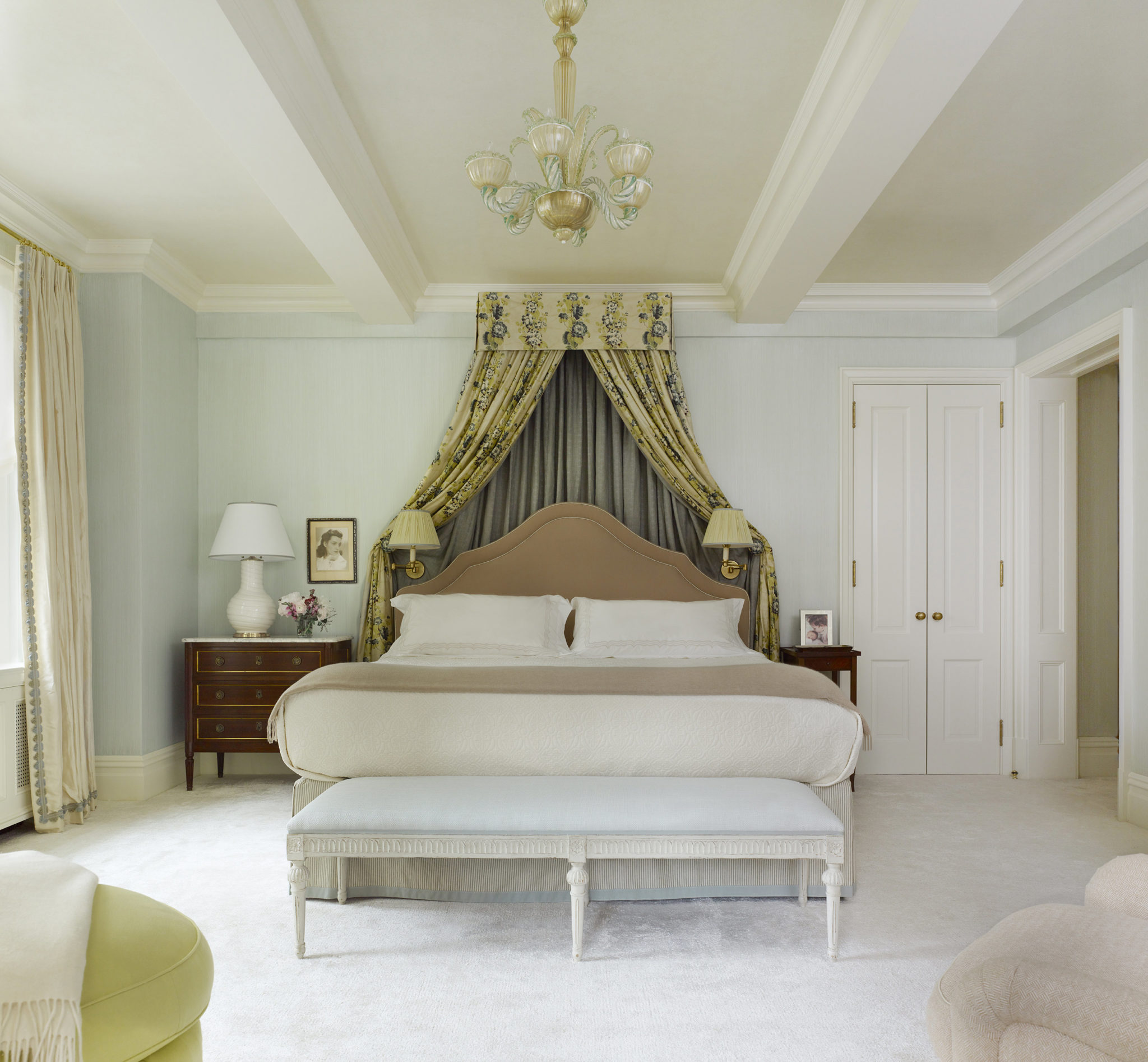
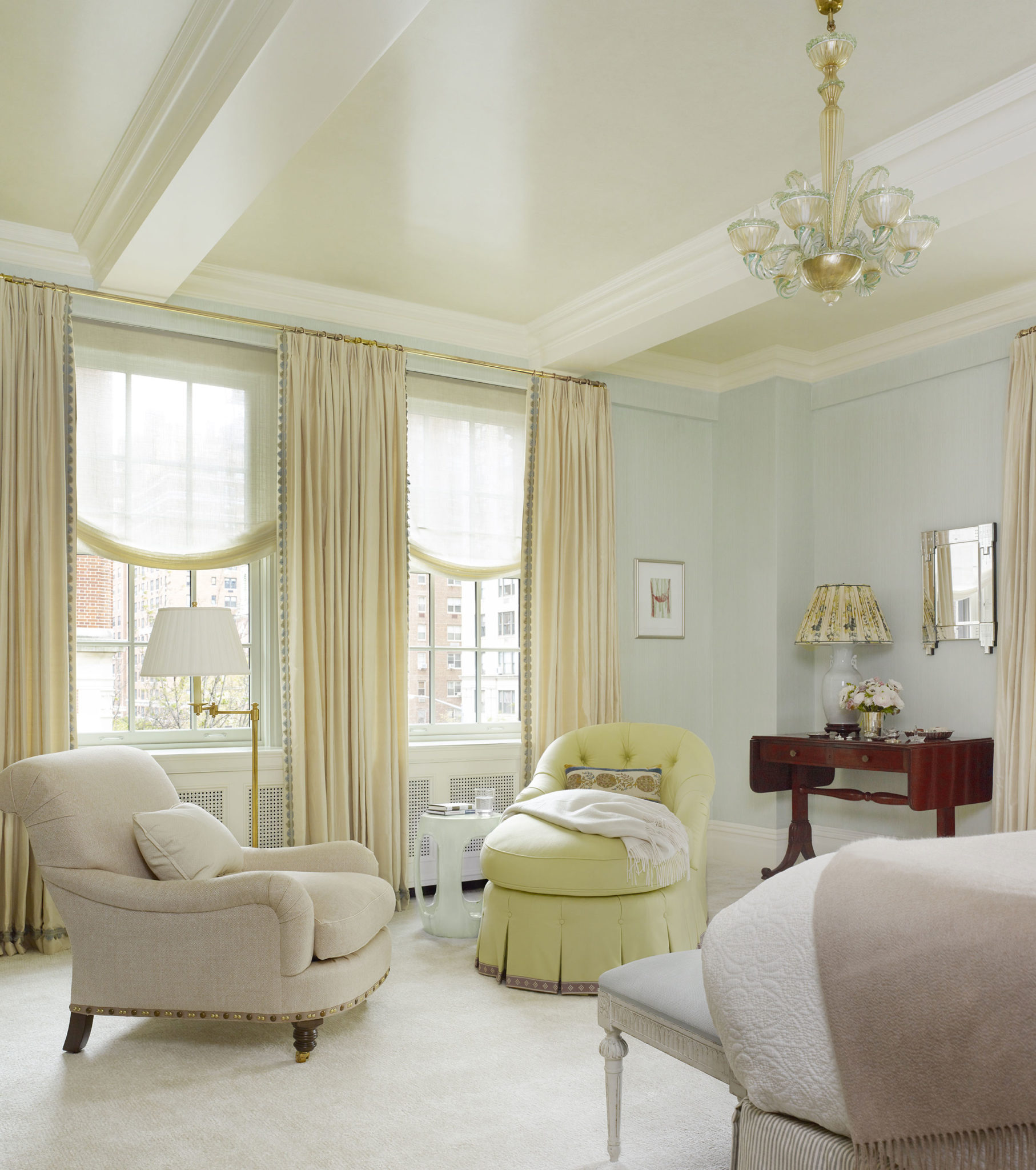
Our client dreamed of having a canopy bed in her bedroom, and we set out to accomplish that by using an unexpected color palette combination. A soft blue strie on the master bedroom walls provides the perfect companion for a tea stained floral textile with subtle hints of deep purple and lime green. The Italian Murano chandelier was an early acquisition, and a way of ensuring that the room would exude glamour. We had the ceilings painted in a soft, cloud like stipple glaze, leaving no surface unfinished. The cozy sitting area gets a shot of lime green on the custom chaise. An English Regency-style sofa table originally intended for the living room got moved into the bedroom serving as a surface for additional ambient light and to display family photos.
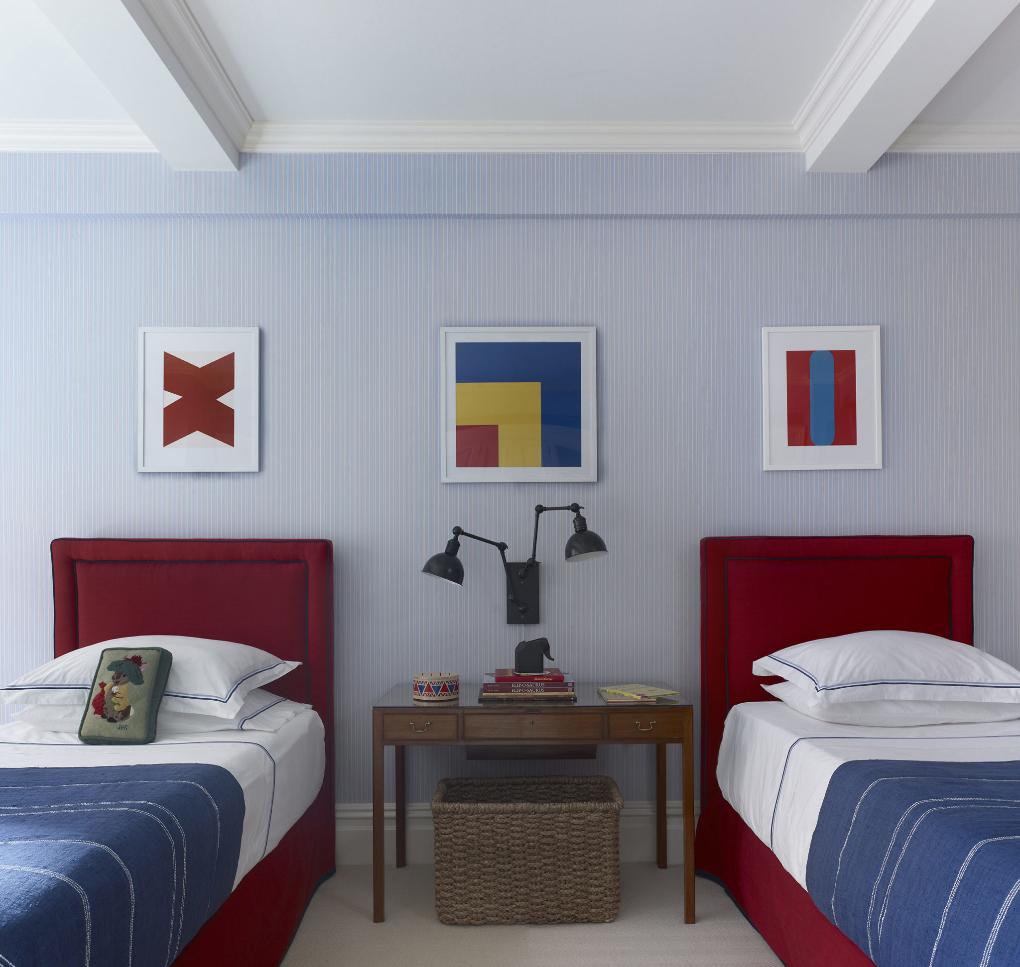
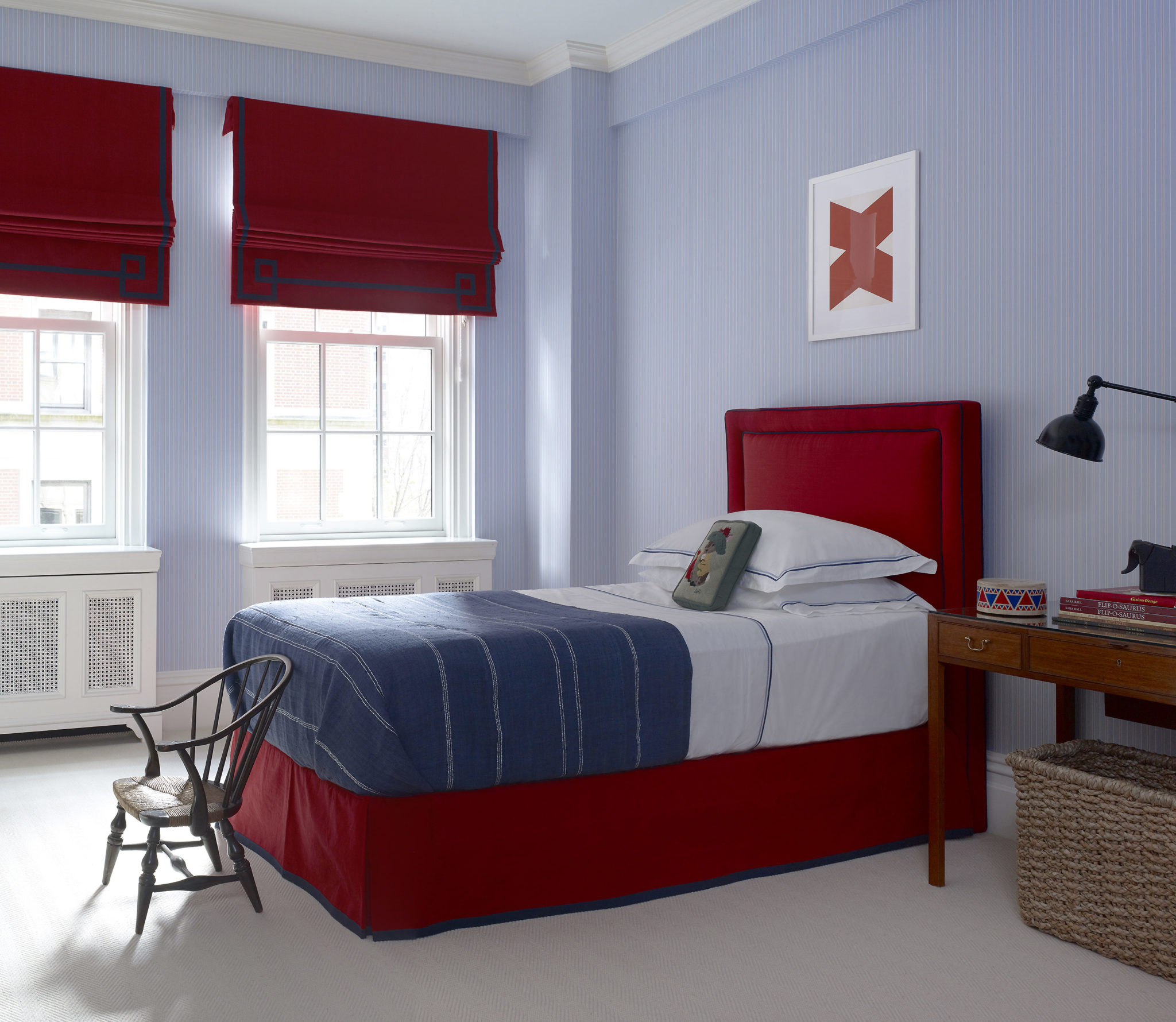
In the little boys room, we opted for strong primary colors. The wallpaper is a shirt ticking stripe. Red roman shades, headboards and bedskirts were embellished with a strong navy blue tape detail. A collection of small Ellsworth Kelly prints put a sophisticated spin on a classic boy’s bedroom. A vintage T.H Robsjohn-Gibbings desk and antique miniature Windsor chair brought to the apartment by the client are sweet additions to the room.
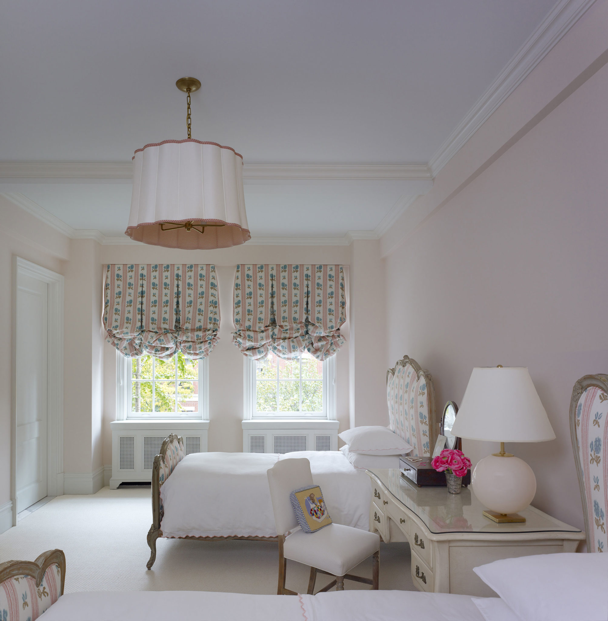
For the little girl’s room, we were inspired by the Sister Parish designed bedroom of Caroline Kennedy at the White House.
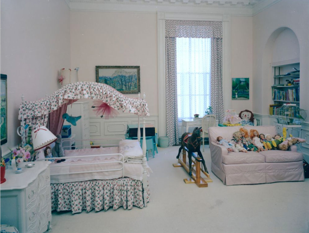
A found pair of antique Jansen beds, upholstering them in a classic Sister Parish floral and repeated again on the balloon shades. The desk came out of the Carlyle Hotel, a wonderful vestige of the original decoration. We designed a fanciful scallop edge pendant for the ceiling lined in pink gingham. Like the rest of the apartment, we wanted this little girl’s room to feel authentic to the period and innate grace of the apartment. No cheap tricks, just classic decorating reminiscent of another time but deeply rooted in today.
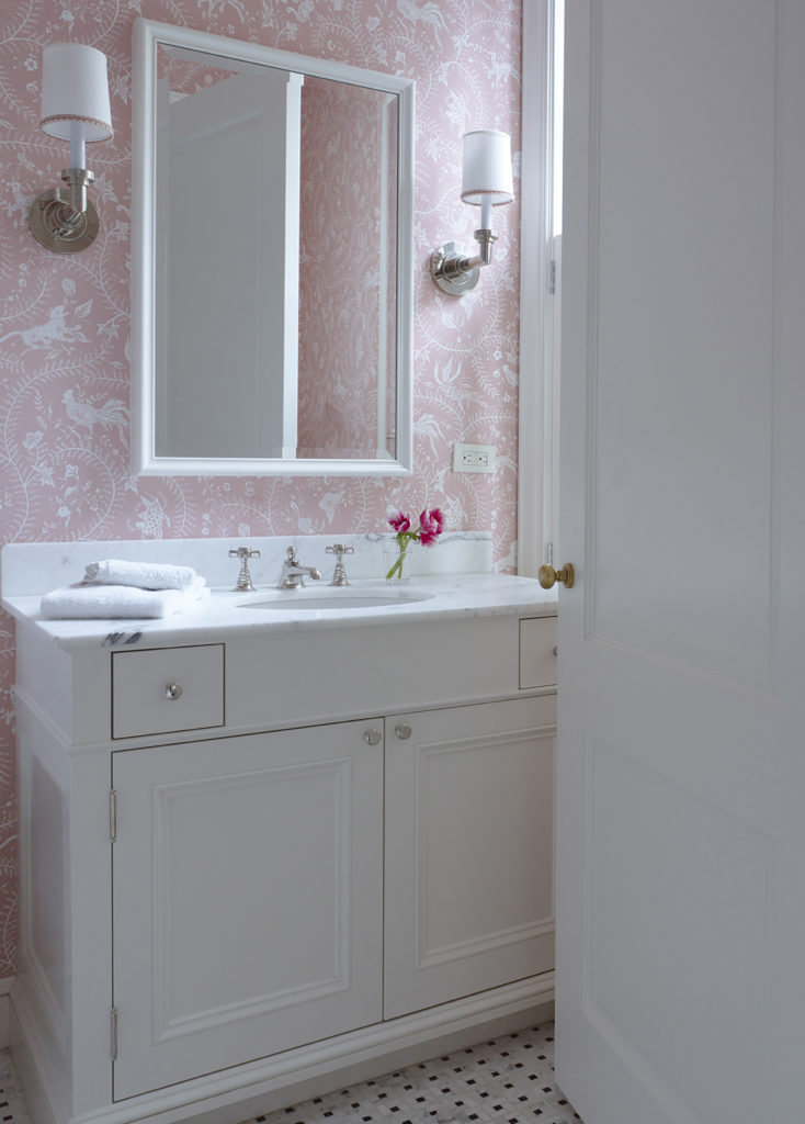
As you can see from this project, we love an all over print wallpaper for children’s bathrooms. It’s so playful and fun.
As designers, we love being able to translate a client’s interests, passions, dreams, vision for how they want to live into a real, living, breathing space! Click here to see more of this project.
 11 August 2014
Michael S. Smith in Architectural Digest
Bring on the chic! This month's Architectural Digest gives us a peek into the London manse of Net-a-Porter exec Natalie Massanet.
Read full post
11 August 2014
Michael S. Smith in Architectural Digest
Bring on the chic! This month's Architectural Digest gives us a peek into the London manse of Net-a-Porter exec Natalie Massanet.
Read full post
 27 January 2017
Cozy Comfortable Kitchen Spaces
When designing kitchens, there's much attention placed on the functionality of it as a work space, but cooking aside, how will the space be maximized in terms of comfort and as a gathering space?
Read full post
27 January 2017
Cozy Comfortable Kitchen Spaces
When designing kitchens, there's much attention placed on the functionality of it as a work space, but cooking aside, how will the space be maximized in terms of comfort and as a gathering space?
Read full post
 26 June 2019
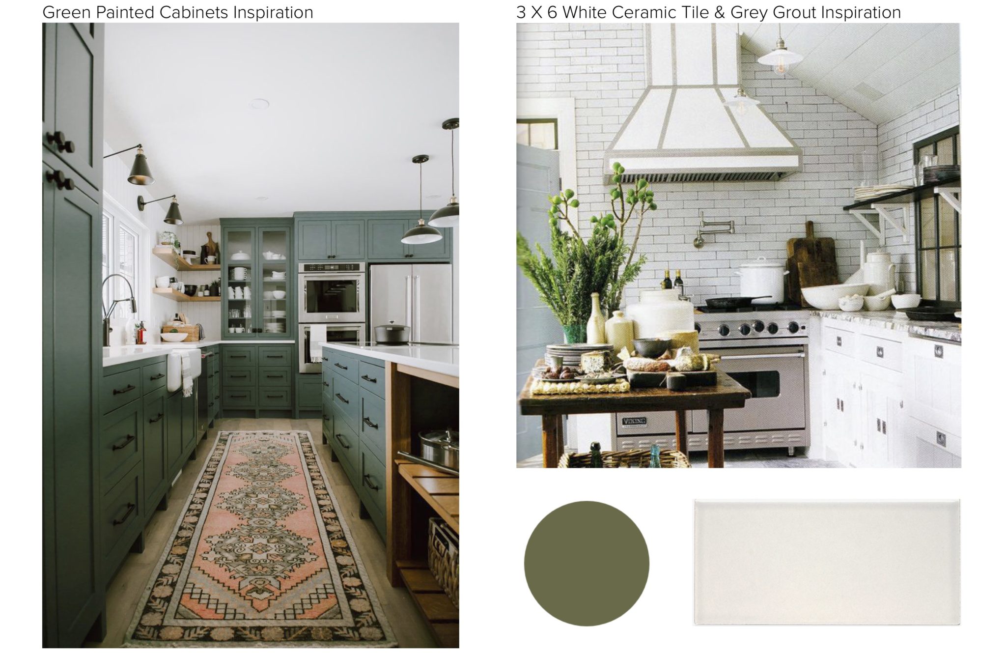
A Recent Townhouse Kitchen Design
A narrow galley kitchen painted a strong green starts the color story for the entire house.
Read full post
26 June 2019
A Recent Townhouse Kitchen Design
A narrow galley kitchen painted a strong green starts the color story for the entire house.
Read full post
